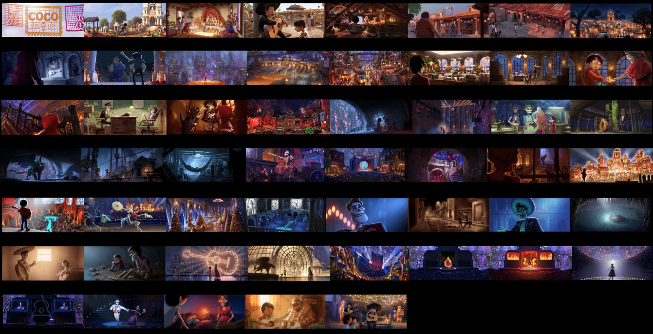
April 27 - 30: Pixar in a Box: Lighting
Monday
Watch the 2 videos linked below and post your black and white sketch from Exercise 1 to your website.
Art of Lighting Overview
Light Quality
Exercise 1: Seeing Light
Watch the video linked below and post your photo from Exercise 2 to your website.
Light Roles
Exercise 2: Lighting an Object
Tuesday
Watch the 2 videos linked below. Complete the interactive lighting questions in Exercise 3 and post your results as well as your photos from Exercise 4 to your website.
Virtual Lights
Exercise 3: Lighting an Orange
Character Lighting
Exercise 4: Lighting a Character
Wednesday
Watch the video linked below and post your answers to Part 1 & 2 of Exercise 5 as well as screen captures of Exercise 6 on your website.
Color Scripts
Exercise 5: Color Scripts
Goals
- Analyse a color script used at Pixar
- Generate an original color script
Questions to Answer
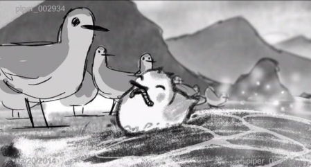
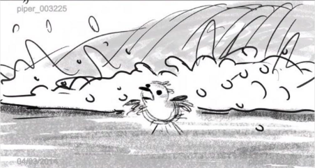
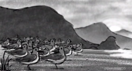
Below are three rough frames from the storyreel for the short film Piper. Pick one of the three frames, print it out and color it in to create two distinct looks. What moods were you able to portray?
- What can you tell about the story by looking at the colorscript?
- What does it tell you about the overall tone & feel of the movie?
- Select three frames that have very different moods and explain what they make you feel and how color and light was used.
Below are three rough frames from the storyreel for the short film Piper. Pick one of the three frames, print it out and color it in to create two distinct looks. What moods were you able to portray?
Master Lighting
Exercise 6: Master Lighting
Thursday
Watch the video linked below and post a screen shot of Exercise 7 on your website.
Shot Lighting
Exercise 7: Shot Lighting
Exercise 6: Master Lighting
Thursday
Watch the video linked below and post a screen shot of Exercise 7 on your website.
Shot Lighting
Exercise 7: Shot Lighting
April 20 - 24: Pixar in a Box: Storytelling
Monday: Introduction to Storytelling
Watch the two videos linked below and complete Activity 1: Expressing Memories
Introduction to Storytelling
Your Unique Perspective
Activity 1: Expressing Memories - *Your story should be something you are comfortable sharing on your webpage and content should be school appropriate.*
Part A: Think of a memory that you remember vividly. It should be a memory that comes easily to you.
Part B: Why do you think you remember this so well? Try connecting one or more emotions to this memory.
Part C: Now try and express your memory and emotion in some way. The goal is to get it out of your head. Here are some ideas for what you could do.
Tuesday: Your Favorite Stories
Watch the video linked below and complete Activity 2: Your 3 Favorite Films.
Your Favorite Stories
Activity 2: Your 3 Favorite Films
Part A: Identify the three films that you would take to a deserted island....
- Verbally: Record yourself recalling your memory. Can you make us feel the emotion?
- Written: Write your memory in less than a page. Do the emotions come out in your words?
- Visually: Express your memory using only lines and shapes. Do the emotions come out in your drawings? example
Tuesday: Your Favorite Stories
Watch the video linked below and complete Activity 2: Your 3 Favorite Films.
Your Favorite Stories
Activity 2: Your 3 Favorite Films
Part A: Identify the three films that you would take to a deserted island....
Part B: Why do you think you connected with these stories? Come up with at least one reason for each.
Part C: What, if anything, do these three films have in common? How are they different?
Wednesday: What If...
Watch the video linked below and complete Activity 3: What If...
What If
Activity 3: What If...
Part C: What, if anything, do these three films have in common? How are they different?
Wednesday: What If...
Watch the video linked below and complete Activity 3: What If...
What If
Activity 3: What If...
Part A: Return to your 3 favorite films and try reframing each of them in terms of a "what if" statement. Share these with someone (written or verbally) and see if they can guess what movie it is from!
Part B: Now it's your turn. Come up with 3-5 of your own “what if” ideas.
Thursday: World & Character
Watch the video linked below and complete Activity 4: Characters & Worlds
World & Character
Activity 4: Characters & Worlds
Part B: Now it's your turn. Come up with 3-5 of your own “what if” ideas.
Thursday: World & Character
Watch the video linked below and complete Activity 4: Characters & Worlds
World & Character
Activity 4: Characters & Worlds
Part A: Return to your 3 films. Identify the worlds and characters in each. Write these down.
Part C: Return to your three "what if" statements from the previous exercises. Pick your favorite one. Can you imagine a possible character and world?
Part D: Draw or write about what life would be like in this world.
Friday: Remote Learning Planning Day
There is no activity for Friday. Enjoy your day off.
- Who are the main characters?
- Is there a character you identify with most?
- Where does the movie take place? Is it one world or multiple worlds?
Part C: Return to your three "what if" statements from the previous exercises. Pick your favorite one. Can you imagine a possible character and world?
Part D: Draw or write about what life would be like in this world.
Friday: Remote Learning Planning Day
There is no activity for Friday. Enjoy your day off.
April 12 - 17: Pixar in a Box - Color Science
Monday: Introduction to Color Science
Watch the two videos linked below and complete Activity 1: Understanding Spectra
Color Science
Spectrum of Light
Activity 1: Understanding Spectra
Tuesday: RGB Color Model
Watch the video linked below and complete Activity 2: RGB Color Matching. Screen capture your score and email it to me at [email protected]
RGB Color Model
Activity 2: RGB Color Matching
Wednesday: HSL Color Model
Watch the video linked below and complete Activity 3: HSL Color Matching. Screen capture your score and email it to me at [email protected]
HSL Color Model
Activity 3: HSL Color Matching
Thursday: Color Contrast
Watch the Color Contrast video linked below and complete Activity 4: Color Contrast. Screen capture your score and email it to me at [email protected]
Then watch the Color Correction video linked below before exploring the Color Correction Suite.
Color Contrast
Activity 4: Color Contrast
Color Correction
Color Correction Suite
Friday: Remote Learning Planning Day
There is no activity for Friday. Enjoy your day off.
April 6 - 9: Logo Evolution Research Project
Choose a logo and research/present the evolution of that logo over its lifespan. The logo you choose should have at least 3 versions over its lifespan. Identify the company name along with a brief description. Then for each logo change identify the years the logo was in use, the creator of the logo if available, and the identifying features or modifications.
Example: Apple Inc.
Apple Inc. headquartered in Cupertino, California started from the bottom in a small garage by Steve Jobs, Steve Wozniak, and Ronald Wayne now is a multinational technology company.
Example: Apple Inc.
Apple Inc. headquartered in Cupertino, California started from the bottom in a small garage by Steve Jobs, Steve Wozniak, and Ronald Wayne now is a multinational technology company.
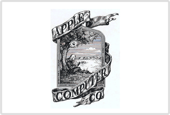
|
1976 - 1977 By Ron Wayne
In 1976, the logo composed by Ron Wayne depicted Sir Isaac Newton sitting underneath an apple tree which couldn’t make an effect and was promptly supplanted. |
|
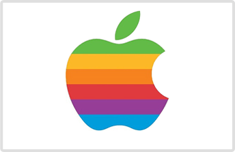
|
1977 - 1998 By Rob Janoff
While aiming for clarity second logo was designed by Rob Janoff as the “rainbow apple” with a bite taken out of it representing the fact that Apple II could generate graphics in color. |
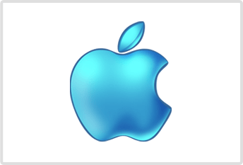
|
|
1998 Aqua - Translucent Version
Almost after 22 years, regaining leadership aimed a new brand logo design to switch from the rainbow variant to the aqua-themed variant nearly identical in shape. |
|
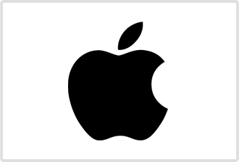
|
1998 - 2000 Monochrome Variant
In 1999 with the launch of iMac G3, the logo was changed to the monochromatic variant designed by Jonathan with the exception of its color use giving it modern and stylish logo design. |
|
|
2001 - 2007 Translucent Variant
Since 1998, some redesigns were made in the logo and a new translucent variant was introduced keeping the shape similar to the prior one. |

|
|
2007 - 2013 Glass - Themed Variant
In 2007, a new logo design keeping it simple as a glass themed variant was launched. |

|
|
2013 – Present
The monochrome variant taken down in 2000 was re-established in 2014 which is presently in use as the brand logo. |
|
March 17 - 20: eLearning Week
Tuesday: Typography Lesson
Watch the linked video and answer the following questions (in complete sentences) in a new post on your webpage:
Wednesday: Principles to Improve Logo Design
Watch the linked video and answer the following questions (in complete sentences) in a new post on your webpage:
Thursday: Logo Types
Describe each of the logo types (in complete sentences) and find an example of each found in mainstream business. Post your example and descriptions as a new post on your webpage.
Friday: Logo Thumbnails
Using the techniques and critiques your have explored this week create two logo sketches in different styles to represent your design work. You can base this logo on your name or a “business name” you want to design under. List this business name (if you choose not to use your name) and the two styles you chose on your website as well as photos of your sketches.
Watch the linked video and answer the following questions (in complete sentences) in a new post on your webpage:
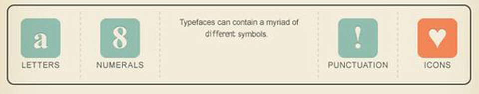
- Define typography
- List the categories of fonts
- What style of font is considered more clean and modern?
- What style of font is best for small amounts of text?
- Name a font that has a reputation for being outdated?
- What is one combination of changes you can use to show contrast in fonts?
- What edit will allow you to modify the space between specific letters?
Wednesday: Principles to Improve Logo Design
Watch the linked video and answer the following questions (in complete sentences) in a new post on your webpage:
- Why should you begin by working in black & white?
- What does legibility mean?
- How can you give better critiques?
Thursday: Logo Types
Describe each of the logo types (in complete sentences) and find an example of each found in mainstream business. Post your example and descriptions as a new post on your webpage.
- Monograms
- Wordmarks
- Pictorial marks
- Abstract marks
- Mascots
- Emblems
- Combination marks
Friday: Logo Thumbnails
Using the techniques and critiques your have explored this week create two logo sketches in different styles to represent your design work. You can base this logo on your name or a “business name” you want to design under. List this business name (if you choose not to use your name) and the two styles you chose on your website as well as photos of your sketches.
Note: According to the Illinois State Board of Education the mandated days of school closure are "Act of God" days in which attendance is not taken and assignments are not graded. However, ISBE has given the guidance that "School districts are strongly encouraged to provide instruction to students during these Act of God Days through whatever means possible." For more information see the attached document from ISBE
| isbe-guidance-mandatory-statewide-closures.pdf |
March 5, 2020: Pathfinder Cont.

March 2, 2020: Pathfinder
February 18, 2020: Gradient Mesh
Using your skills with the pen tool, blend tool, and now gradient mesh complete this 6 step tutorial for a new, more detailed, fish.
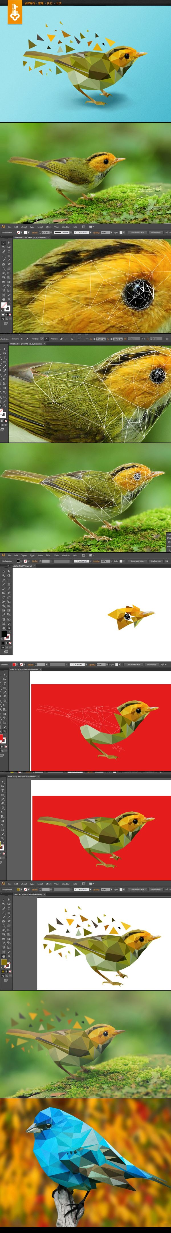
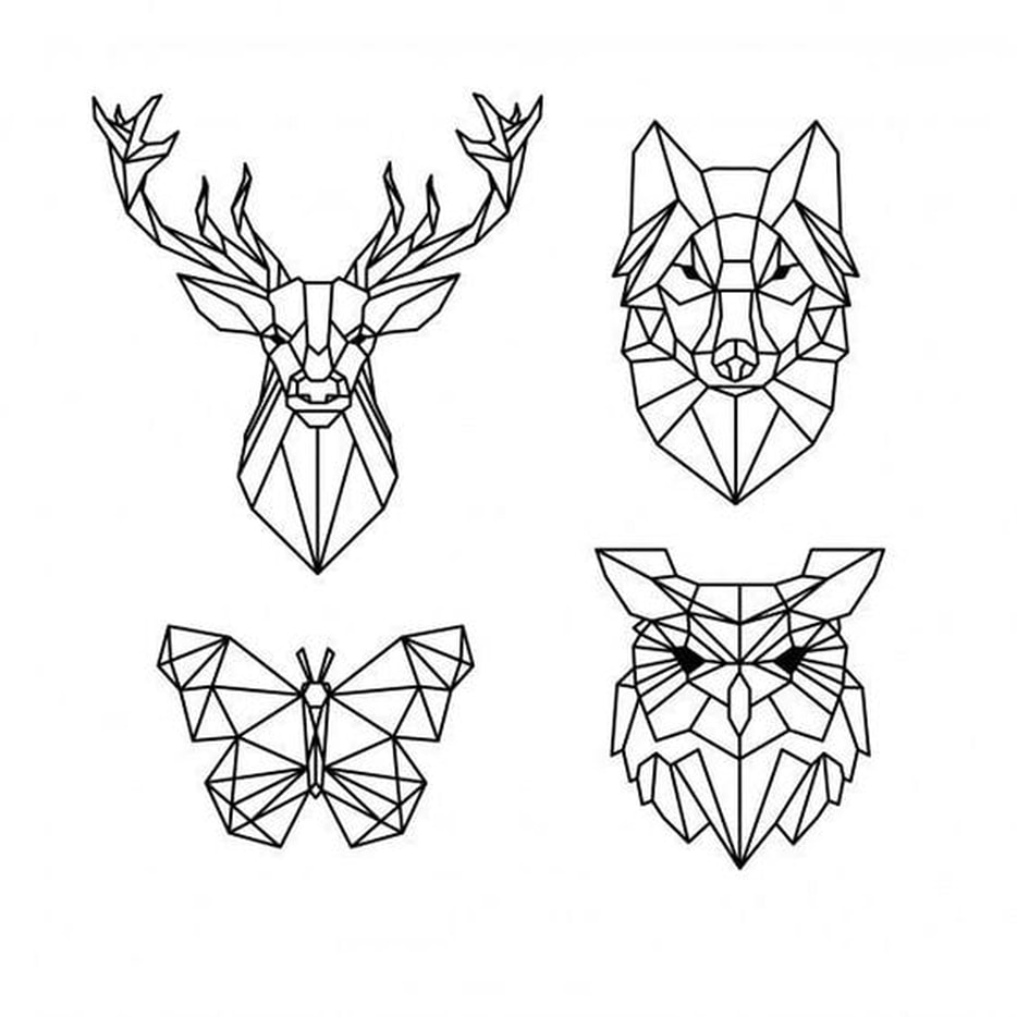
February 6, 2020: Low Poly
You will be creating a Geometric/Low Poly design over the next few days. This will require you to download a photo you want to work with. You can choose an animal or person but no architecture or landscape photos. Using your pen tool and ONLY STRAIGHT LINES you will create triangles of varying sizes and degrees to create a geometric version of your photo. You should then fill in each shape with a color within that shape from the original photo.
* You should not have a stroke on any shape.
*You should have a background of some kind. This can be a gradient on the whole piece or a geometric landscape that ties into the subject.
*See examples below.
Process:
* You should not have a stroke on any shape.
*You should have a background of some kind. This can be a gradient on the whole piece or a geometric landscape that ties into the subject.
*See examples below.
Process:
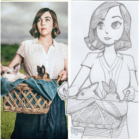
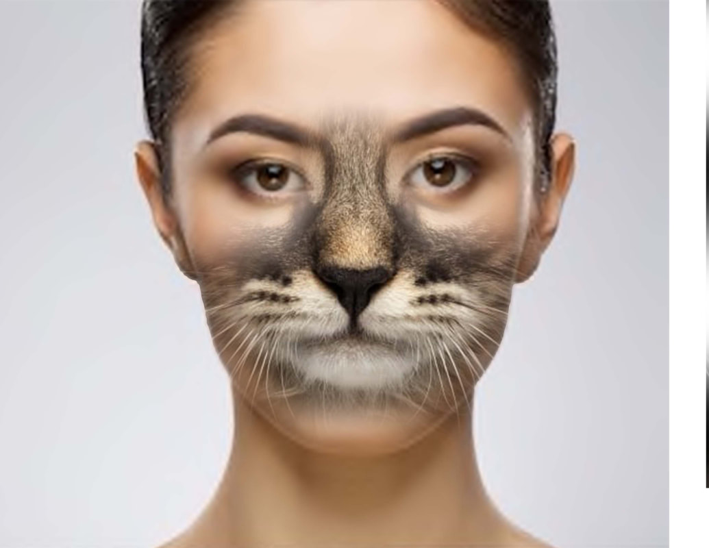
January 31, 2020: Character Illustration - Photo to Sketch
|
|
|
|
|
|
January 29, 2020: Rotation
January 27, 2020: Reflection
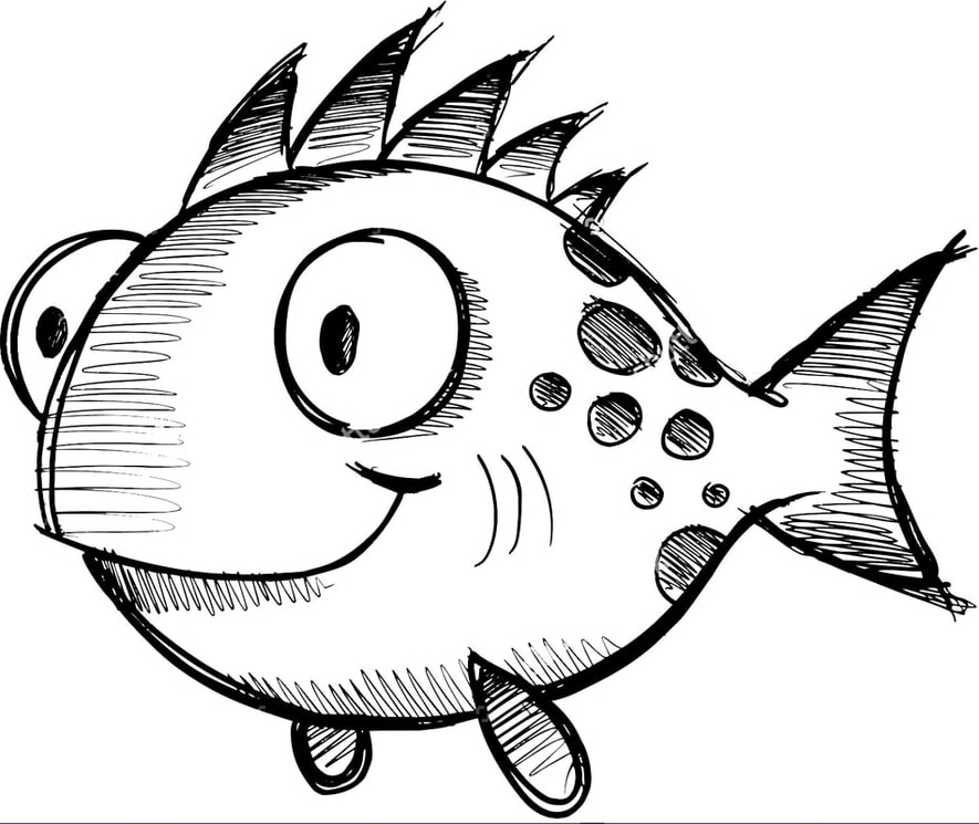
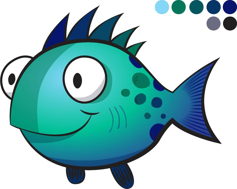
January 21, 2020: Character Illustration - Fish
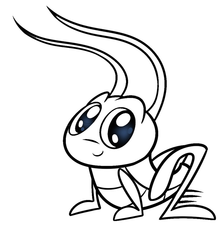
January 16, 2020: Character Illustration - Cricket
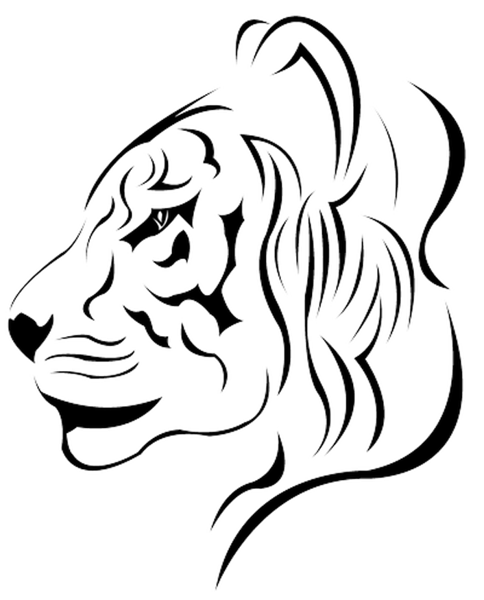
January 13, 2020: Shapes & Paths Lion
January 9, 2020: Path Profiles
Video instructions can be found here. Butterfly & Cat
Focus on creating one path and using the path profile option to change the shape and stroke weight. DON'T try to go around the shapes.
Useful keyboard shortcuts:
Both pieces, and any work not finished/posted yesterday should be on your website today by the end of class.
Focus on creating one path and using the path profile option to change the shape and stroke weight. DON'T try to go around the shapes.
Useful keyboard shortcuts:
- Lock: Command 2
- Unlock: Option Command 2
- Section Tool: V
- Direct Select Tool: A
- Pen Tool: P
- Zoom: Z
- End a line: Enter
Both pieces, and any work not finished/posted yesterday should be on your website today by the end of class.

|

|
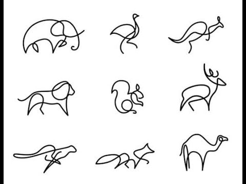
January 8, 2019: Pen Tool Practice - Animals
January 7, 2019: Illustrator Intro
December 11, 2019: Final Project - Package Design
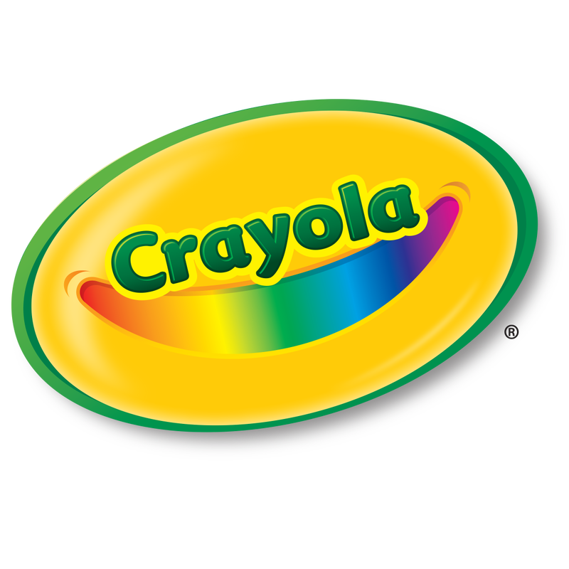
You will be using the following information to create a Crayola Crayon box package design.
- Crayola logo
- Crayon box theme
- 10 custom color names
- 3 images
- 1 brush
- 2 fonts (1 should be your custom handwriting font)
- Crayola.com website
- Proof of purchase barcode (This is not counted as one of the 3 images required
- Corporate contact information
- 1-800-CRAYOLA
- Consumer Affairs
Crayola LLC
1100 Church Lane
Easton, PA 18044-0431
December 6, 2019: Sport/Team/Club Poster
Create a poster featuring a club or sport team. Use your Photoshop skills to make the poster interesting, attractive and a poster the team would be proud to use. Consider the design rules when laying out the poster.
REMEMBER DIMENSIONS: 18" x 24" with resolution of 300
REMEMBER DIMENSIONS: 18" x 24" with resolution of 300
| sports_poster_3.xlsx |
December 4, 2019: Final Project, Package Design
December 2, 2019: Custom Typeface
| calligraphr-template.pdf |
|
A small look at what it means to design with type for clients.
|
|
November 20, 2019: Color
Now you will be illustrating the feeling of a color following this tutorial. First, visit paletton.com and choose your monochromatic color scheme. Save the color codes so that you can refer back to them as you work. Then choose the word describing that color that you will illustrate (HINT: don't choose an enormously long word 5-7 letters is best) Then begin the tutorial replacing the colors used with the colors in your scheme.

| onelily-colormatters_5.jpg |
| color_5.jpg |
November 18, 2019: Color Theory
|
Red
Examples of red app icons: Pinterest, Google+, YouTube Evokes: “Action, adventure, fire, lust, anger, courage and rebellion.”
Orange Examples of orange app icons: Blogger, RSS feed, MozillaFirefox Evokes: “Energy, vitality, cheer, excitement, adventure, warmth, and good health.”
Yellow Examples of yellow app icons: SnapChat, YellowPages, TimeHop Evokes: “Happiness, optimism, enlightenment, creativity, sunshine, warmth, cheeriness and fun.”
|
Green
Examples of green app icons: WhatsApp, Vine, Facetime Evokes: “Growth, rebirth, freshness, revitalisation, and fertility.”
Blue Examples of blue app icons: Facebook, Twitter, LinkedIn Evokes: “Dignity, intelligence, cleanliness, peace, security and calmness of mind.”
Purple Examples of purple app icons: Viber, Yahoo!, Podcast Evokes: “Nobility, wealth, magic, mystery, spirituality, creativity, dignity, and royalty.”
|
November 14, 2019: Disintegration Effect
|
Use the linked image and brush set to complete this disintegration effect piece
|
| ||
November 11, 2019: Pixel Explosion Effect

November 4, 2019: Package Design
PlayDoh Package
Design a package to hold a custom set of 2 playdoh jars.
Use the color scheme and theory to tailor your design to the feeling those colors convey.
Include each of the following:
Design a package to hold a custom set of 2 playdoh jars.
Use the color scheme and theory to tailor your design to the feeling those colors convey.
Include each of the following:
- PlayDoh logo
- Custom names for each color
- Custom background
- Care instructions (Replace lid after each use. If compound becomes dry add one drop of water and work through as needed.)
- Corporate contact information (1 800 408-0052)
- Product barcode
October 28, 2019: Halloween Fun
|
|
| ||||||
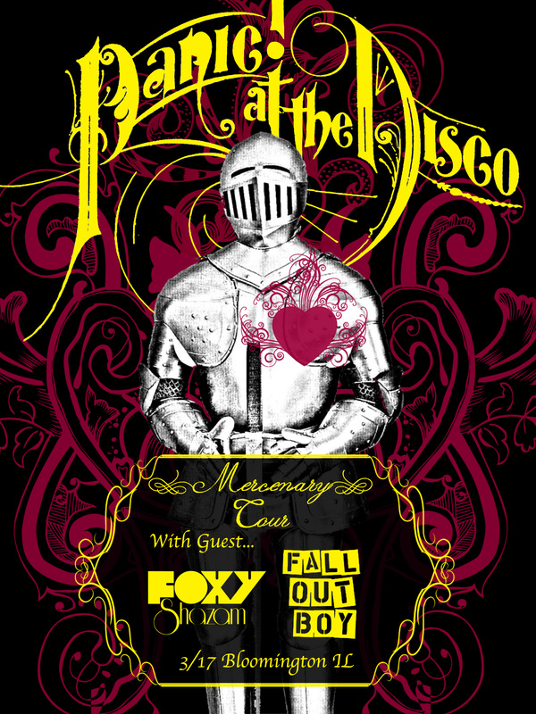
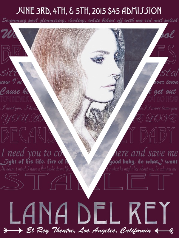
October 18, 2019: Concert Poster
| concert_poster_rubric_4.docx |
Posters should be 18" x 24" with 300 resolution.
Due Date: Friday, October 25th
Due Date: Friday, October 25th
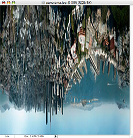
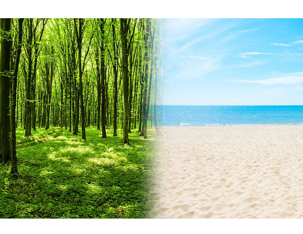
October 15, 2019: My Own Little World
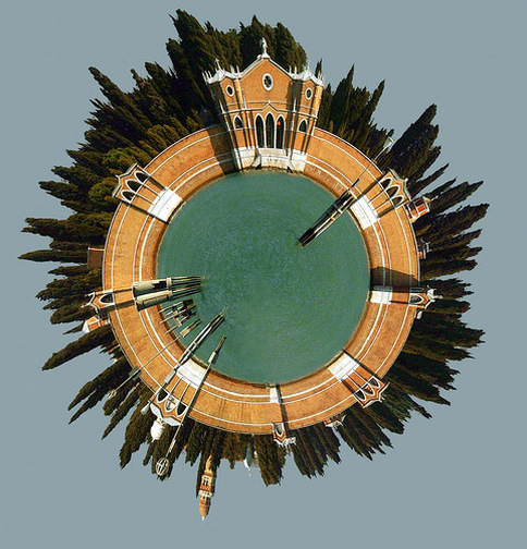
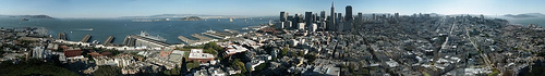
STEP 1: RESIZE AND ROTATE
The first thing we need to do is prepare the image for the Polar filter. We do this by stretching the height of the image so that the image is a perfect square.
Select Image>Image Size from the menus. Uncheck ‘Constrain Proporties’ and set the “height” to the same value as your “width”. Next, rotate the image 180 degrees. (Image>Rotate Canvas>180)
You should end up with something like this:
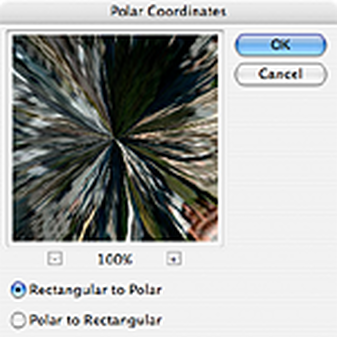
STEP 2: APPLY THE POLAR FILTER
Next, we’ll apply the Polar Filter to wrap our image into a sphere.
Choose Filter > Distort > Polar Coordinates from the menus and in the resulting dialog box, select the “Rectangular to Polar” setting.
(If you’re using The Gimp the command is Filters > Distorts > Polar Coords.)
Next, we’ll apply the Polar Filter to wrap our image into a sphere.
Choose Filter > Distort > Polar Coordinates from the menus and in the resulting dialog box, select the “Rectangular to Polar” setting.
(If you’re using The Gimp the command is Filters > Distorts > Polar Coords.)
As you can see we’re 90% of the way there!:
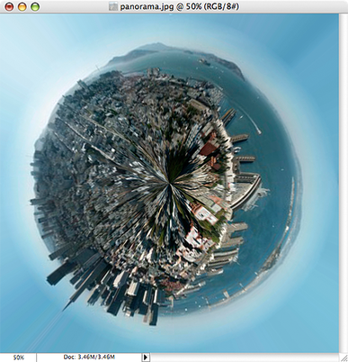
Easy cheesy, right? Now for some finishing touches…
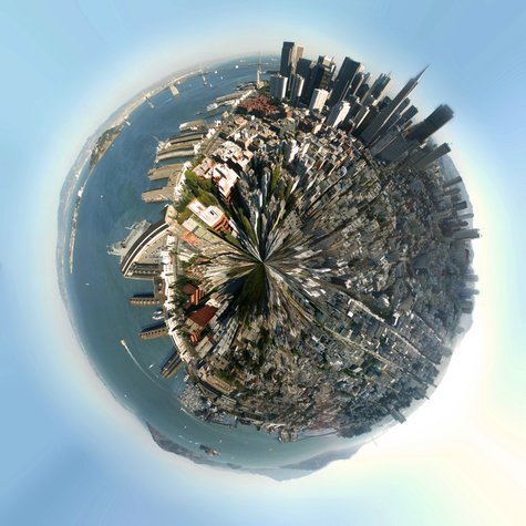
STEP 3: ROTATE AND CLEAN UP
The rest is just a little digital darkroom work: Rotate the planet to your liking, adjust the contrast and colors, clean up the sky and the edges where the left and right border of the image came together. (The clone stamp and healing brush may be handy here.) That’s it, we’re done!
October 7, 2019: Contrast Examples
Find and post to your website examples of contrast in each of the following elements:
- Color
- Size
- Type
- Texture
- Elements
October 3, 2019: Contrast
October 2, 2019: Principles of Design, Contrast
Contrast is one of the key principles within Composition and Layout. Contrast in design is an accentuation of the differences between elements in a design. Most people think of contrast only as it applies to colors, but contrast can work with any design element. Contrast is important because the meaningful essence of any thing is defined by its value, properties, or quality relative to something else. Nothing has meaning by itself.
Importance of Contrast Focus
Contrast creates focus. In the iPod advertisement below, the designer used a silhouetted character on a brightly green colored background in contrast with the iPod and earphones in white. The design creates contrast and focuses the viewers' attention on the music player.
Organization
Contrast help with organizing the information and improving the clarity of the message. Contrast helps lead the reader’s eye into and through your layout. Each component is but a piece of the overall project message and objective. With creative uses of contrast, you can influence user choices and compel specific actions.
Appeal
A main reason to use contrast in a design, whether for print or web, is to grab attention. Contrast creates an impact, but too high contrast between design elements might give an unsettled and messy impression.
Forms of Contrast
Contrast with Color
According to Colin Ware, most principles for effectively using color in design can be derived from an understanding of the red-green, yellow-blue, and black-white color channels. A phenomenon known as simultaneous contrast occurs in each of the channels. The effect of simultaneous contrast is distortion of the appearance of a patch color that increases the differences between a color and its surroundings. This is called lightness or brightness contrast when it occurs in the black-white channel, and chromatic contrast when it occurs in either the red-green or yellow-blue channel. Contrasting colors are those on opposite sides of the color wheel. The further apart and more directly opposite each other, the greater the contrast. For example, red is from the warm half of the color wheel and blue is from the cool half. Opposite colors is also referred to as complementary colors which generally refers to each of a pair of colors that are directly opposite each other on the color wheel, such as purple and yellow.
Contrast with Size
Big and small elements of the same type as seen on the figure 5, are the most obvious uses of size to create contrast. The big elephant is in contrast with a smaller creature walking beside it.The second picture below shows contrasting white space or the physical size of the piece with another element of the design as another method of contrast. The huge pyramid is in contrast with a person walking in front of the pyramid.
Contrast with Type
Type contrast can use size, value, and color to create contrasting typographic treatments. One can add bold or italics to create contrast, mix large type with small type, or combine serif with sans serif type to create type contrast. You can also set portions of text in contrasting colors or varying values. Changes in type alignment create contrast as does type spacing such as extreme kerning for headlines.
Contrast with Value
The relative lightness or darkness of two elements to each other can create a contrast in value. Whether with shades of gray or tints and shades of a single color, the further apart the values the greater the contrast.
Contrast with Other Design Elements
Contrast is one of the most powerful design concepts because any design element can be contrasted with another. Use the principle of contrast to create strong dynamic differences among elements that are different. If it is different, make it very different. You can achieve contrast through the manipulation of space, color choices, text selection, positioning, and so on. Making use of contrast can help you create a design in which one item is clearly dominant. This helps the viewer get the point of your design quickly. Every good design has a strong and clear focal point and having a clear contrast among elements helps. If all items in a design are of equal or similar weight with weak contrast and with nothing being clearly dominant, it is difficult for the viewer to know where to begin. Designs with strong contrast attract interest, and help the viewer make sense of the visual.
October 1, 2019: Principles and Elements of Design
In your own words define each of the following terms related to graphic design. Then find a graphic example of each term. Post your examples and descriptions together on your assignments page as a new post. (If you would like to make 2 posts, one for Principals of Design and one for Elements of Design that is ok.)
Principals of Design
Elements of Design
Principals of Design
- Contrast
- Repetition
- Emphasis
- Balance
- Proportion/Scale
- Harmony
- Rhythm/Movement
Elements of Design
- Line
- Shape
- Form
- Color
- Texture
- Space
- Value
September 25, 2019: Theatrical Portraits
We will be trying out this tutorial to test theatrical portrait settings.
September 23, 2019: Portrait Posing
| Portrait Posing |
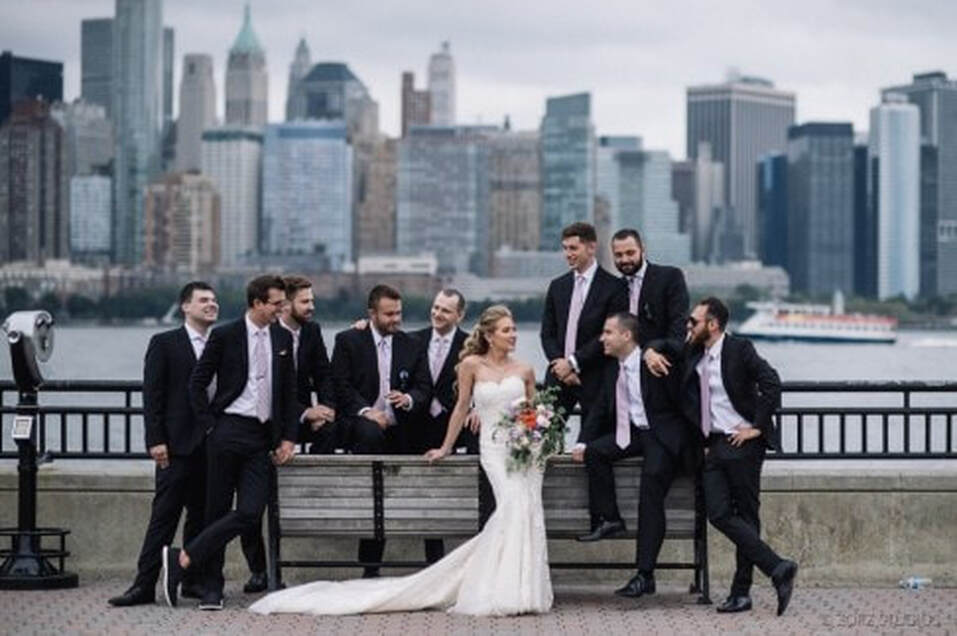
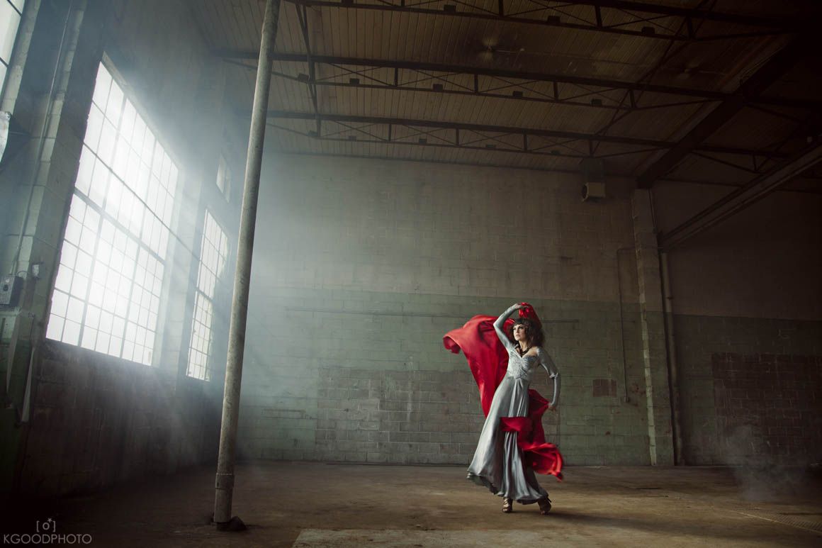
September 19, 2019: Removing Unwanted Elements
Video of photo clean up.
We will be using BOTH of the following photos.
Remove the viewfinder in the wedding photo and the pole in the warehouse photo.
We will be using BOTH of the following photos.
Remove the viewfinder in the wedding photo and the pole in the warehouse photo.
September 13, 2019
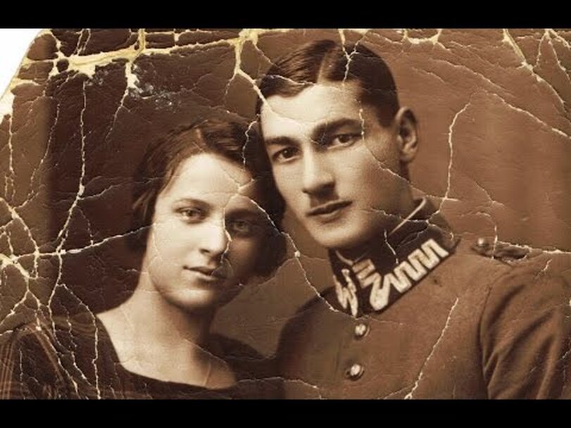
Continue your work on your photo restoration. You should have a finished piece posted to your website by the end of class today.
September 12, 2019
August 19, 2019
August 20, 2019
| 8-20-19.pdf |
