May 8, 2018: Post Test Info
Go to www.precisionexams.com/illinois/
Click Student Login
Enter your 5 digit Student ID
District: Bloomington D*&
Block 2 Test Code: PLEHDASN
Block 3 Test Code: C2NSTUNG
Click Student Login
Enter your 5 digit Student ID
District: Bloomington D*&
Block 2 Test Code: PLEHDASN
Block 3 Test Code: C2NSTUNG
April 23, 2018: School Apparel Final Project
Design a line of school spirit wear for your home high school, BACC, or the college your plan to attend after high school. Your line should include the following:
Use the clothing site ssactivewear.com to fine the piece you would create and put your design on the item you would use.
Vinyl can be found at www.signwarehouse.com/c/heat-transfer-vinyl
Final designs are due posted to your website by the end of class on May 11, 2018.
Example:
- 4 tops (t-shirt, sweatshirt, baseball tee, zip up, etc.)
- 2 bottoms (basketball shorts, running shorts, sweatpants, etc.)
- 2 accessories (hats, bags, sport accessories, etc.)
Use the clothing site ssactivewear.com to fine the piece you would create and put your design on the item you would use.
Vinyl can be found at www.signwarehouse.com/c/heat-transfer-vinyl
- Be specific in notes about what style of print you would use (eg. glitter purple, metallic gold, matte golden yellow, etc.)
- Include the price of each item for purchase.
Final designs are due posted to your website by the end of class on May 11, 2018.
Example:
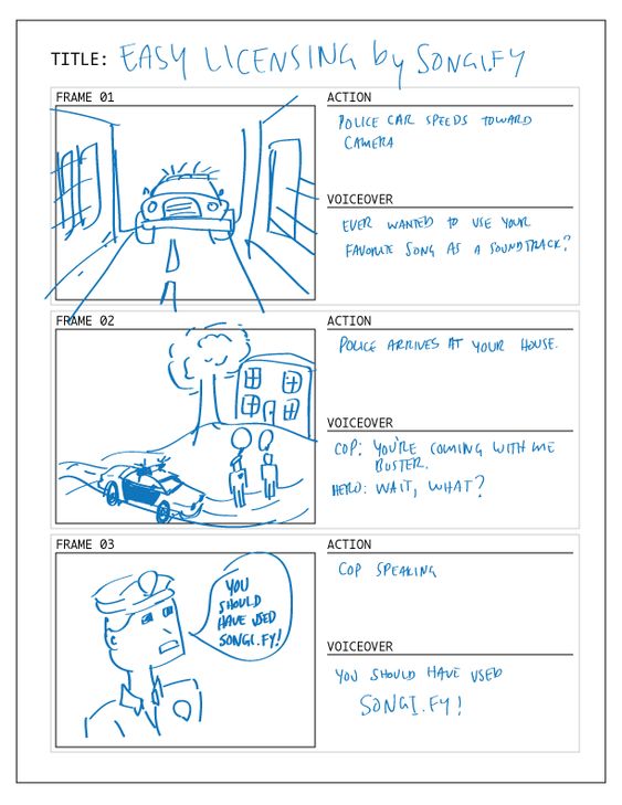
March 5 - 20, 2018: Music Video Production
Stage 1 due 3/7
- Print out of song lyrics
- Story board of concept including locations and people to be included in your video
- Full song (clean version or edited to omit inappropriate language)
- Include the video production logo for each person in your group at the beginning
- Include credits at the end of your video including credit tot the original artist and any person involved in your project (people you recruit to be in the video, everyone in your group, and any other outside sources).
| Storyboard Template |
Storyboard Examples
|
|
February 26-28, 2018: Video Production Logo
As we move through video editing we have added credit requirements to all video assignments and are now going to work on Title or Opening sequences. The first requirement for this is a production name you want to work under. Just like a business name needs a logo or sequence you will need a graphic to go along with your productions. Use the next few days to research production names and logos and then create your own original logo. This will be placed at the beginning of every video project from here on out so take your time and MAKE IT GOOD!!!
You should also use your time to complete the Student Led Conferences requirements found here.
*BOTH OF THESE ARE DUE BY THE END OF THE DAY THURSDAY*
You should also use your time to complete the Student Led Conferences requirements found here.
*BOTH OF THESE ARE DUE BY THE END OF THE DAY THURSDAY*
February 21, 2018: Creative Commons
tSeveral sites offer music published under Creative Commons’ flexible copyright licenses.
Here are some:
Can I use any song with a CC license on it?Almost — you need to make sure that what you want to do with the music is OK under the terms of the particular Creative Commons license it’s under. CC-licensed music isn’t free for all uses, only some — so make sure to check out the terms (you can find these by clicking on each song’s license icon).
Most importantly, you need to use music that is not licensed under a No Derivative Works license. This means that the musician doesn’t want you to change, transform, or make a derivative work using their music. Under CC licenses, synching the music to images amounts to transforming the music, so you can’t legally use a song under a CC No Derivative Works license in your video.
Also, make sure to properly credit the musician and the track, as well as express the CC license the track is under. For example, you might include text like this at the end of your video:
"This video features the song “Desaprendere (Treatment)” by fourstones,
available under a Creative Commons Attribution-Noncommercial license."
Here are some:
- ccMixter
- Free Music Archive
- Jamendo
- Magnatune
- Simuze
- BeatPick
- CASH Music
- SectionZ
- Opsound
- Podsafe Audio
- AudioFarm
- Internet Archive’s Netlabels Collection
Can I use any song with a CC license on it?Almost — you need to make sure that what you want to do with the music is OK under the terms of the particular Creative Commons license it’s under. CC-licensed music isn’t free for all uses, only some — so make sure to check out the terms (you can find these by clicking on each song’s license icon).
Most importantly, you need to use music that is not licensed under a No Derivative Works license. This means that the musician doesn’t want you to change, transform, or make a derivative work using their music. Under CC licenses, synching the music to images amounts to transforming the music, so you can’t legally use a song under a CC No Derivative Works license in your video.
Also, make sure to properly credit the musician and the track, as well as express the CC license the track is under. For example, you might include text like this at the end of your video:
"This video features the song “Desaprendere (Treatment)” by fourstones,
available under a Creative Commons Attribution-Noncommercial license."
Feeling Through Sound Video
Examples:
Requirements:
Requirements:
- Find a short video or trailer on YouTube. (15-30 seconds)
- Select a piece of music that has a different “feel” and replace the audio of the clip.
- Adjust the music so that it matches the clip and changes the theme or feel of the clip.
- Add credits to the end of your clip giving credit to the video and music owner as well as yourself for editing.
February 6, 2018: Final Cut Pro X
Create a 20 second piece including the following:
- 1 transition
- 1 text piece
- 1 sound effect
- 1 video effect
February 5, 2018: Final Cut Pro X
February 2, 2018: Business Project Feedback
The following should be answered in a new post on your website:
- What is your business?
- Who is your target audience?
- Why did you choose the color scheme you did?
- What logos did you brainstorm?
- Why did you choose the one you did?
- When might you use your business cards?
- What do you want people to be able to do in your app?
January 24, 2018 App Icon Practice

|
|

|

|
|
|
|
|
|
|
January 10, 2018: Business Project - Logo
Visit this page for all the information on each section of the business project. Remember, today we are beginning with just the logo.
January 9, 2018:
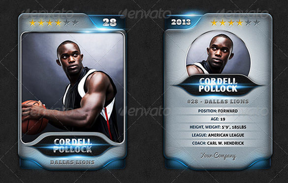
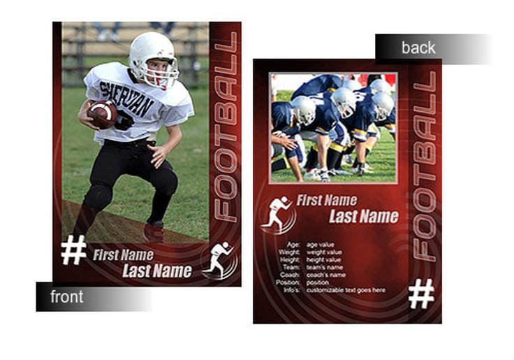
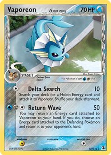
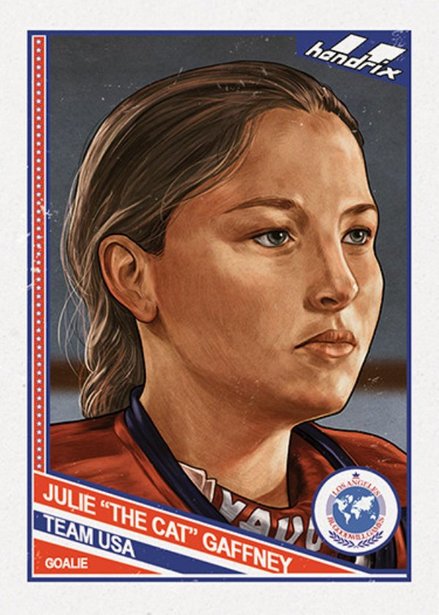
January 8, 2018: Trading Card
Cards must include:
- Dimensions 2.25" x 3.5" (1 file with 6 fronts and 1 file with 6 backs)
- Name (title if applicable)
- 4 distinguishing pieces of information ( this could be a logo or information about the person like height or sport stats)
|
|
December 6, 2017: Ugly Holiday Sweater Examples
November 27, 2017: Animated Character
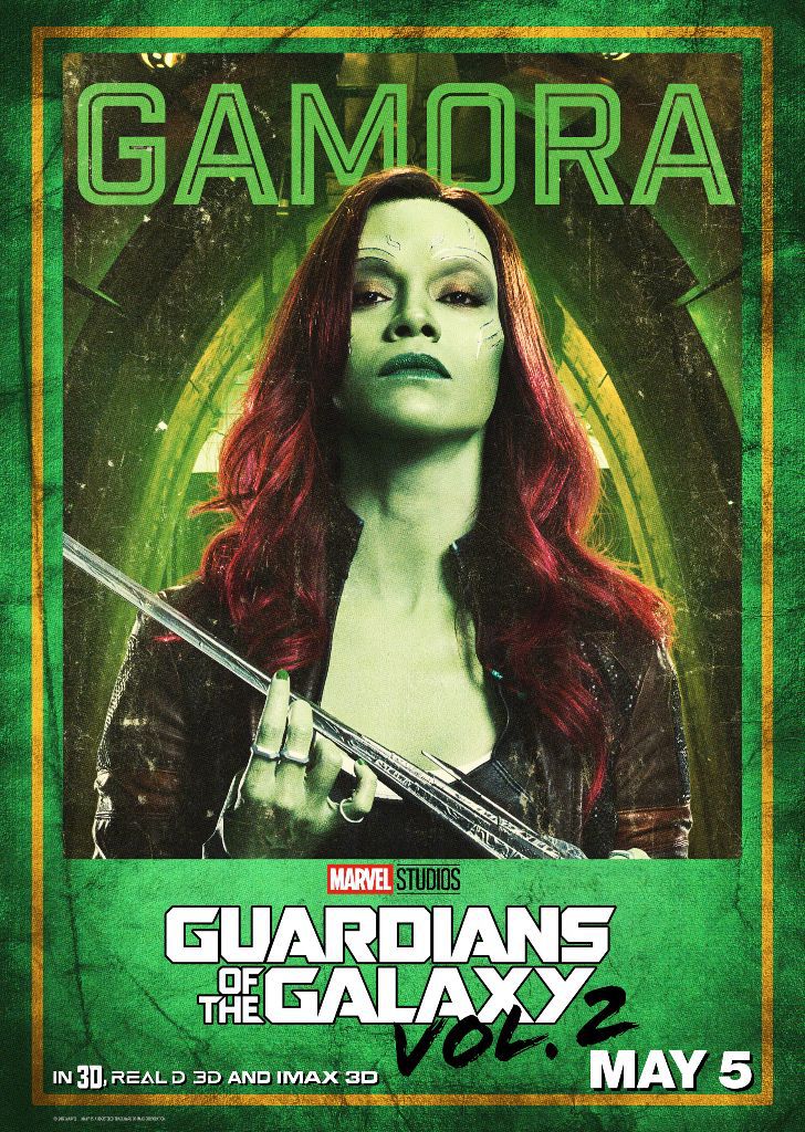
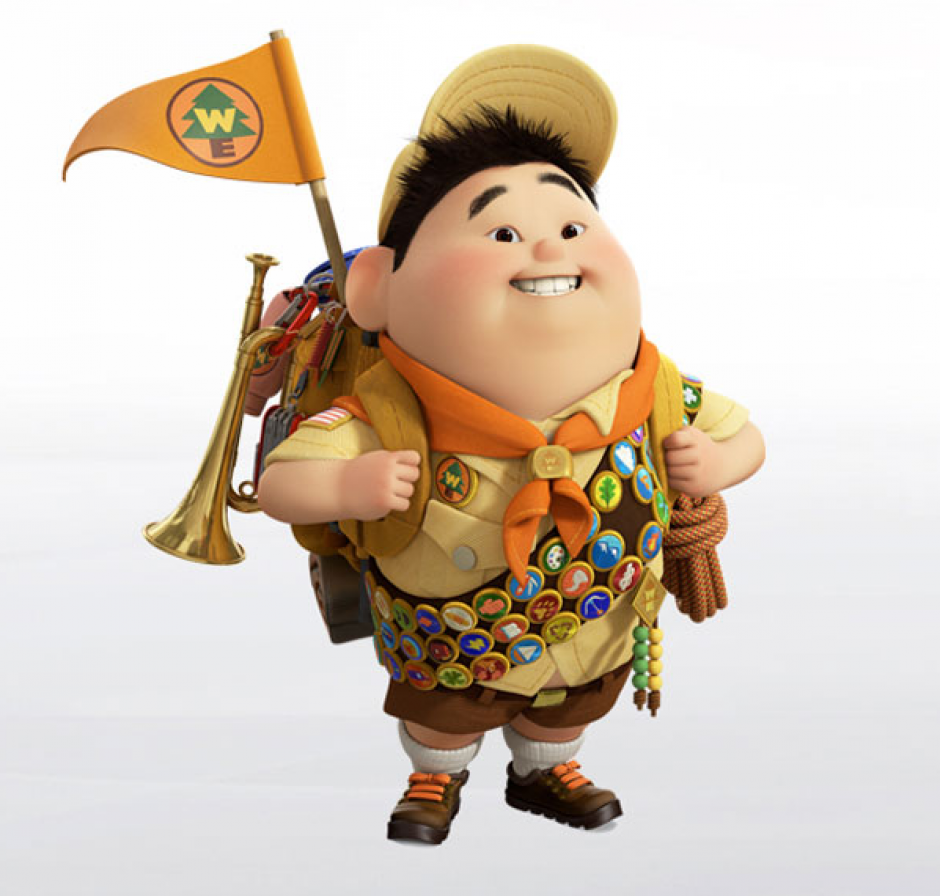
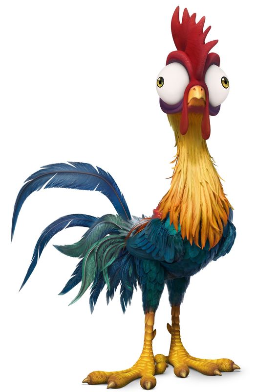
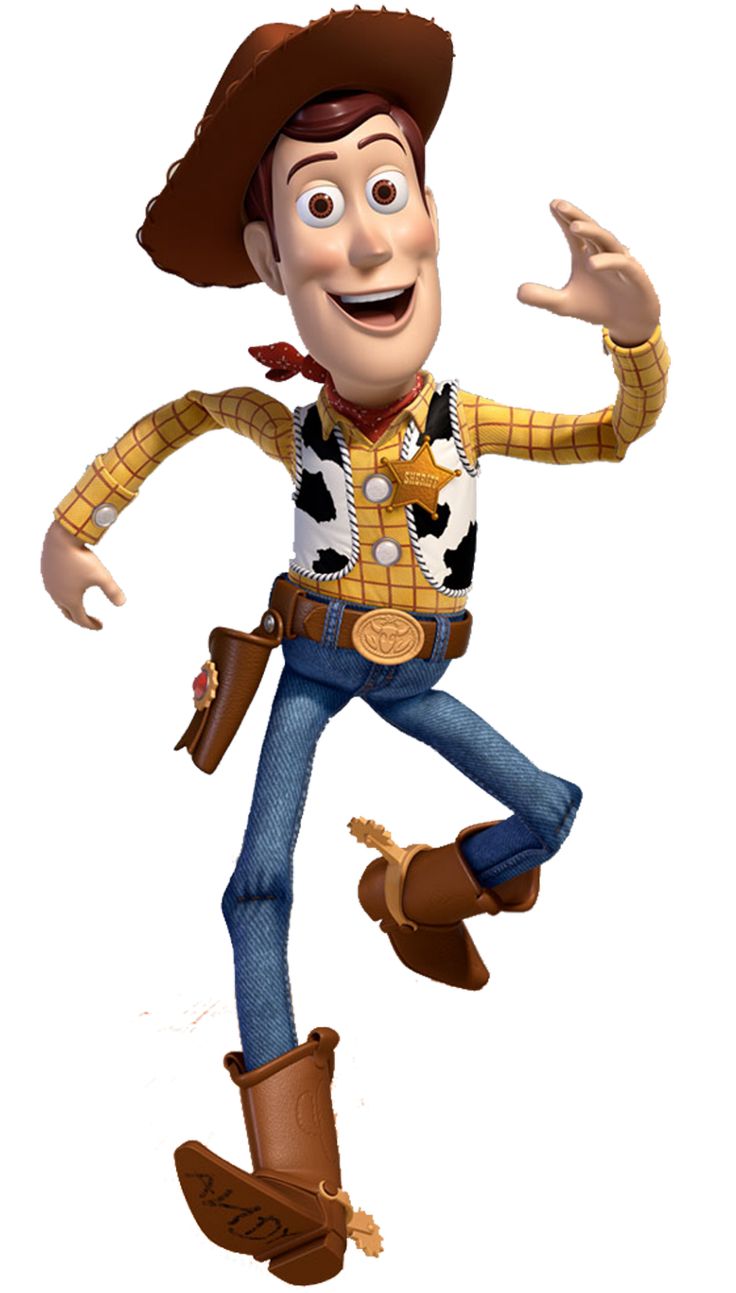
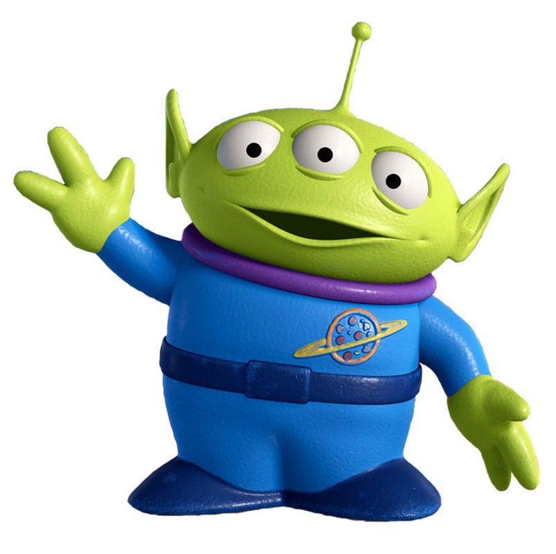
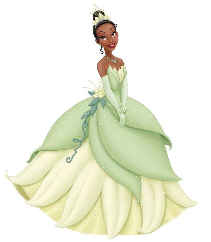
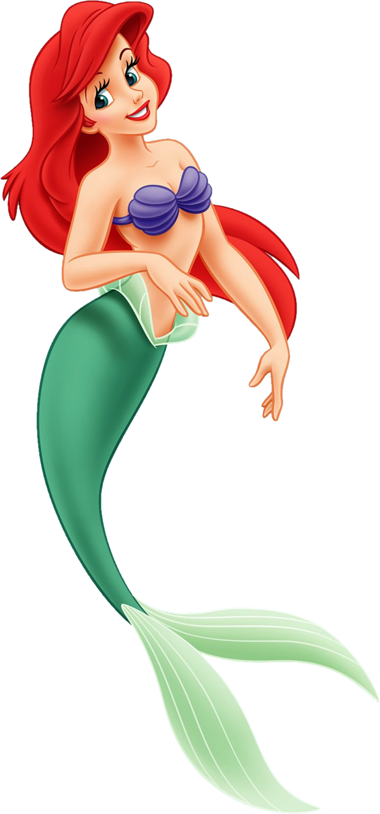
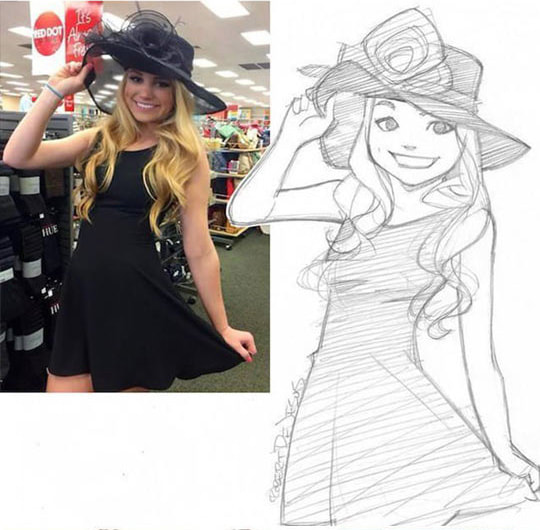
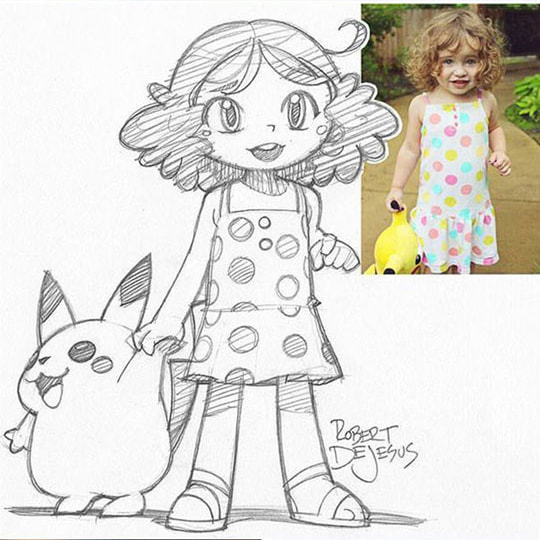
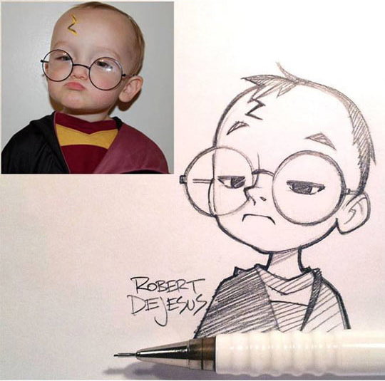
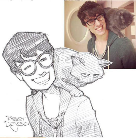
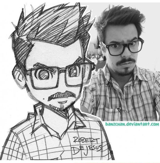
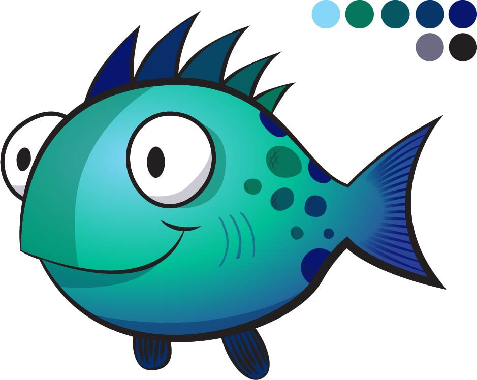
Choose any Pixar, Dreamworks, Disney, etc. character to illustrate. Do not choose a "flat" character but rather one with depth (shadows/highlights). Your character should also be a full body character (head to foot or fin whatever the case may be). Your character should be done on an 18" x 24" artboard and should include a background or scene that is appropriate to that character.
Examples of Acceptable Characters:
Examples of Acceptable Characters:
November 17, 2017
November 14, 2017: Animated Character
This character should have shadows, highlights, and be fully colored.
November 13, 2017: Layer and Color Practice
November 9, 2017: Rotation and Reflection
November 8, 2017: White Space
November 7, 2017: Colorizing B&W Sketches
|
|
November 6, 2017: Blend Tool
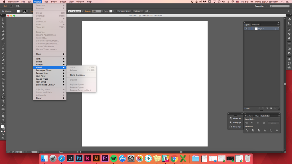
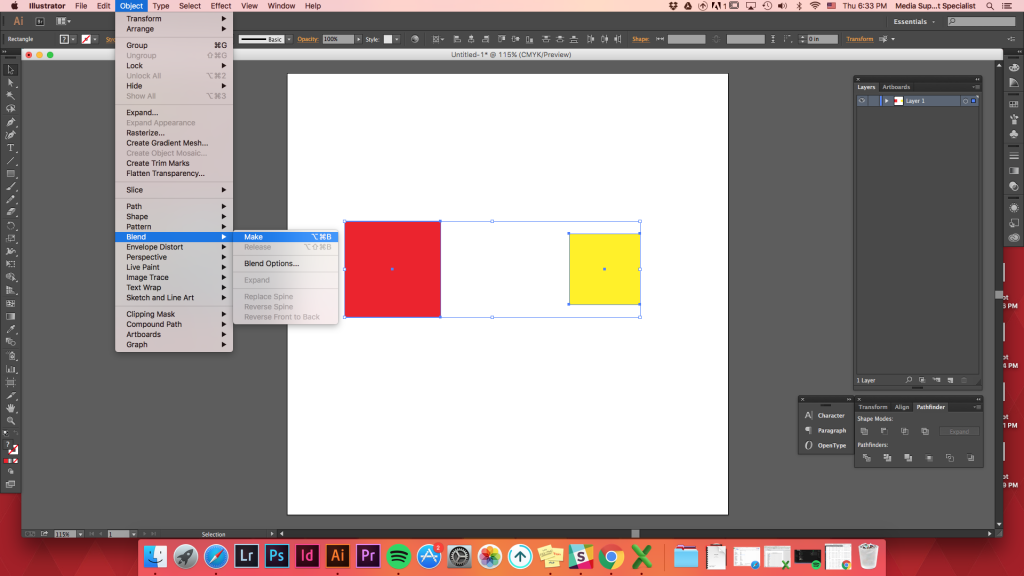
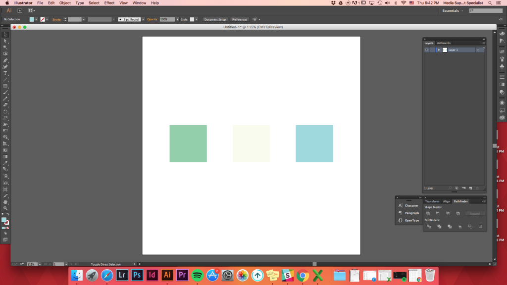
Selecting the Blend ToolThere are three ways to select the blend tool.
- Keyboard Shortcut for Blend Tool: W
- Object->Blend->Make
- Click on Blend Tool on the tools palette. (It looks like a circle with a square tucked behind it.)
Blending Various Shapes
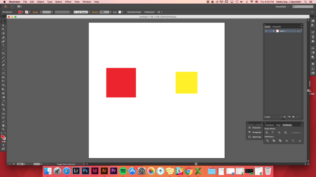
Blending 2 shapesY
ou can make 2 shapes blend together regardless of size and shapes.
Make any two shapes -> select both shapes -> Object -> Blend -> Make
To make it easier and faster, use the keyboard shortcut: W. Holding down Option (or alt) and clicking on a shape will bring up a Blend Options. Click on one shape and then click on another one. When trying to click the second shape, the mouse cursor will turn into a Blend Tool with a plus sign (+).

Using Keyboard Shortcut (w)
Blending Multiple Shapes
Blending multiple shapes is as easy as blending just two shapes.
Create multiple shapes (quick tip: create one shape and hold option key and move the shape. Command D can duplicate your action to create multiple shapes quick!) -> lay them out -> select Blend Tool (short cut: w) -> click on the top left circle -> click in the circle below it -> click on the second left circle on top -> repeat
Blend Tool will remain active unless you choose another tool (so anything else you click will be included in the blend.)
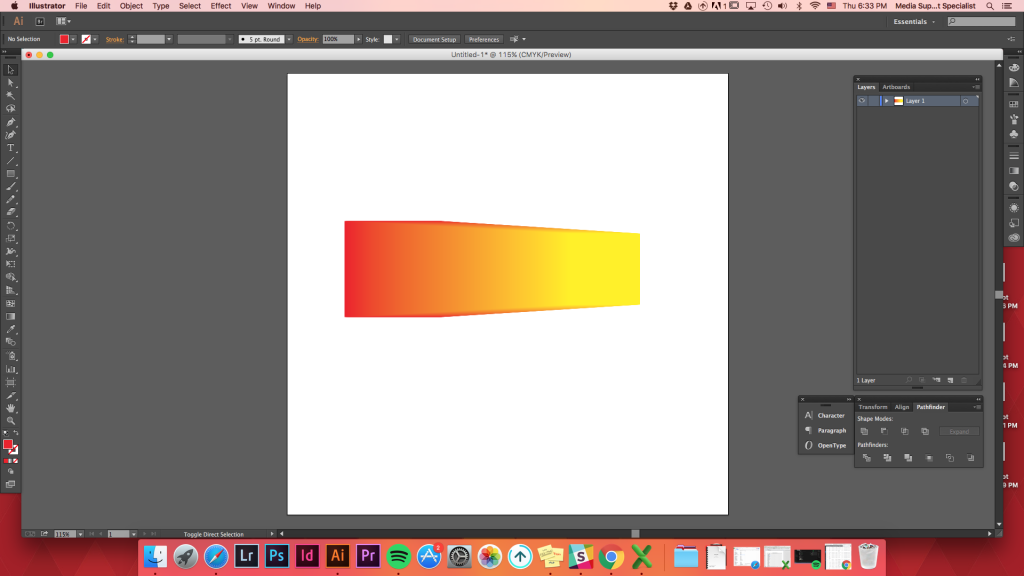
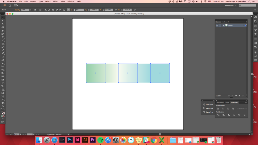
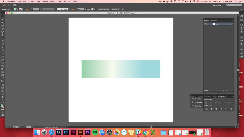
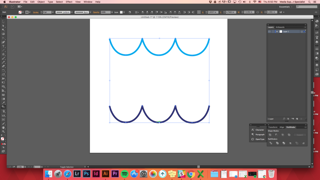
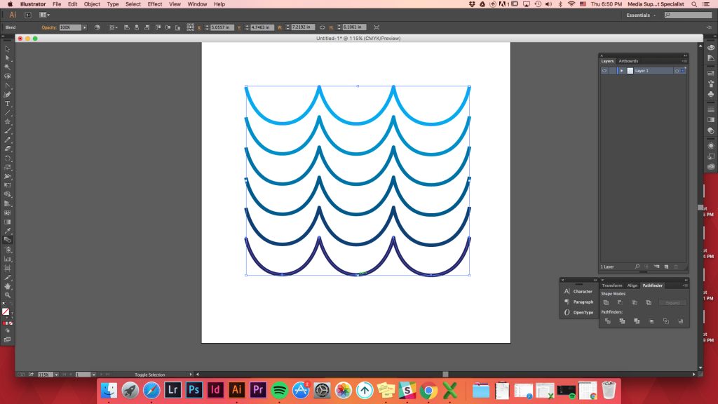
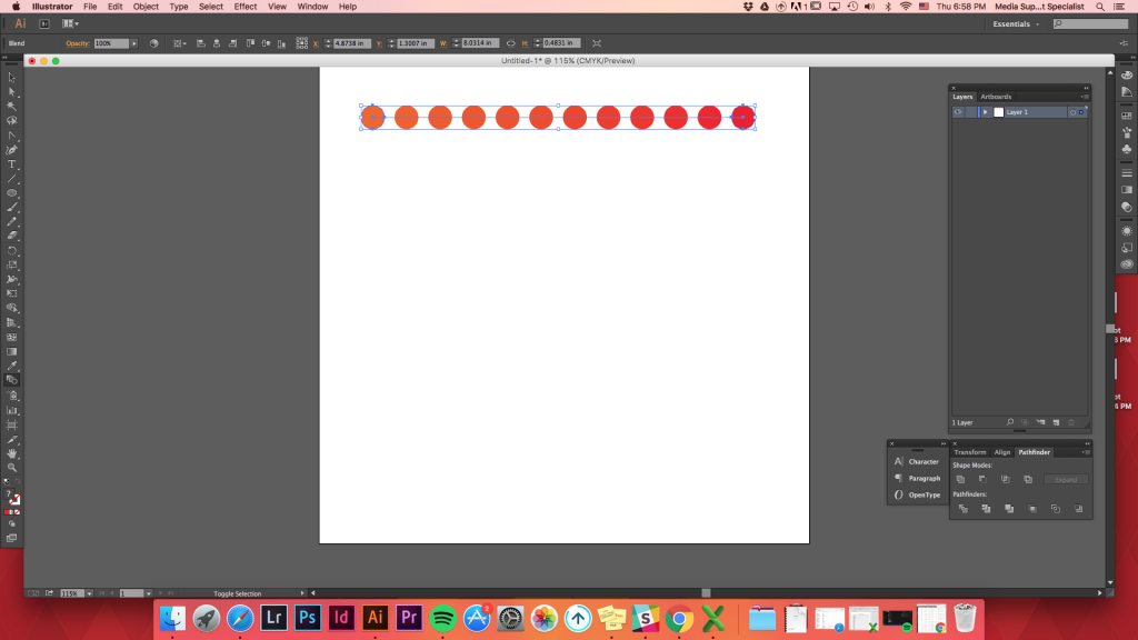
Blending 3 shapes
Blending 3 shapes that are in a row can create a beautiful gradient of colors transitioning between multiple shapes.
Create 3 shapes of different colors -> align them -> blend tool -> click on the first shape -> click on the second shape -> click on the third shape
Depending on which shape you click first/ what order you click, colors being blended will change.
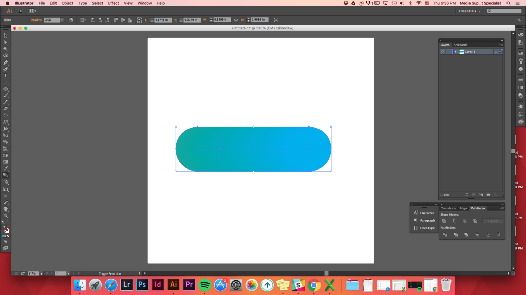
Blending a shape within a shape
Using the blend tool to transition between several colors, shapes can create an illusion of depth.
You can also use this tool to make a shape look 3D depending on where you locate another shape on top of the other.
Create any shape -> create another shape on top of the first one -> blend tool -> click on the top shape -> click on the background shape


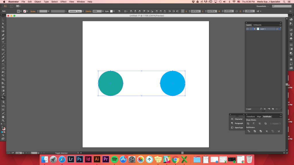
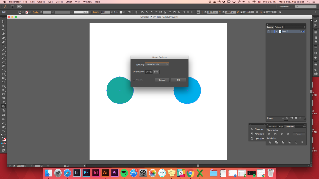
Blending Options
When clicking on the Blend Options (Objects -> Blend -> Blend Options), there will be different options to blend the shapes.
Smooth Color: Illustrator automatically calculates the number of steps for the blends.
Specified Steps: Controls the number of steps between the start and end of the blend.
Specified Distance: Controls the distance between the steps in the blend.
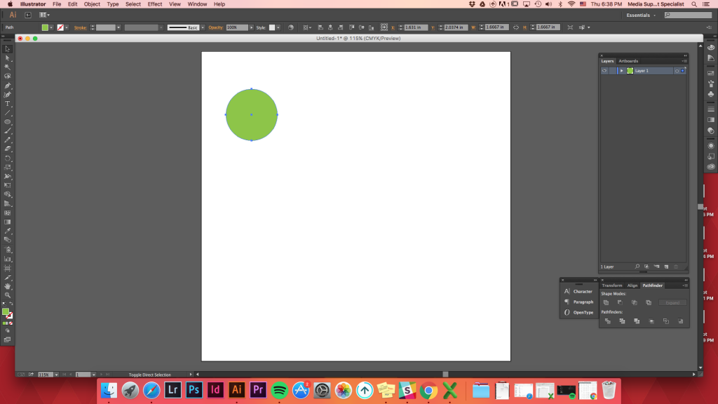
Make two shapes (does not have to be filled/lines are okay) -> separate them from one another -> blend (w)
Just trying to blend two shapes without controlling the Blend Options, will result the blend to be like this.
When clicking on the Blend Options (Objects -> Blend -> Blend Options), there will be different options to blend the shapes.
Smooth Color: Illustrator automatically calculates the number of steps for the blends.
Specified Steps: Controls the number of steps between the start and end of the blend.
Specified Distance: Controls the distance between the steps in the blend.
Make two shapes (does not have to be filled/lines are okay) -> separate them from one another -> blend (w)
Just trying to blend two shapes without controlling the Blend Options, will result the blend to be like this.

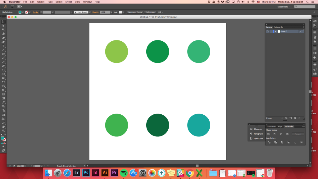
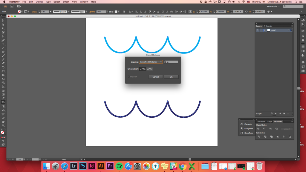
We want to distribute shapes evenly between two shapes.
Objects-> Blend -> Blend Options -> Specified Distance -> set it as 1 inch -> Ok
or use keyboard shortcut
blend (w) -> hold down Option key (or alt) -> click on one of the shape -> Specified Distance -> set it as 1inch -> Ok
Objects-> Blend -> Blend Options -> Specified Distance -> set it as 1 inch -> Ok
or use keyboard shortcut
blend (w) -> hold down Option key (or alt) -> click on one of the shape -> Specified Distance -> set it as 1inch -> Ok
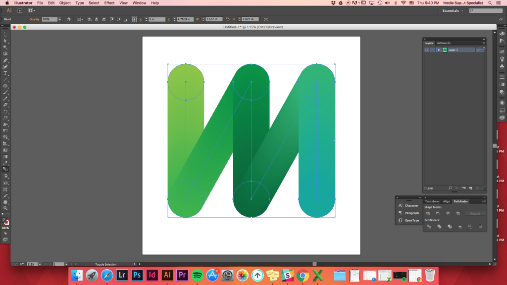
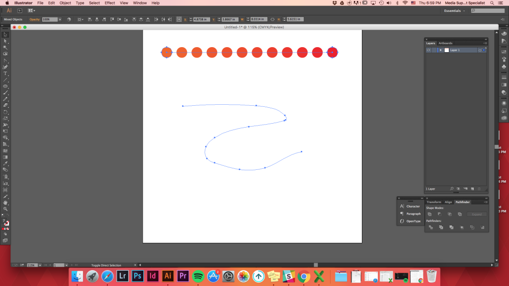
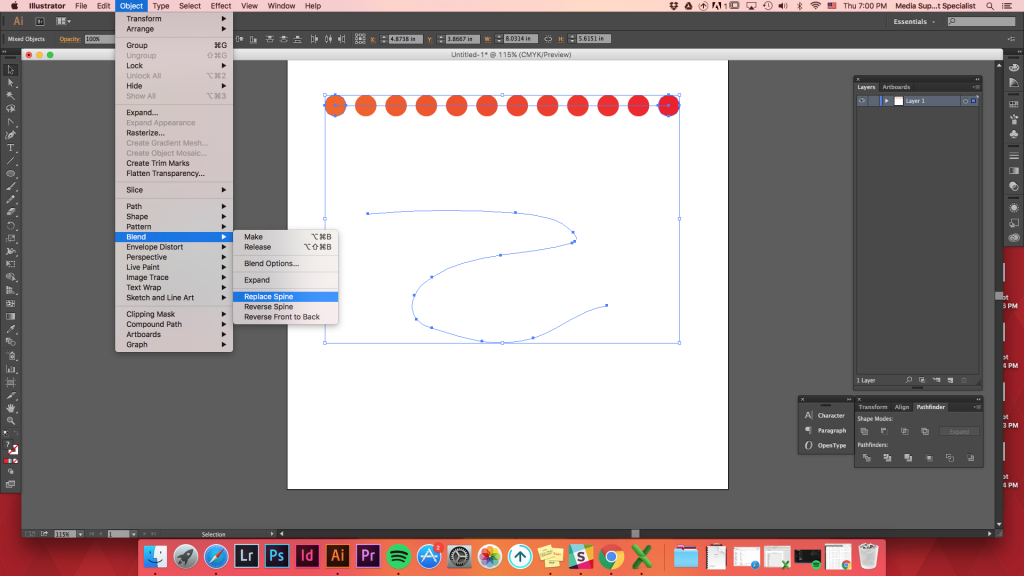
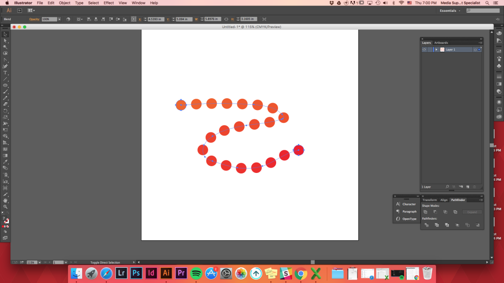
Replace Spine Option
After creating any blend, you can change the path it went along to blend.
Create any path you want -> select both the path and the blended shapes -> Option -> Blend -> Replace Spine (before clicking Blend Options, it is under Expand)
After creating any blend, you can change the path it went along to blend.
Create any path you want -> select both the path and the blended shapes -> Option -> Blend -> Replace Spine (before clicking Blend Options, it is under Expand)

Follow this link to build upon the blend tool and see how to make seamless patterns in Illustrator.
October 31, 2017: Illustrator Intro Paths vs. Shapes

October 30, 2017: Illustrator Intro
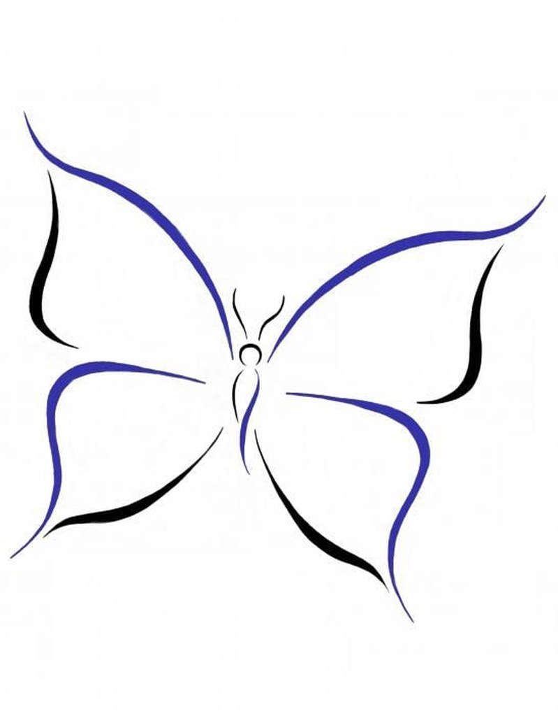
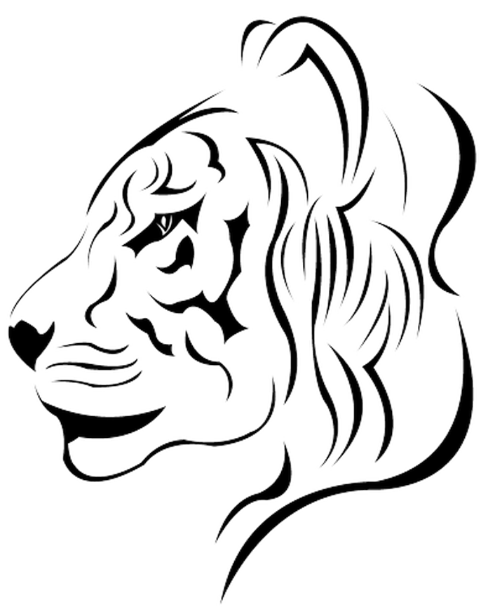
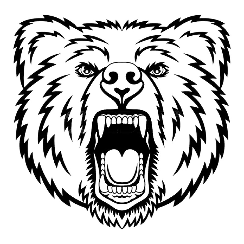
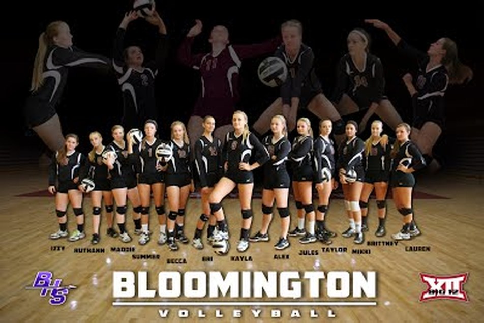
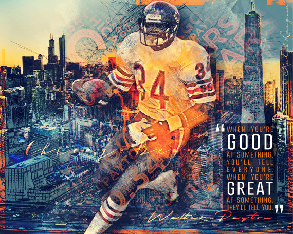
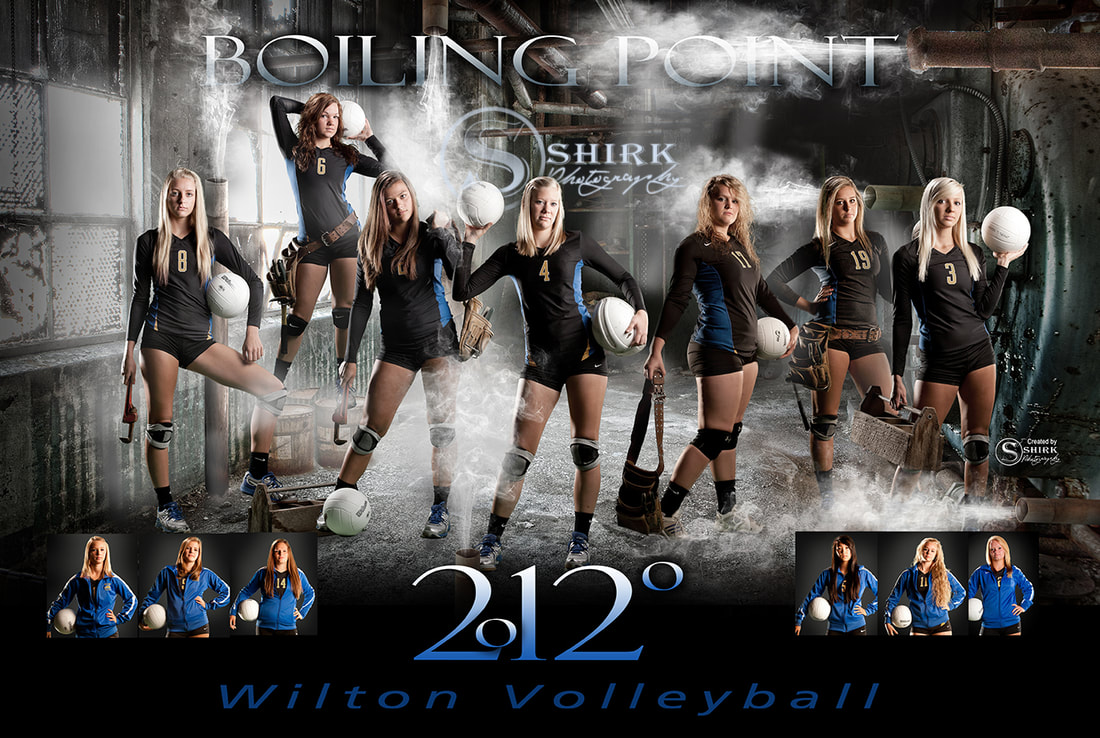
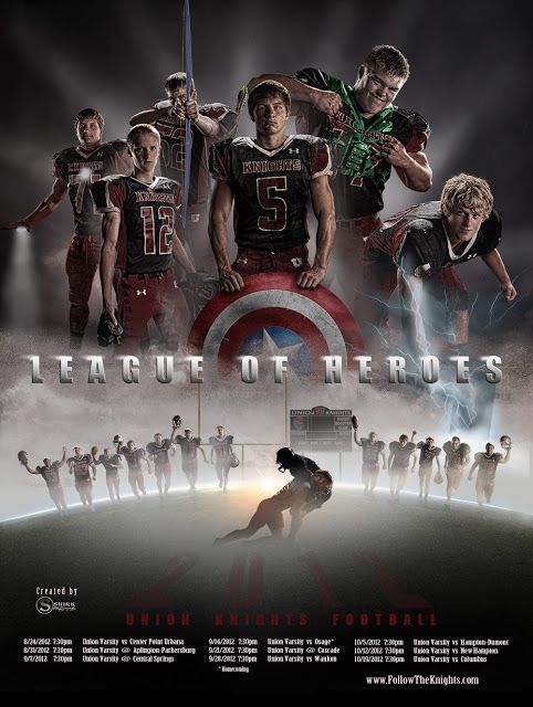
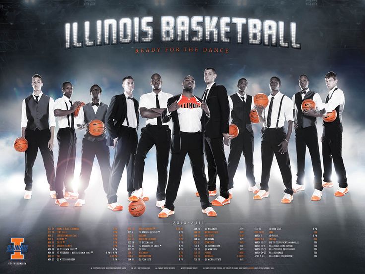
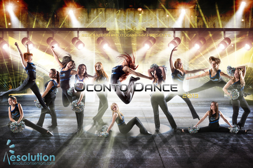
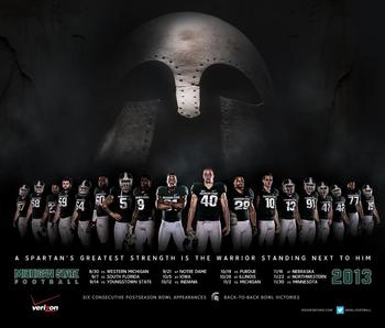
October 16 - 26, 2017: Sport/Club Poster
|
|
Create a poster featuring a sport/club team. Use your Photoshop skills to make the poster interesting, attractive and a poster the team would be proud to use. Consider the design rules when laying out the poster.
REMEMBER DIMENSIONS: 18" x 24" with resolution of 300
REMEMBER DIMENSIONS: 18" x 24" with resolution of 300
| sports_poster_1.xlsx |
October 13, 2017: Elements of Design
Line
Shapes
Value
Mass
Space
Texture
Color
Shapes
Value
Mass
Space
Texture
Color
Now you are going to take each element and build an example of each. They can be simple or complex but need to fully meet that element.
October 10, 2017: Pixel Disintegration
Let's try this again. All the files needed are below as well as the link.
REMEMBER: If instructions indicate the use of the Control key that is for Windows operating systems. We substitute the Command key in its place.
Disintegration Effect
REMEMBER: If instructions indicate the use of the Control key that is for Windows operating systems. We substitute the Command key in its place.
Disintegration Effect
| particle_brush_2.abr |
October 4, 2017: Package Design
The following must be included on your label
- Play Dough logo (you can change the color scheme to fit your design)
- Do not eat warning
- Care instructions: "Always put compound back in container after play. Store in a cool place. If necessary, water may be added one drop at a time to restore softness."
October 2, 2017: Project of Choice
Skull Face Source Files
| terminator_robot.jpg |
| skull_hd_widescreen_wallpapers_1680x1050.jpeg |
| 51a47f71b25be39619.jpg |
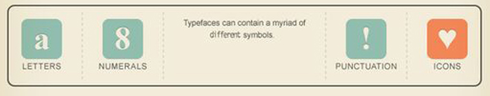
September 27, 2017: Creating Your Type
Everyone will create TWO typefaces. One will be a script style of your handwriting and the other will be a display font of anything you would like. (This could be a wingdings style or a stylized version of your handwriting.) You will need to use the attached file to create each set and then upload it into www.calligraphr.com
| calligraphr-template.pdf |
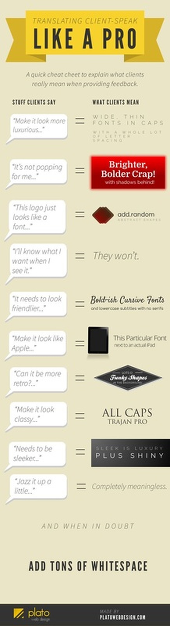
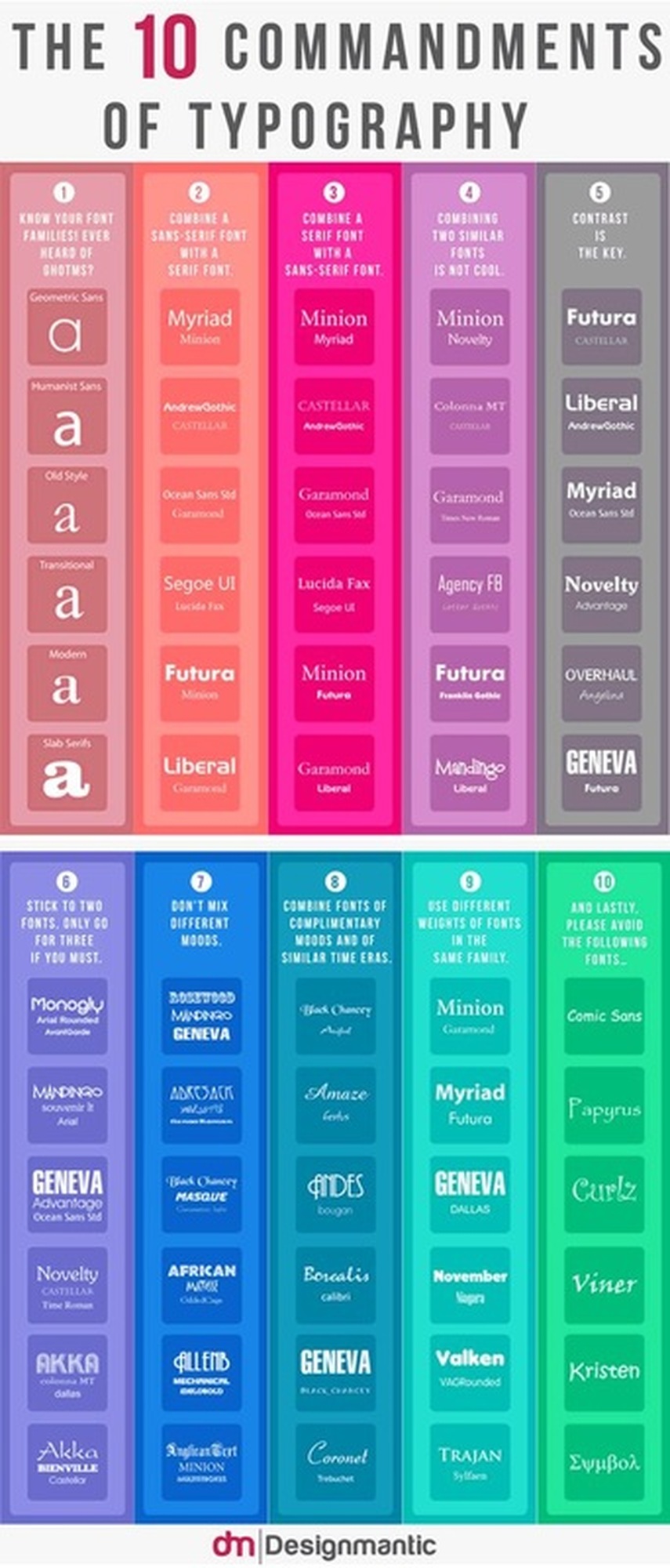
September 26, 2017: Type
|
A small look into customizing type for clients.
|
|
September 22, 2017: Color Correction and Manipulation
|

|
September 19, 2017: Color
Today you will be illustrating the feeling of a color following this tutorial. First, visit paletton.com and choose your monochromatic color scheme. Save the color codes so that you can refer back to them as you work. Then choose the word describing that color that you will illustrate (HINT: don't choose an enormously long word 5-7 letters is best) Then begin the tutorial replacing the colors used with the colors in your scheme.
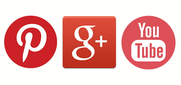
Red
Examples of red app icons: Pinterest, Google+, YouTube
Evokes: “Action, adventure, fire, lust, anger, courage and rebellion.”
Examples of red app icons: Pinterest, Google+, YouTube
Evokes: “Action, adventure, fire, lust, anger, courage and rebellion.”
- Red is best used for action orientated products and brands.
- Red and orange are colors that boost appetite.
- Red is one of the top two favorite colors of all people.
- Red is the most popular color used on flags in the world.
- Approximately 77% of all flags include red.
- Red is the international color for stop.
Orange
Examples of orange app icons: Blogger, RSS feed, MozillaFirefox
Evokes: “Energy, vitality, cheer, excitement, adventure, warmth, and good health.”
Examples of orange app icons: Blogger, RSS feed, MozillaFirefox
Evokes: “Energy, vitality, cheer, excitement, adventure, warmth, and good health.”
- Orange is a color that suggests value and discounts.
- Orange is symbolic of autumn.
- Children all over the world are drawn to orange.
- Orange is the color of life rafts, hazard cones, and high visibility police vests.

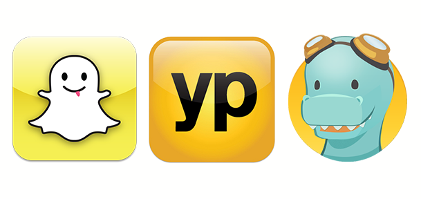
Yellow
Examples of yellow app icons: SnapChat, YellowPages, TimeHop
Evokes: “Happiness, optimism, enlightenment, creativity, sunshine, warmth, cheeriness and fun.”
Examples of yellow app icons: SnapChat, YellowPages, TimeHop
Evokes: “Happiness, optimism, enlightenment, creativity, sunshine, warmth, cheeriness and fun.”
- Yellow is the color that captures our attention more than any other.
- In almost every culture, yellow represents, sunshine, happiness and warmth.
- Yellow is the color most often associated with the deity in many religions.
- Yellow is the color of traffic lights and signs indicating caution all over the world.
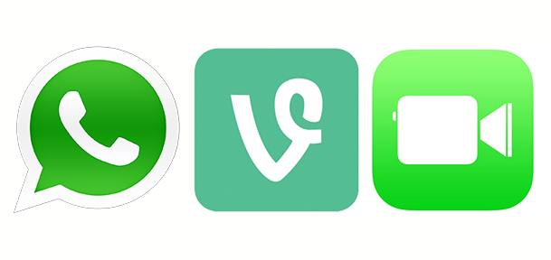
Green
Examples of green app icons: WhatsApp, Vine, Facetime
Evokes: “Growth, rebirth, freshness, revitalisation, and fertility.”
Examples of green app icons: WhatsApp, Vine, Facetime
Evokes: “Growth, rebirth, freshness, revitalisation, and fertility.”
- Green is now the symbol of ecology and has become a verb.
- Green is universally associated with nature.
- Green symbolizes ecology and the environment.
- Green traffic lights symbolize “go” all over the world.
Blue
Examples of blue app icons: Facebook, Twitter, LinkedIn
Evokes: “Dignity, intelligence, cleanliness, peace, security and calmness of mind.”
Examples of blue app icons: Facebook, Twitter, LinkedIn
Evokes: “Dignity, intelligence, cleanliness, peace, security and calmness of mind.”
- Blue is the #1 favorite color of all people.
- However, blue can be over-used. Combining blue with another color creates a more creative effect.
- 53% of the flags in the world contain blue.
- Blue is the most commonly used color in corporate identity.

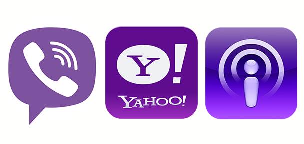
Purple
Examples of purple app icons: Viber, Yahoo!, Podcast
Evokes: “Nobility, wealth, magic, mystery, spirituality, creativity, dignity, and royalty.”
Examples of purple app icons: Viber, Yahoo!, Podcast
Evokes: “Nobility, wealth, magic, mystery, spirituality, creativity, dignity, and royalty.”
- There’s a huge difference of opinion about purple. It all depends on age.
- Purple tends to be a color that people either love or hate.
- Purple is the color of mourning or death in many cultures.
- Purple is not common flag color. Only two flags contain purple.
| color.jpg |
| onelily-colormatters.jpg |
September 18, 2017: Color Theory
Today we will be addressing terms associated with color theory and principles. Once we have gone over what we know as a class, we will be taking a term, and creating something in photoshop to represent the term. Here are a list of key terms that we will be using:
Accent color
Achromatic color
Additive color
Analogous color
Bezold effect
Chroma
Color harmony
Color interaction
Color key
Color overtone
Color theory
Complementary
Composition
Hue
Intensity
Monochromatic
Opponent theory
Primary colors
Saturation
Secondary color
Shade
Simultaneous contrast
Split complementary
Subtractive color
Temperature
Tertiary colors
Tint
Tone
Value
|
Block 2
Rowan: Accent color and Tint Adrianna: Chromatic color and Value Ryan: Additive color and Subtractive color Olivia: Analogous color and Monochromatic color Amelia: Color harmony and Simultaneous contrast Xzaion: Secondary color and Shade Walter: Color key and Chroma Isabel: Bezold effect and Opponent theory Zara: Hue and Saturation Johnnie: Complementary color and Split complementary |
Block 3
Kaylee: Hue and Saturation Victoria: Shade and Secondary Colors April: Color theory and Color Key Blake: Accent color and Achromatic color Jon: Bezold effect and Additive color Hadley: Color harmony and Color overtone Sarah: Monochromatic and Composition Michal: Tone and Tint Dani: Chroma and Complimentary colors Qunicy: Split complimentary and Tertiary colors |
Heartland Dual Credit Application Process
You must have a completed application before September 15th. If you do not have your SSN to do the application with us in class you will need to follow these directions to do so from home. You should receive a conformation email once you have submitted your application.
September 12, 2017: Concert Poster
| concert_poster_rubric.docx |
Final Designs should be 18" x 24" and 300dpi
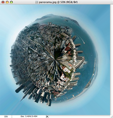
September 7, 2017: My Own Little World
You will be creating your own galaxy today. We will create the first together and then you will find 7 photos that follow a theme (ex. all cities at night, all major cities around the world, all seasons of the same place...) to create your galaxy.
STEP 1: RESIZE AND ROTATE
The first thing we need to do is prepare the image for the Polar filter. We do this by stretching the height of the image so that the image is a perfect square.
Select Image>Image Size from the menus. Uncheck ‘Constrain Proporties’ and set the “height” to the same value as your “width”. Next, rotate the image 180 degrees. (Image>Rotate Canvas>180)
You should end up with something like this:
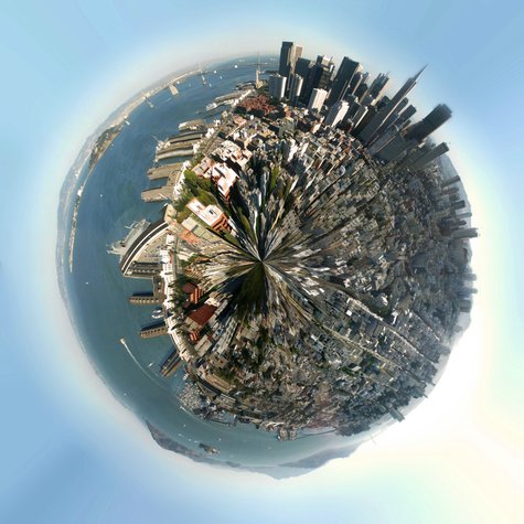
STEP 2: APPLY THE POLAR FILTER
Next, we’ll apply the Polar Filter to wrap our image into a sphere.
Choose Filter > Distort > Polar Coordinates from the menus and in the resulting dialog box, select the “Rectangular to Polar” setting.
(If you’re using The Gimp the command is Filters > Distorts > Polar Coords.)
Next, we’ll apply the Polar Filter to wrap our image into a sphere.
Choose Filter > Distort > Polar Coordinates from the menus and in the resulting dialog box, select the “Rectangular to Polar” setting.
(If you’re using The Gimp the command is Filters > Distorts > Polar Coords.)
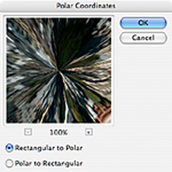
As you can see we’re 90% of the way there!:
Easy cheesy, right? Now for some finishing touches…
STEP 3: ROTATE AND CLEAN UP
The rest is just a little digital darkroom work: Rotate the planet to your liking, adjust the contrast and colors, clean up the sky and the edges where the left and right border of the image came together. (The clone stamp and healing brush may be handy here.) That’s it, we’re done!
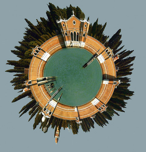
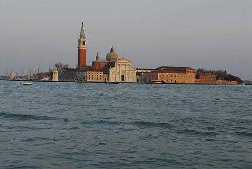
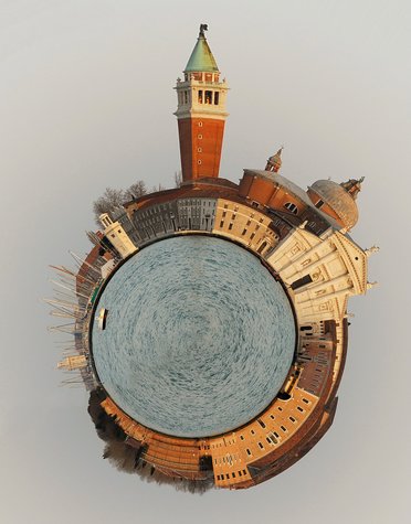
MORE ADVANCED: PLANET VENICE
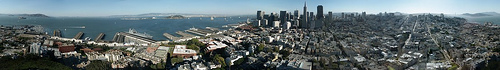
Planets work best when created using panoramas, but for this second example we’ll use the following landscape photo of San Girgio Maggiore Island in Venice. Islands are especially well-suited for planetization because the left and right edges of the images are easy to match up–you only have to make sure the horizon is level.
Planets work best when created using panoramas, but for this second example we’ll use the following landscape photo of San Girgio Maggiore Island in Venice. Islands are especially well-suited for planetization because the left and right edges of the images are easy to match up–you only have to make sure the horizon is level.
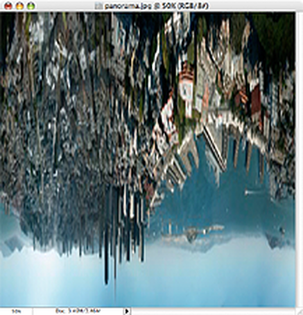
CROP AND STRAIGHTEN
Because we’re not starting with a 360 degree panorama, we’ll need to do some extra work before we can follow the steps above.
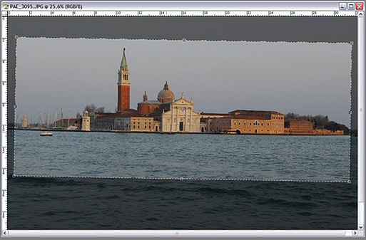
First we’ve gotta crop and straighten the image to make the horizon absolutely horizontal. Using the cropping tool of PhotoShop we can do both in one step:
First, we must ensure that our crop selection is parallel to the horizon. Choose the crop tool and select a flat rectangular area of the photo. Move the cursor just outside of an edge of the selected area so that the cursor changes to two arrows pointing left and up. Click the mouse button and you can rotate the cropped area.
By moving the top border of your selection to the horizon of the photo you can inspect the rotation closely. Move and rotate the crop selection until the top border and your horizon are parallel, but don’t crop your photo yet.
Because we’re not starting with a 360 degree panorama, we’ll need to do some extra work before we can follow the steps above.
First we’ve gotta crop and straighten the image to make the horizon absolutely horizontal. Using the cropping tool of PhotoShop we can do both in one step:
First, we must ensure that our crop selection is parallel to the horizon. Choose the crop tool and select a flat rectangular area of the photo. Move the cursor just outside of an edge of the selected area so that the cursor changes to two arrows pointing left and up. Click the mouse button and you can rotate the cropped area.
By moving the top border of your selection to the horizon of the photo you can inspect the rotation closely. Move and rotate the crop selection until the top border and your horizon are parallel, but don’t crop your photo yet.
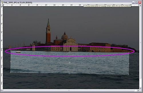
Now we want to make sure the left and the right borders of the image fit together. Look for areas on the right and the left where the buildings have the same height:
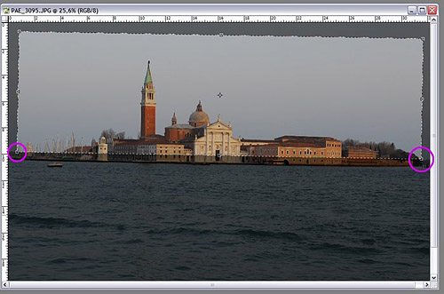
Move the right and left borders of your selection so that the edges will match up. Finally, adjust the top and bottom of your selection so your waterline is roughly in the middle of the cropped photo:
Double-click your image to commit the crop and you’re ready for the transformation! Just follow steps 1-3 as in the example above.
Here’s the final result:
Here’s the final result:
More Samples:


August 31, 2017: Me Poster
Your poster must be 11in x 17in size and include ALL of the following:
- Picture of You (Recent but not necessarily taken in this class, it can be a senior picture or one you already have from an event or place you want to remember.)
- Your name in a new font (Big enough to read, don't hide it!)
- Brush of some kind
- Background of some kind (This can be a photo or graphic of some kind or something you paint/draw in the background)
August 30, 2017: Principals of Design - Alignment
Alignment is one of those obvious design concepts that hardly seem worth making a big deal about. It is something you see and use every day. There are, however, many more opportunities to use this system for organizing materials than are obvious without a thorough understanding of the principles involved.
Items can line up either along their edges or on their centers. Alignment is used extensively to organize all graphic arts. Almost all text uses alignment to organize lines of type. The letters align along their bases and the lines begin (and/or end) along a line. You probably discovered the importance of this in the last project.
Alignment works best with items that have straight edges, especially rectangles. Rectangles are the most economical shapes to trim pictures into so pictures are most often seen in that format. Text is made of letters of varying shapes that form lines and blocks that act as rectangles. Most formats are also rectangles.
There are two major types of alignment: edge and center.
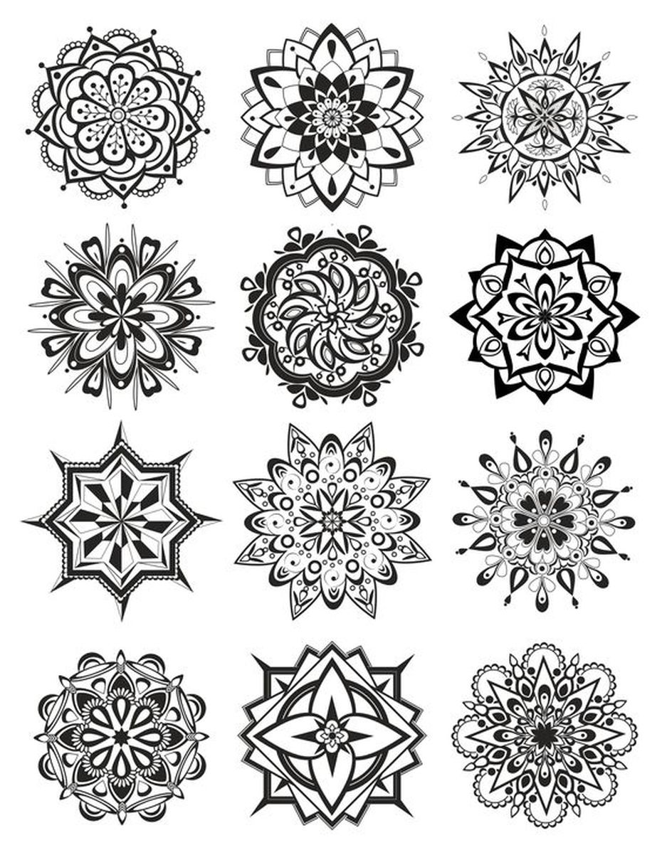
August 24, 2017: Principals of Design-Repetition, Pattern, & Rhythm
Principle of Repetition
The principle of repetition simply means the reusing of the same or similar elements throughout your design. Repetition of certain design elements in a design will bring a clear sense of unity, consistency, and cohesiveness.
Repetition is the use of similar or connected pictorial elements. For example, similar shapes, colours or lines that are used more than once
Repetition can be regular or irregular and even or uneven.
Repetition can be in the form of RADIATION where the repeated elements spread out from a central point.
Repetition may be in the form of GRADATION where the repeated elements slowly become smaller or larger.
Repetition works with pattern to make the artwork seem active. The repetition of elements of design creates unity within the artwork.
Patterns often occur in nature, and artists use similar repeated motifs to create pattern in their work. Pattern increases visual excitement by enriching surface interest.
Principle of Pattern
Pattern is a combination of elements or shapes repeated in a recurring and regular arrangement.Symbolic uses of pattern
Pattern is often used symbolically to represent many things: people, beliefs, the natural world, history, tradition. Colors and shapes have specific meanings, and are passed down from generation to generation. The predictability of pattern is important in establishing a historical tradition and cultural practice.
Principle of Rhythm
We are all familiar with the use of pattern as decoration, from clothing, to everyday objects, to home decorating . Below is an example of an elaborate use of pattern in home decoration.
Rhythm is like pattern, in that the same elements (i.e.shape, line) are repeated; however, with rhythm there are slight variations in the pattern. Rhythm is easily perceived but complex and subtle. Think of water on a beach; it continually breaks on the shore in lines that are repeated, yet each one is different.
Class Shirt Designs
|
Culinary Arts
Digital Media (make it GOOD!) Automotive CAD (Engineering/architecture class) Criminal Justice Construction Computer Maintenance |
Front (holographic)
Back
Front (pocket size)

|
August 22, 2017: Principals of Design: Contrast
Contrast is one of the key principles within Composition and Layout. Contrast in design is an accentuation of the differences between elements in a design. Most people think of contrast only as it applies to colors, but contrast can work with any design element. Contrast is important because the meaningful essence of any thing is defined by its value, properties, or quality relative to something else. Nothing has meaning by itself.
Importance of ContrastFocusContrast creates focus. In the iPod advertisement below, the designer used a silhouetted character on a brightly green colored background in contrast with the iPod and earphones in white. The design creates contrast and focuses the viewers' attention on the music player.
OrganizationContrast help with organizing the information and improving the clarity of the message. Contrast helps lead the reader’s eye into and through your
layout. Each component is but a piece of the overall project message and objective. With creative uses of contrast, you can influence user choices and compel specific actions. Figure 2 image is from a site that submitted designs for an Obama book. The image could be good design in a section where one is evaluating the president's accomplishments.
AppealA main reason to use contrast in a design, whether for print or web, is to grab attention. Contrast creates an impact, but too high contrast between design elements might give an unsettled and messy impression. Figure 3 consists of fifty collages of the seasons, seen through the eyes of the artists. The post-edited art brings up the contrasts between the visuals, mostly chromatic.
Forms of ContrastContrast with ColorAccording to Colin Ware, most principles for effectively using color in design can be derived from an understanding of the red-green, yellow-blue, and black-white color channels. A phenomenon known as simultaneous contrast occurs in each of the channels. The effect of simultaneous contrast is distortion of the appearance of a patch color that increases the differences between a color and its surroundings. This is called lightness or brightness contrast when it occurs in the black-white channel, and chromatic contrast when it occurs in either the red-green or yellow-blue channel.
Contrasting colors are those on opposite sides of the color wheel. The further apart and more directly opposite each other, the greater the contrast.
For example, red is from the warm half of the color wheel and blue is from the cool half. Opposite colors is also referred to as complementary colors which generally refers to each of a pair of colors that are directly opposite each other on the color wheel, such as purple and yellow.
Contrast with SizeBig and small elements of the same type as seen on the figure 5, are the most obvious uses of size to create contrast. The big elephant is in contrast with a smaller creature walking beside it.The second picture below shows contrasting white space or the physical size of the piece with another element of the design as another method of contrast. The huge pyramid is in contrast with a person walking in front of the pyramid.
Contrast with TypeType contrast can use size, value, and color to create contrasting typographic treatments. One can add bold or italics to create contrast, mix large type with small type, or combine serif with sans serif type to create type contrast. You can also set portions of text in contrasting colors or varying values. Changes in type alignment create contrast as does type spacing such as extreme kerning for headlines.
Contrast with ValueThe relative lightness or darkness of two elements to each other can create a contrast in value. Whether with shades of gray or tints and shades of a single color, the further apart the values the greater the contrast. The picture in Figure 7 shows a person is jumping across in hopes of reaching the other side. There is an intense contrast of her jumping and the bright sky behind her. There is also a contrast of the rock or surface she is jumping from and the sky behind it. The other picture shows a sunset image. One can see that the value contrast is much lighter than in the rain forest picture. Imagine viewing this photo without any value contrast and no light sunset hues. It would make it difficult to see what’s going on in the photo.
Contrast with Other Design ElementsContrast is one of the most powerful design concepts because any design element can be contrasted with another. Use the principle of contrast to create strong dynamic differences among elements that are different. If it is different, make it very different. You can achieve contrast through the manipulation of space, color choices, text selection, positioning, and so on. Making use of contrast can help you create a design in which one item is clearly dominant. This helps the viewer get the point of your design quickly. Every good design has a strong and clear focal point and having a clear contrast among elements helps. If all items in a design are of equal or similar weight with weak contrast and with nothing being clearly dominant, it is difficult for the viewer to know where to begin. Designs with strong contrast attract interest, and help the viewer make sense of the visual.
