April 3 - 10: How To Video
| video_project_3-_how_to_video.docx |
|
|
|
Block 2: March 13 - March 22: Video 2 - A Day in the Life |
Block 3: March 9 - March 17th: Video 2 - A Day in the Life |
Choose a day between today and next Monday and shoot a short (1 to 3 minute) video clip about what happened that day.
*You can use a video camera, cell phone, or laptop webcam to record the clip.
Videos should be on the front computer by the end of class time on Monday, March 6th. We will be watching videos together on Tuesday, you must show your video to receive credit. (20pts.)
Examples:
*You can use a video camera, cell phone, or laptop webcam to record the clip.
Videos should be on the front computer by the end of class time on Monday, March 6th. We will be watching videos together on Tuesday, you must show your video to receive credit. (20pts.)
Examples:
|
|
|
Vlog Plan
- Preview the day/activity
- Branding Information
- Show/go through whatever the activity is
- Speed play footage of the activity
- Recap the day and give any closing info
February 16 - 24: Video 1 - Feeling Through Sound
- Find a short video or trailer on YouTube. (15-30 seconds)
- Select a piece of music that has a different “feel” and replace the audio of the clip.
- Adjust the music so that it matches the clip and changes the theme or feel of the clip.
- Add credits to the end of your clip giving credit to the video and music owner as well as yourself for editing.
- Publish to Apple Devices 1080p and move your video to iTunes on the front computer.
Free Music Archive
To download music from youtube
To download video from youtube
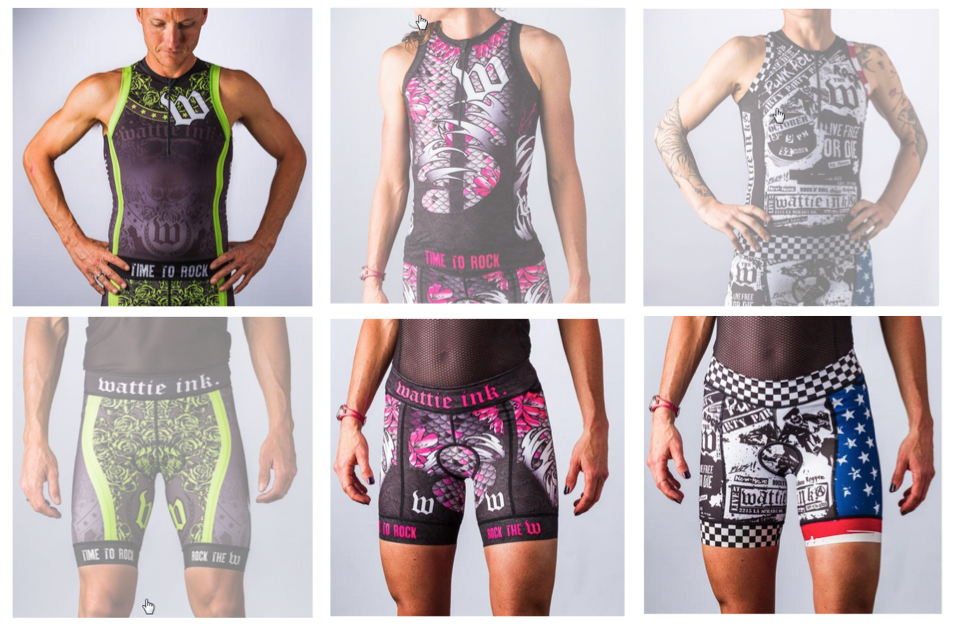
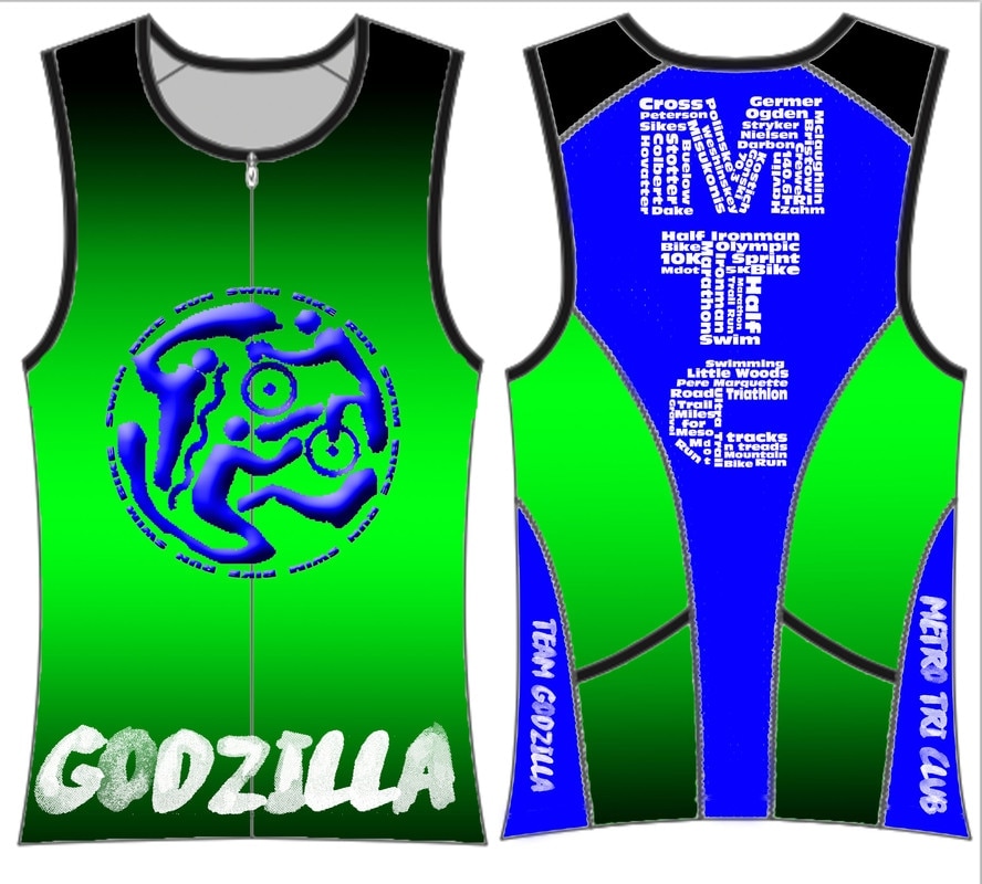
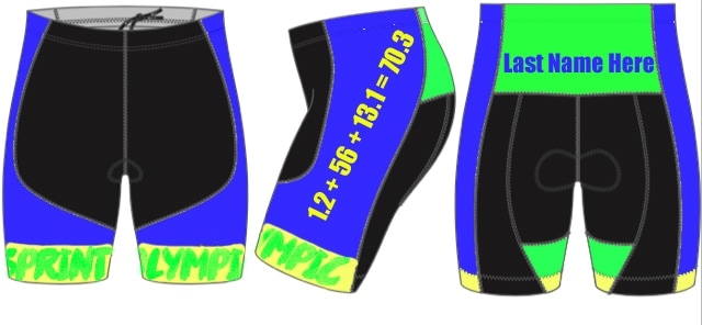
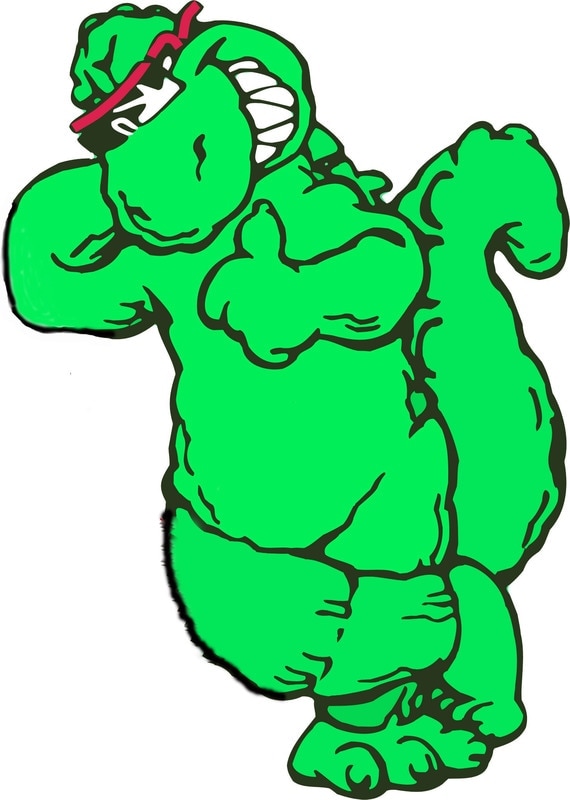
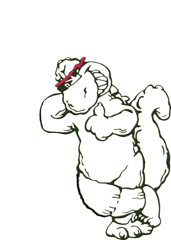
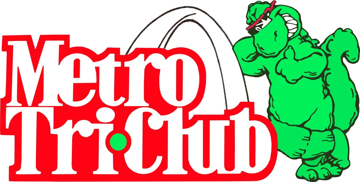
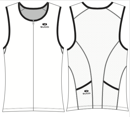
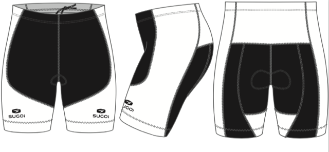
February 10: Triathlon Uniform
Use Photoshop to create a new design for each of the uniform pieces.
Attached is the kit file for the shorts and jersey. I have also attached some of our logos, a photo of the existing kit, a ppt slide with example of the style we are looking for (tattooish)
The kits will need the following:
Feel free to use any of the graphics I have attached, the only one we require is the Godzilla leaning on the arch with the Metro Tri Club text, you can change colors or make it black and while, it just needs to be that graphic.
Web address must be somewhere on suit, it can be small as long as its readable www.teamgodzilla.org
Metro Tri Club or MTC somewhere
Team Godzilla somewhere
Our colors have been mainly green, yellow and blue in the past, we probably want some green and yellow in them, but we are not tied to that as our main colors, we do however want them to stand out so they are easy to see in a crowd.
We are going for a tattoo kind of feel to them
The design has to work for both men and women
The black section on the shorts has to stay solid black.
There will be a prize for any designs that we use.
We would like these as soon as you can get them because it takes 10 weeks to get them produced So we would like to have them in around mid March if possible.
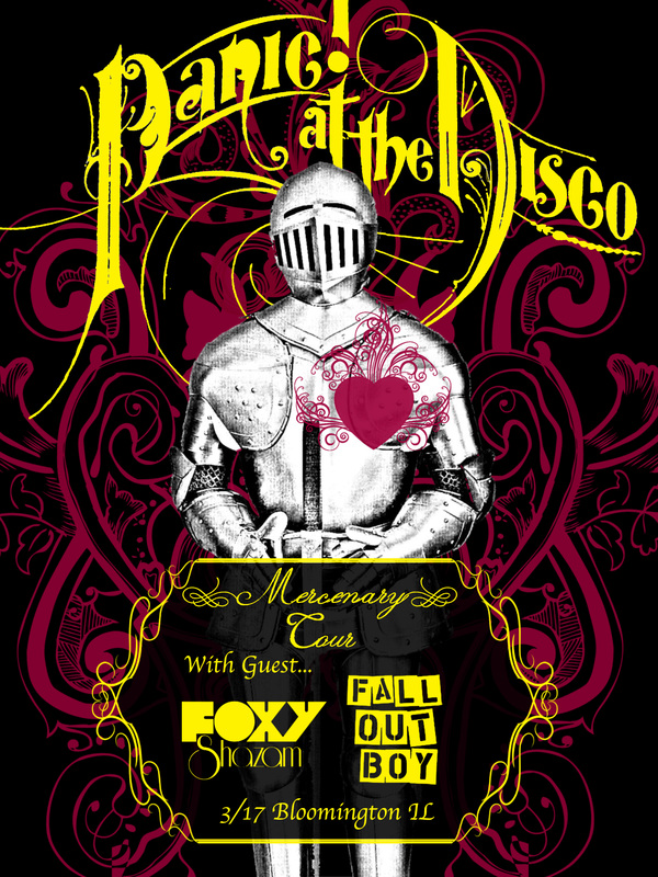
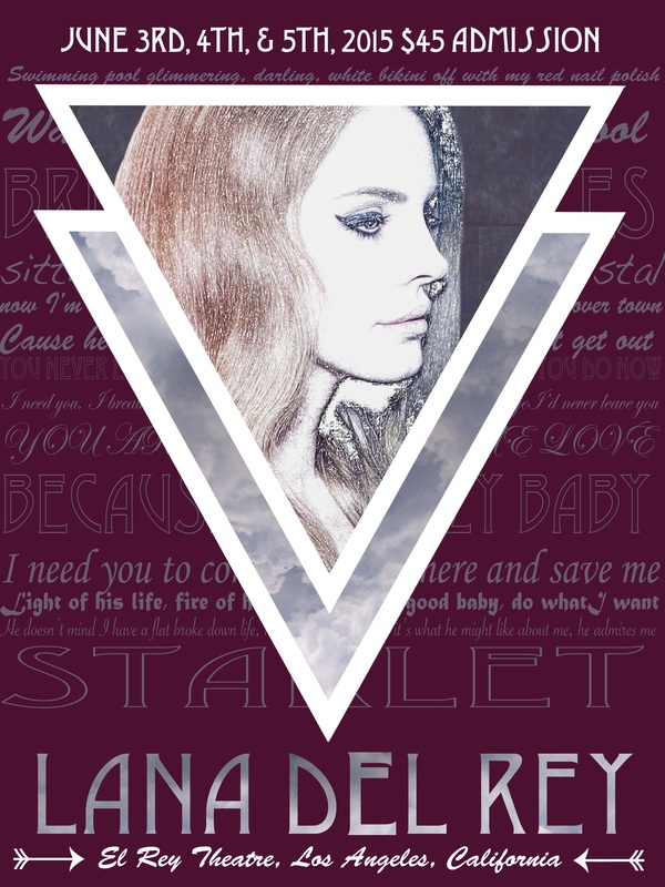
Uniform Examples:
|
|
Usable Images
|

|
|
|
Templates
January 23 - February 6, 2017: Original Characters
For this project you will be characterizing yourself. Remember, you can choose the style but it should be head to toe and of YOU. A couple examples are below of the same person in different styles.
Cartoon Styles
Skin and Hair Tones
January 10 - 20, 2017
Everything you need for your Business Project can be found here.
January 9, 2017: App Logo

|
|

|
|
|
|
|
November 21, 2016: Animated Character
Choose any Pixar, Dreamworks, Disney, etc. character to illustrate. Do not choose a "flat" character but rather one with depth (shadows/highlights). Your character should also be a full body character (head to foot or fin whatever the case may be). Your character should be done on an 18" x 24" artboard and should include a background or scene that is appropriate to that character.
November 7, 2016:
November 4, 2016: Shadow and Gradient Practice
November 3, 2016: Illustrator Pen Practice
November 2, 2016: Illustrator Intro
November 1, 2016: Pixel Disintegration
Let's try this again. All the files needed are below as well as the link.
REMEMBER: If instructions indicate the use of the Control key that is for Windows operating systems. We substitute the Command key in its place.
Disintegration Effect
REMEMBER: If instructions indicate the use of the Control key that is for Windows operating systems. We substitute the Command key in its place.
Disintegration Effect
| particle_brush_2.abr |
October 24 - 26, 2016: Expo Prep and Spirit Wear Delivery
October 17, 2016: Project of Choice
Skull Face Source Files
|
|
| ||||||
October 14, 2016: Digital Typeface
| typefacetemplate.pdf |
October 12, 2016: Pre-Test File
| online_exam_file.docx |
October 12, 2016: Custom Typeface
A small glimpse into customizing type for clients.
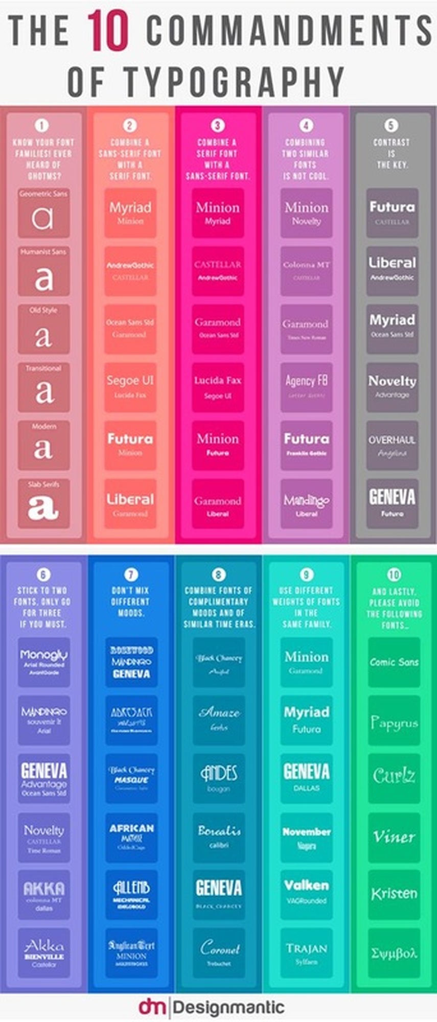
October 11, 2016: Typefaces
Today we are going to take a look at what makes a typeface a typeface as well as the 7 categories of typefaces. Below are the 10 commandments for working with the different styles.
October 6, 2016:
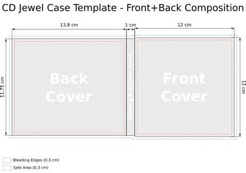
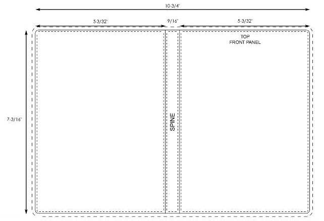
Block 3: You all have time to work on your CD/DVD/Game case today. If anyone thinks they are finished, remember to post it to your website and fill out the Early Turn In Feedback form on my homepage. After you have done so visit the tutorials page and pick what you want to work on for today. This is your choice so take a look at all the options and find something you are interested in. Post what you finish today to your website.
October 3 - 10, 2016: CD/DVD/Game Design
September 23-30: Sport/Club/Activity Poster
Create a poster featuring a sports team. Use your Photoshop skills to make the poster interesting, attractive and a poster the team would be proud to use. Consider the design rules when laying out the poster.
REMEMBER DIMENSIONS: 18" x 24" with resolution of 300
REMEMBER DIMENSIONS: 18" x 24" with resolution of 300
| sports_poster_1.xlsx |
September 23, 2016: Package Design
Final Package will be presented today. Be ready to talk about your design! (Why you chose the name you did? How you came up with that theme? Etc.)
September 22, 2016: Package Design
September 21, 2016: Package Design
September 20, 2016: Package Design
September 19, 2016: Package Design
Final design due: Friday, September 23rd
Label dimensions: 6.75in x 1.875in with 300 resolution
Checklist for Play Dough Package:
Label dimensions: 6.75in x 1.875in with 300 resolution
Checklist for Play Dough Package:
- Play Dough (either logo or name typed if logo is remade to say something else)
- Custom Color Name
- Website
- Barcode
- Warning Info (Notice: Contains Wheat)
- Care Instructions (Always put compound back in container after play. Store in a cool place. If necessary, water may be added one drop at a time to restore softness.)
September 13, 2016: 3D Type/Hair Processing
Finish hair processing and 3D Type work today.
September 12, 2016: 3D Type
In this Photoshop tutorial, you are going to learn how to create some 3D text using only Photoshop. The mood we will strive to incorporate in our piece is dark and grungy. We are going to use consistent lighting, layer styles to create shadows for our type, Photoshop filters, and more. We will finish off our scene by adding a dark textured background that seems to fade out as it approaches the edge of the canvas — a popular design technique.
Click here to begin.
Click here to begin.
September 9, 2016: Photo Correction/Manipulation
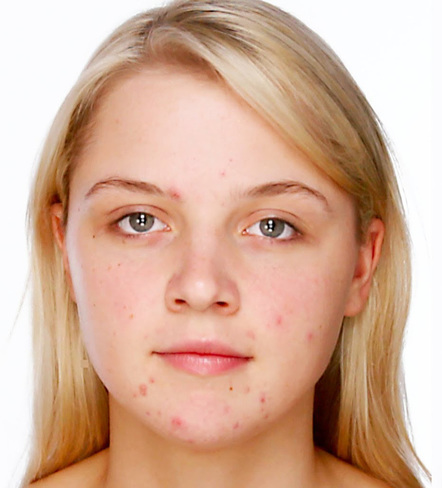
|
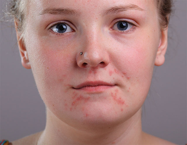
|
September 7, 2016: Color
Today you will be illustrating the feeling of a color following this tutorial. First, visit paletton.com and choose your monochromatic color scheme. Save the color codes so that you can refer back to them as you work. Then choose the word describing that color that you will illustrate (HINT: don't choose an enormously long word 5-7 letters is best) Then begin the tutorial replacing the colors used with the colors in your scheme.
Red
Examples of red app icons: Pinterest, Google+, YouTube
Evokes: “Action, adventure, fire, lust, anger, courage and rebellion.”
Examples of red app icons: Pinterest, Google+, YouTube
Evokes: “Action, adventure, fire, lust, anger, courage and rebellion.”
- Red is best used for action orientated products and brands.
- Red and orange are colors that boost appetite.
- Red is one of the top two favorite colors of all people.
- Red is the most popular color used on flags in the world.
- Approximately 77% of all flags include red.
- Red is the international color for stop.
Orange
Examples of orange app icons: Blogger, RSS feed, MozillaFirefox
Evokes: “Energy, vitality, cheer, excitement, adventure, warmth, and good health.”
Examples of orange app icons: Blogger, RSS feed, MozillaFirefox
Evokes: “Energy, vitality, cheer, excitement, adventure, warmth, and good health.”
- Orange is a color that suggests value and discounts.
- Orange is symbolic of autumn.
- Children all over the world are drawn to orange.
- Orange is the color of life rafts, hazard cones, and high visibility police vests.
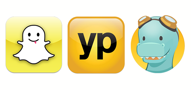
Yellow
Examples of yellow app icons: SnapChat, YellowPages, TimeHop
Evokes: “Happiness, optimism, enlightenment, creativity, sunshine, warmth, cheeriness and fun.”
Examples of yellow app icons: SnapChat, YellowPages, TimeHop
Evokes: “Happiness, optimism, enlightenment, creativity, sunshine, warmth, cheeriness and fun.”
- Yellow is the color that captures our attention more than any other.
- In almost every culture, yellow represents, sunshine, happiness and warmth.
- Yellow is the color most often associated with the deity in many religions.
- Yellow is the color of traffic lights and signs indicating caution all over the world.
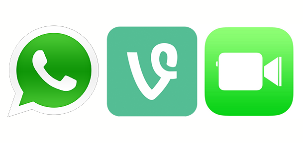
Green
Examples of green app icons: WhatsApp, Vine, Facetime
Evokes: “Growth, rebirth, freshness, revitalisation, and fertility.”
Examples of green app icons: WhatsApp, Vine, Facetime
Evokes: “Growth, rebirth, freshness, revitalisation, and fertility.”
- Green is now the symbol of ecology and has become a verb.
- Green is universally associated with nature.
- Green symbolizes ecology and the environment.
- Green traffic lights symbolize “go” all over the world.
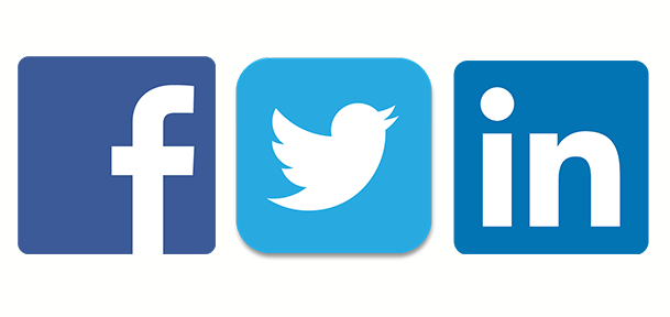
Blue
Examples of blue app icons: Facebook, Twitter, LinkedIn
Evokes: “Dignity, intelligence, cleanliness, peace, security and calmness of mind.”
Examples of blue app icons: Facebook, Twitter, LinkedIn
Evokes: “Dignity, intelligence, cleanliness, peace, security and calmness of mind.”
- Blue is the #1 favorite color of all people.
- However, blue can be over-used. Combining blue with another color creates a more creative effect.
- 53% of the flags in the world contain blue.
- Blue is the most commonly used color in corporate identity.
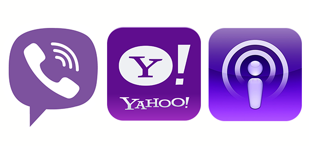
Purple
Examples of purple app icons: Viber, Yahoo!, Podcast
Evokes: “Nobility, wealth, magic, mystery, spirituality, creativity, dignity, and royalty.”
Examples of purple app icons: Viber, Yahoo!, Podcast
Evokes: “Nobility, wealth, magic, mystery, spirituality, creativity, dignity, and royalty.”
- There’s a huge difference of opinion about purple. It all depends on age.
- Purple tends to be a color that people either love or hate.
- Purple is the color of mourning or death in many cultures.
- Purple is not common flag color. Only two flags contain purple.
|
| ||||
September 6, 2016: Concert Poster and Color Theory
Today we will be addressing terms associated with color theory and principles. Once we have gone over what we know as a class, we will be taking a term, and creating something in photoshop to represent the term. Here are a list of key terms that we will be using:
Accent color
Achromatic color
Additive color
Analogous color
Bezold effect
Chroma
Color harmony
Color interaction
Color key
Color overtone
Color theory
Complementary
Composition
Hue
Intensity
Monochromatic
Opponent theory
Primary colors
Saturation
Secondary color
Shade
Simultaneous contrast
Split complementary
Subtractive color
Temperature
Tertiary colors
Tint
Tone
Value
|
Block 2
Jacob- Value and Tint Jordyn- Hue and Secondary Color Breanne - Shade and Chroma Zha'teya- Temperature and Overtone Hunter- Tertiary color and Monochromatic Zach- Analogous Color and Additive color Quinnie- Accent color and Intensity Collin- Complementary color and Tertiary color |
Block 3
Zach- Tint and Shade Colleen- Secondary and tertiary colors Corine- Value and color harmony Jessica- color interaction and monochromatic Emily- analogous color and behold effect Dez- Hue and intensity Carsyn- temperature and tone Karson- achromatic and accent color Arijeta- Complementary and chroma Mackenzi- subtractive color and split complementary |
September 2, 2016: Concert Poster
September 1, 2016: Concert Poster
| concert_poster_rubric.docx |
Posters should be 18" x 24" with 300 resolution.
August 30, 2016: Glow Text
Work through the Glow Text Effect tutorial using your own phrase or word. Take your time and look at the images that go along with the instructions. If you run into a problem please ASK a 2nd year student! They are really good at helping so use them. If you don't finish today that is fine but please POST WHAT YOU FINISH AT THE END OF THE DAY.
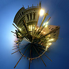
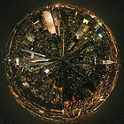
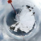
August 29, 2016: Dual Credit Presentation/ Filters/ My Little World
STEP 1: RESIZE AND ROTATE
The first thing we need to do is prepare the image for the Polar filter. We do this by stretching the height of the image so that the image is a perfect square.
Select Image>Image Size from the menus. Uncheck ‘Constrain Proporties’ and set the “height” to the same value as your “width”. Next, rotate the image 180 degrees. (Image>Rotate Canvas>180)
You should end up with something like this:
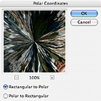
STEP 2: APPLY THE POLAR FILTER
Next, we’ll apply the Polar Filter to wrap our image into a sphere.
Choose Filter > Distort > Polar Coordinates from the menus and in the resulting dialog box, select the “Rectangular to Polar” setting.
(If you’re using The Gimp the command is Filters > Distorts > Polar Coords.)
Next, we’ll apply the Polar Filter to wrap our image into a sphere.
Choose Filter > Distort > Polar Coordinates from the menus and in the resulting dialog box, select the “Rectangular to Polar” setting.
(If you’re using The Gimp the command is Filters > Distorts > Polar Coords.)
As you can see we’re 90% of the way there!:
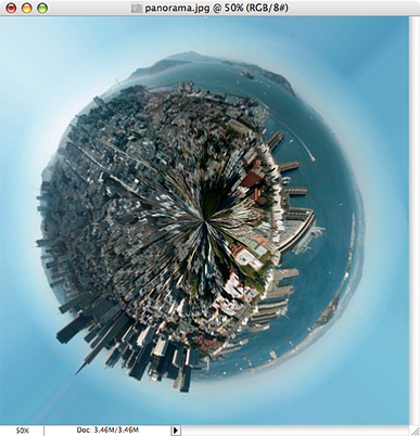
Easy cheesy, right? Now for some finishing touches…
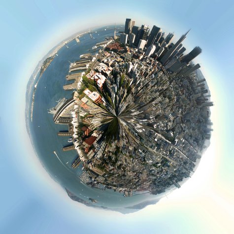
STEP 3: ROTATE AND CLEAN UP
The rest is just a little digital darkroom work: Rotate the planet to your liking, adjust the contrast and colors, clean up the sky and the edges where the left and right border of the image came together. (The clone stamp and healing brush may be handy here.) That’s it, we’re done!
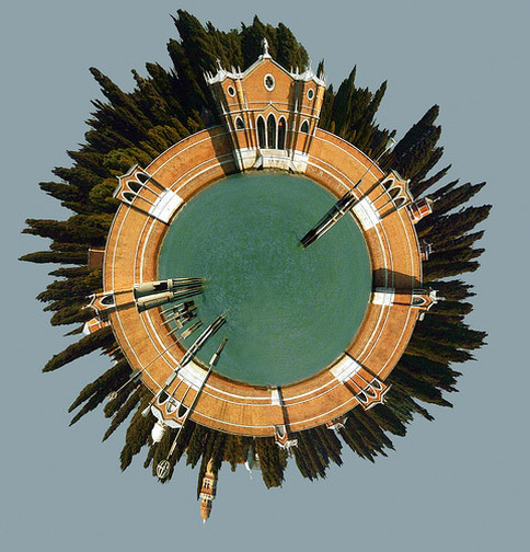
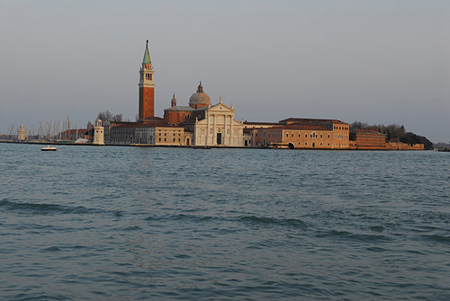
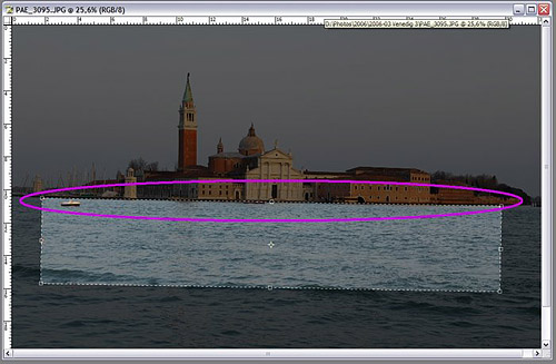
MORE ADVANCED: PLANET VENICE
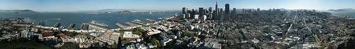
Planets work best when created using panoramas, but for this second example we’ll use the following landscape photo of San Girgio Maggiore Island in Venice. Islands are especially well-suited for planetization because the left and right edges of the images are easy to match up–you only have to make sure the horizon is level.
Planets work best when created using panoramas, but for this second example we’ll use the following landscape photo of San Girgio Maggiore Island in Venice. Islands are especially well-suited for planetization because the left and right edges of the images are easy to match up–you only have to make sure the horizon is level.
CROP AND STRAIGHTEN
Because we’re not starting with a 360 degree panorama, we’ll need to do some extra work before we can follow the steps above.
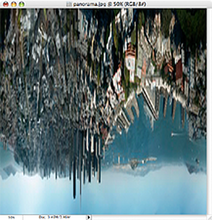
First we’ve gotta crop and straighten the image to make the horizon absolutely horizontal. Using the cropping tool of PhotoShop we can do both in one step:
First, we must ensure that our crop selection is parallel to the horizon. Choose the crop tool and select a flat rectangular area of the photo. Move the cursor just outside of an edge of the selected area so that the cursor changes to two arrows pointing left and up. Click the mouse button and you can rotate the cropped area.
By moving the top border of your selection to the horizon of the photo you can inspect the rotation closely. Move and rotate the crop selection until the top border and your horizon are parallel, but don’t crop your photo yet.
Because we’re not starting with a 360 degree panorama, we’ll need to do some extra work before we can follow the steps above.
First we’ve gotta crop and straighten the image to make the horizon absolutely horizontal. Using the cropping tool of PhotoShop we can do both in one step:
First, we must ensure that our crop selection is parallel to the horizon. Choose the crop tool and select a flat rectangular area of the photo. Move the cursor just outside of an edge of the selected area so that the cursor changes to two arrows pointing left and up. Click the mouse button and you can rotate the cropped area.
By moving the top border of your selection to the horizon of the photo you can inspect the rotation closely. Move and rotate the crop selection until the top border and your horizon are parallel, but don’t crop your photo yet.
Now we want to make sure the left and the right borders of the image fit together. Look for areas on the right and the left where the buildings have the same height:
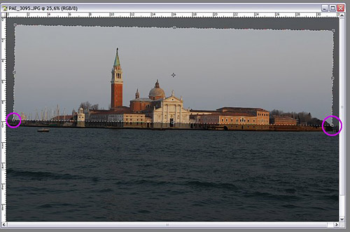
Move the right and left borders of your selection so that the edges will match up. Finally, adjust the top and bottom of your selection so your waterline is roughly in the middle of the cropped photo:
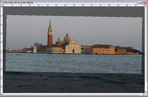
Double-click your image to commit the crop and you’re ready for the transformation! Just follow steps 1-3 as in the example above.
Here’s the final result:
Here’s the final result:
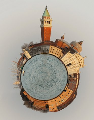
More Samples:
August 26, 2016: Me Poster Printing/Blending Optoins
August 25, 2016: Me Poster
Your poster must be 11in x 17in size and include ALL of the following:
- Picture of You (Recent but not necessarily taken in this class, it can be a senior picture or one you already have from an event or place you want to remember.)
- Your name in a new font (Big enough to read, don't hide it!)
- Brush of some kind
- Background of some kind (This can be a photo or graphic of some kind or something you paint/draw in the background)
August 24, 2016: Principles of Design - Alignment
Alignment is one of those obvious design concepts that hardly seem worth making a big deal about. It is something you see and use every day. There are, however, many more opportunities to use this system for organizing materials than are obvious without a thorough understanding of the principles involved.
Items can line up either along their edges or on their centers. Alignment is used extensively to organize all graphic arts. Almost all text uses alignment to organize lines of type. The letters align along their bases and the lines begin (and/or end) along a line. You probably discovered the importance of this in the last project.
Alignment works best with items that have straight edges, especially rectangles. Rectangles are the most economical shapes to trim pictures into so pictures are most often seen in that format. Text is made of letters of varying shapes that form lines and blocks that act as rectangles. Most formats are also rectangles.
There are two major types of alignment: edge and center.
August 23, 2016: Principles of Design - Repetition, Pattern, Rhythm
Principle of Repetition
The principle of repetition simply means the reusing of the same or similar elements throughout your design. Repetition of certain design elements in a design will bring a clear sense of unity, consistency, and cohesiveness.
Repetition is the use of similar or connected pictorial elements. For example, similar shapes, colours or lines that are used more than once
Repetition can be regular or irregular and even or uneven.
Repetition can be in the form of RADIATION where the repeated elements spread out from a central point.
Repetition may be in the form of GRADATION where the repeated elements slowly become smaller or larger.
Repetition works with pattern to make the artwork seem active. The repetition of elements of design creates unity within the artwork.
Patterns often occur in nature, and artists use similar repeated motifs to create pattern in their work. Pattern increases visual excitement by enriching surface interest.
Principle of Pattern
Pattern is a combination of elements or shapes repeated in a recurring and regular arrangement.Symbolic uses of pattern
Pattern is often used symbolically to represent many things: people, beliefs, the natural world, history, tradition. Colors and shapes have specific meanings, and are passed down from generation to generation. The predictability of pattern is important in establishing a historical tradition and cultural practice.
Principle of Rhythm
We are all familiar with the use of pattern as decoration, from clothing, to everyday objects, to home decorating . Below is an example of an elaborate use of pattern in home decoration.
Rhythm is like pattern, in that the same elements (i.e.shape, line) are repeated; however, with rhythm there are slight variations in the pattern. Rhythm is easily perceived but complex and subtle. Think of water on a beach; it continually breaks on the shore in lines that are repeated, yet each one is different.
August 22, 2016: Principles of Design - Contrast
Contrast is one of the key principles within Composition and Layout. Contrast in design is an accentuation of the differences between elements in a design. Most people think of contrast only as it applies to colors, but contrast can work with any design element. Contrast is important because the meaningful essence of any thing is defined by its value, properties, or quality relative to something else. Nothing has meaning by itself.
Importance of ContrastFocusContrast creates focus. In the iPod advertisement below, the designer used a silhouetted character on a brightly green colored background in contrast with the iPod and earphones in white. The design creates contrast and focuses the viewers' attention on the music player.
OrganizationContrast help with organizing the information and improving the clarity of the message. Contrast helps lead the reader’s eye into and through your
layout. Each component is but a piece of the overall project message and objective. With creative uses of contrast, you can influence user choices and compel specific actions. Figure 2 image is from a site that submitted designs for an Obama book. The image could be good design in a section where one is evaluating the president's accomplishments.
AppealA main reason to use contrast in a design, whether for print or web, is to grab attention. Contrast creates an impact, but too high contrast between design elements might give an unsettled and messy impression. Figure 3 consists of fifty collages of the seasons, seen through the eyes of the artists. The post-edited art brings up the contrasts between the visuals, mostly chromatic.
Forms of ContrastContrast with ColorAccording to Colin Ware, most principles for effectively using color in design can be derived from an understanding of the red-green, yellow-blue, and black-white color channels. A phenomenon known as simultaneous contrast occurs in each of the channels. The effect of simultaneous contrast is distortion of the appearance of a patch color that increases the differences between a color and its surroundings. This is called lightness or brightness contrast when it occurs in the black-white channel, and chromatic contrast when it occurs in either the red-green or yellow-blue channel.
Contrasting colors are those on opposite sides of the color wheel. The further apart and more directly opposite each other, the greater the contrast.
For example, red is from the warm half of the color wheel and blue is from the cool half. Opposite colors is also referred to as complementary colors which generally refers to each of a pair of colors that are directly opposite each other on the color wheel, such as purple and yellow.
Contrast with SizeBig and small elements of the same type as seen on the figure 5, are the most obvious uses of size to create contrast. The big elephant is in contrast with a smaller creature walking beside it.The second picture below shows contrasting white space or the physical size of the piece with another element of the design as another method of contrast. The huge pyramid is in contrast with a person walking in front of the pyramid.
Contrast with TypeType contrast can use size, value, and color to create contrasting typographic treatments. One can add bold or italics to create contrast, mix large type with small type, or combine serif with sans serif type to create type contrast. You can also set portions of text in contrasting colors or varying values. Changes in type alignment create contrast as does type spacing such as extreme kerning for headlines.
Contrast with ValueThe relative lightness or darkness of two elements to each other can create a contrast in value. Whether with shades of gray or tints and shades of a single color, the further apart the values the greater the contrast. The picture in Figure 7 shows a person is jumping across in hopes of reaching the other side. There is an intense contrast of her jumping and the bright sky behind her. There is also a contrast of the rock or surface she is jumping from and the sky behind it. The other picture shows a sunset image. One can see that the value contrast is much lighter than in the rain forest picture. Imagine viewing this photo without any value contrast and no light sunset hues. It would make it difficult to see what’s going on in the photo.
Contrast with Other Design ElementsContrast is one of the most powerful design concepts because any design element can be contrasted with another. Use the principle of contrast to create strong dynamic differences among elements that are different. If it is different, make it very different. You can achieve contrast through the manipulation of space, color choices, text selection, positioning, and so on. Making use of contrast can help you create a design in which one item is clearly dominant. This helps the viewer get the point of your design quickly. Every good design has a strong and clear focal point and having a clear contrast among elements helps. If all items in a design are of equal or similar weight with weak contrast and with nothing being clearly dominant, it is difficult for the viewer to know where to begin. Designs with strong contrast attract interest, and help the viewer make sense of the visual.
