*Dual Credit Update*
Check out some dual credit info updates here.
May 11 - 14 & 18 - 22: Certification Testing
Wonder of all wonders, our certification block for Friday to test has been bumped by Certiport.
Anyone who is interested in certification testing for Adobe Illustrator, please plan on being in the Zoom call on Tuesday May 19th. *We will begin promptly at 10am. (Zoom has modified settings so if you are prompted for a meeting password use: 0hv8BT)
I have detailed information on testing process as well as details we need to discuss. I need to have an exact number of people who want to certify so if you can't make the Zoom call on Tuesday, May 19th please email me as soon as possible.
For our call you will need the following information:
Our new assigned window is Thursday, May 28 @ 3:00pm, Thursday, May 28 @ 5:00pm, Friday, May 29 @ 11:00am, or Friday, May 29 @ 1:00pm. I am asking everyone who would like to test to fill out this form to indicate your preferred testing day/time. Again, I need exact numbers. If you do not submit a form I am not going to schedule you to test. This will absolutely need to be done by next Friday, May 22.
If you have questions before next Tuesday please feel free to reach out.
Anyone who is interested in certification testing for Adobe Illustrator, please plan on being in the Zoom call on Tuesday May 19th. *We will begin promptly at 10am. (Zoom has modified settings so if you are prompted for a meeting password use: 0hv8BT)
I have detailed information on testing process as well as details we need to discuss. I need to have an exact number of people who want to certify so if you can't make the Zoom call on Tuesday, May 19th please email me as soon as possible.
For our call you will need the following information:
- Yes or No: Do you have a laptop or desktop with Windows 10 or Mac OSX Sierra 10.12 or higher
- Yes or No: Do you have a keyboard and a mouse
- Yes or No: Do you have Chrome, Internet Explorer, or Safari
- Yes or No: Do you have bandwidth download speed of at least 5Mbps (I STRONGLY recommend you test your bandwidth before attempting to test. This is to verify your testing session will not be interrupted. A good site to use is www.speedtest.net. Be sure other members of your household are offline during the bandwidth test and during your actual exam session.)
Our new assigned window is Thursday, May 28 @ 3:00pm, Thursday, May 28 @ 5:00pm, Friday, May 29 @ 11:00am, or Friday, May 29 @ 1:00pm. I am asking everyone who would like to test to fill out this form to indicate your preferred testing day/time. Again, I need exact numbers. If you do not submit a form I am not going to schedule you to test. This will absolutely need to be done by next Friday, May 22.
If you have questions before next Tuesday please feel free to reach out.
| candidate_guide_exams_from_home.pdf |
Process Info
1. You will get your exam link email at least 1 hour before your scheduled test time.
5. The Notepad app will only be available before your begin your exam. I am looking into scheduling Zoom calls to have a link available to talk if you have problems.
6. Exam: Adobe Certified Associate - Graphic Design & Illustration using Adobe Illustrator CC
7. No Exam Group
9. Inventory/Site Licenses
May 4 - 8: Copyright/Creative Commons & Certification Practice Test
Monday - Friday
After the glitch of last week’s piece not posting on Monday please use the rest of this week to finish your evaluation of the copyright case study. If you have questions or would like me to look over your piece before you turn it in via email please let me know.
After your paper is done please use the rest of your time to practice test for the Illustrator certification test. I haven’t gotten an official date but at least one day next week (May 11-14) will have the opportunity to take the real certification test. This will be a specific date and time to test so please be sure to check back next Monday so you don’t miss it.
April 27 - 30: **DUAL CREDIT ASSIGNMENT**
Copyright & Creative Commons
Review the attached powerpoint pdf and read the attached case study pdf.
In 3-5 pages answer the following questions and email your paper to me at [email protected] when finished.
Don’t forget to cite any sources you use outside of the attached case study under APA guidelines. (If you're rusty Purdue Owl has great resources here.)
If you have a hulu subscription, or want to try the 7 day free trial, there is a documentary called Obey Giant that has some great background/supplemental info.
In 3-5 pages answer the following questions and email your paper to me at [email protected] when finished.
Don’t forget to cite any sources you use outside of the attached case study under APA guidelines. (If you're rusty Purdue Owl has great resources here.)
- What was the base for Shephard Fairey’s case that he did not commit copyright infringement of Mannie Garcia’s Associated Press photo?
- What was The Associated Press’s stance that he did commit copyright infringement?
- What was the outcome of the case?
- What, if any, punishment did Shepard Fairey received for what crime?
- What, if any, agreement was reached between Shepard Fairey and The Associated Press?
If you have a hulu subscription, or want to try the 7 day free trial, there is a documentary called Obey Giant that has some great background/supplemental info.
|
| ||||
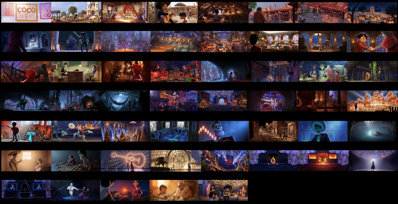
April 20 - 24: Pixar in a Box - Lighting
Monday: Art of Lighting Overview
Watch the 2 videos linked below and post your black and white sketch from Exercise 1 to your website.
Art of Lighting Overview
Light Quality
Exercise 1: Seeing Light
Tuesday:
Watch the video linked below and post your photo from Exercise 2 to your website.
Light Roles
Exercise 2: Lighting an Object
Wednesday:
Watch the 2 videos linked below. Complete the interactive lighting questions in Exercise 3 and post your results as well as your photos from Exercise 4 to your website.
Virtual Lights
Exercise 3: Lighting an Orange
Character Lighting
Exercise 4: Lighting a Character
Thursday:
Watch the video linked below and post your answers to Part 1 & 2 of Exercise 5 as well as screen captures of Exercise 6 on your website.
Color Scripts
Exercise 5: Color Scripts
Goals
- Analyse a color script used at Pixar
- Generate an original color script
Questions to Answer
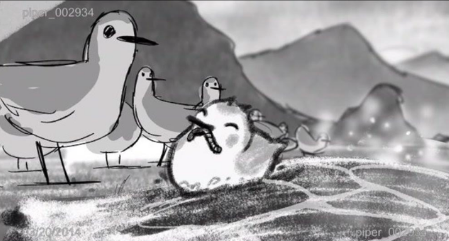
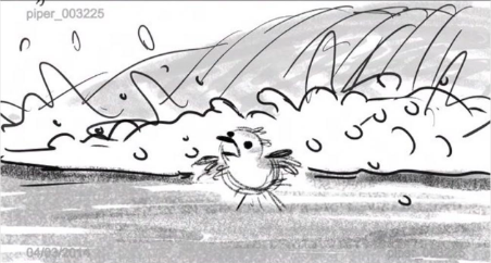
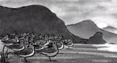
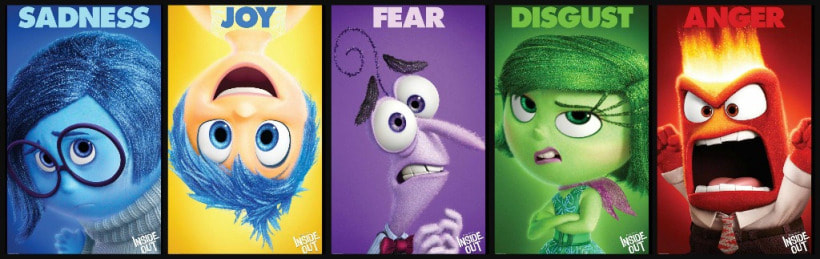
Below are three rough frames from the storyreel for the short film Piper. Pick one of the three frames, print it out and color it in to create two distinct looks. What moods were you able to portray?
- What can you tell about the story by looking at the colorscript?
- What does it tell you about the overall tone & feel of the movie?
- Select three frames that have very different moods and explain what they make you feel and how color and light was used.
Below are three rough frames from the storyreel for the short film Piper. Pick one of the three frames, print it out and color it in to create two distinct looks. What moods were you able to portray?
Part 3: GenerateDo you have an idea for your own story? Or a story that you've read that you'd like to think about designing the lighting for? Apply what you've learned here and create a color script for it!
Keep in mind that you don’t need to draw to make a great color script, even a photo collage would work. Choose images that reference how you imagine color, light and shadow would be used for each key moment in the story. Or, feel free to draw each frame.
Master Lighting
Exercise 6: Master Lighting
Friday:
Watch the video linked below and post a screen shot of Exercise 7 on your website.
Shot Lighting
Exercise 7: Shot Lighting
April 13 - 17: Pixar in a Box - Storytelling
***FOR MONDAY: If the story you want to share with me is not one you would like to post on your webpage you are welcome to email this assignment to me at [email protected].***
Monday: Introduction to Storytelling
Watch the two videos linked below and complete Activity 1: Expressing Memories
Introduction to Storytelling
Your Unique Perspective
Activity 1: Expressing Memories
Part A: Think of a memory that you remember vividly. It should be a memory that comes easily to you.
Part B: Why do you think you remember this so well? Try connecting one or more emotions to this memory.
Part C: Now try and express your memory and emotion in some way. The goal is to get it out of your head. Here are some ideas for what you could do.
Tuesday: Your Favorite Stories
Watch the video linked below and complete Activity 2: Your 3 Favorite Films.
Your Favorite Stories
Activity 2: Your 3 Favorite Films
Part A: Identify the three films that you would take to a deserted island....
- Verbally: Record yourself recalling your memory. Can you make us feel the emotion?
- Written: Write your memory in less than a page. Do the emotions come out in your words?
- Visually: Express your memory using only lines and shapes. Do the emotions come out in your drawings? example
Tuesday: Your Favorite Stories
Watch the video linked below and complete Activity 2: Your 3 Favorite Films.
Your Favorite Stories
Activity 2: Your 3 Favorite Films
Part A: Identify the three films that you would take to a deserted island....

Part B: Why do you think you connected with these stories? Come up with at least one reason for each.
Part C: What, if anything, do these three films have in common? How are they different?
Wednesday: What If...
Watch the video linked below and complete Activity 3: What If...
What If
Activity 3: What If...
Part C: What, if anything, do these three films have in common? How are they different?
Wednesday: What If...
Watch the video linked below and complete Activity 3: What If...
What If
Activity 3: What If...
Part A: Return to your 3 favorite films and try reframing each of them in terms of a "what if" statement. Share these with someone (written or verbally) and see if they can guess what movie it is from!
Part B: Now it's your turn. Come up with 3-5 of your own “what if” ideas.
Thursday: World & Character
Watch the video linked below and complete Activity 4: Characters & Worlds
World & Character
Activity 4: Characters & Worlds
Part B: Now it's your turn. Come up with 3-5 of your own “what if” ideas.
Thursday: World & Character
Watch the video linked below and complete Activity 4: Characters & Worlds
World & Character
Activity 4: Characters & Worlds
Part A: Return to your 3 films. Identify the worlds and characters in each. Write these down.
Part C: Return to your three "what if" statements from the previous exercises. Pick your favorite one. Can you imagine a possible character and world?
Part D: Draw or write about what life would be like in this world.
Friday: Remote Learning Planning Day
There is no activity for Friday. Enjoy your day off.
- Who are the main characters?
- Is there a character you identify with most?
- Where does the movie take place? Is it one world or multiple worlds?
Part C: Return to your three "what if" statements from the previous exercises. Pick your favorite one. Can you imagine a possible character and world?
Part D: Draw or write about what life would be like in this world.
Friday: Remote Learning Planning Day
There is no activity for Friday. Enjoy your day off.
April 6 - 9: Certification Practice Testing & Type
Monday: Practice Test
Use this link to complete a practice test for the Adobe Illustrator certification test.
GMetrix link: https://gmetrix.net/Login.aspx?ReturnUrl=%2Fstudent
GMetrix code: 41908-160-99545
Tuesday: Type and Life
Review the attached file on typography and the concordant, conflicting, and contrasting relationships. Then find 3 examples of type in your life, post a photo of each one with a description of the type relationship. These can be examples from movie cases, textbooks, or even junk mail.
| 3_principles_for_perfect_typeface_pairings.pdf |
Wednesday: Practice Test
Use this link to complete a practice test for the Adobe Illustrator certification test.
GMetrix link: https://gmetrix.net/Login.aspx?ReturnUrl=%2Fstudent
GMetrix code: 41908-160-99545
***After this practice test please email me your scores and if you feel ready to certify or have test questions that are not making sense.
Thursday: Type and Life Corrected
Find one example each of a concordant and conflicting type combination in your life. Post a photo of your example, labeling each one and remembering this example can be from movie cases, textbooks, or even junk mail. Then use the website canva.com to create a better font combination for your example and post a screen capture of your redesigned font choices.
Ex.
Friday: No class
I hope you all can enjoy the holiday weekend even just a little.
I hope you all can enjoy the holiday weekend even just a little.
March 17 - 20: eLearning Days
Tuesday: Adobe Certified Associate Illustrator Practice Test
Use this link to access the GMetrix practice test site. Log in to your existing account and complete a practice test for Adobe Illustrator CC (If you don't remember your login you will need to perform a password recovery or create a new account using a new email.)
GMetrix Access Code: 41908-160-99545
When finished post a screen capture of your submission page.
Wednesday: Video Shot Review
Using the powerpoint posted February 25th. Search Youtube for an example of each of the video shots. Post the shot name, video link, and time stamp the shot takes place as a list in a new post on your webpage.
Example:
Extreme Close-Up, https://www.youtube.com/watch?v=AIzbwV7on6Q, 0:43
Thursday: Adobe Certified Associate Illustrator Practice Test
Use this link to access the GMetrix practice test site. Log in to your existing account and complete a practice test for Adobe Illustrator CC (If you don't remember your login you will need to perform a password recovery or create a new account using a new email.)
GMetrix Access Code: 41908-160-99545
When finished post a screen capture of your submission page.
Friday: Video Angle Review
Using the powerpoint posted February 25th. Search Youtube for an example of each of the video angles. Post the angle name, video link, and time stamp the angle takes place as a list in a new post on your webpage.
Example:
Over the Shoulder, https://www.youtube.com/watch?v=s-7pyIxz8Qg, 1:15
Use this link to access the GMetrix practice test site. Log in to your existing account and complete a practice test for Adobe Illustrator CC (If you don't remember your login you will need to perform a password recovery or create a new account using a new email.)
GMetrix Access Code: 41908-160-99545
When finished post a screen capture of your submission page.
Wednesday: Video Shot Review
Using the powerpoint posted February 25th. Search Youtube for an example of each of the video shots. Post the shot name, video link, and time stamp the shot takes place as a list in a new post on your webpage.
Example:
Extreme Close-Up, https://www.youtube.com/watch?v=AIzbwV7on6Q, 0:43
Thursday: Adobe Certified Associate Illustrator Practice Test
Use this link to access the GMetrix practice test site. Log in to your existing account and complete a practice test for Adobe Illustrator CC (If you don't remember your login you will need to perform a password recovery or create a new account using a new email.)
GMetrix Access Code: 41908-160-99545
When finished post a screen capture of your submission page.
Friday: Video Angle Review
Using the powerpoint posted February 25th. Search Youtube for an example of each of the video angles. Post the angle name, video link, and time stamp the angle takes place as a list in a new post on your webpage.
Example:
Over the Shoulder, https://www.youtube.com/watch?v=s-7pyIxz8Qg, 1:15
Note: According to the Illinois State Board of Education the mandated days of school closure are "Act of God" days in which attendance is not taken and assignments are not graded. However, ISBE has given the guidance that "School districts are strongly encouraged to provide instruction to students during these Act of God Days through whatever means possible." For more information see the attached document from ISBE
| isbe-guidance-mandatory-statewide-closures.pdf |
February 25, 2020
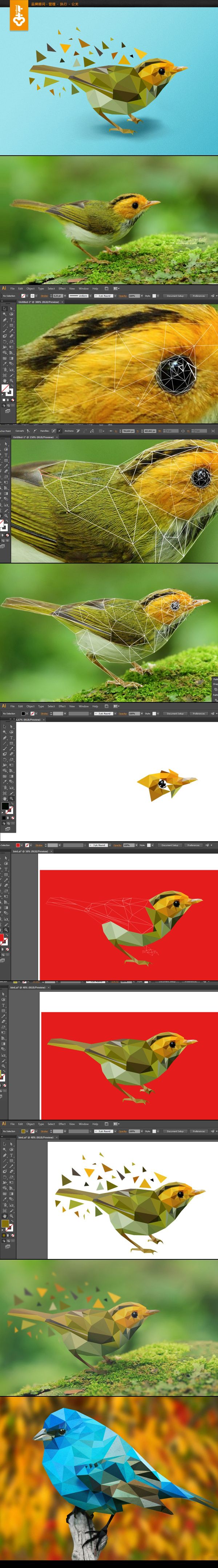
February 6, 2020 - Low Poly Design
You will be creating a Geometric/Low Poly design over the next few days. This will require you to download a photo you want to work with. You can choose an animal or person but no architecture or landscape photos. Using your pen tool and ONLY STRAIGHT LINES you will create triangles of varying sizes and degrees to create a geometric version of your photo. You should then fill in each shape with a color within that shape from the original photo.
* You should not have a stroke on any shape.
*You should have a background of some kind. This can be a gradient on the whole piece or a geometric landscape that ties into the subject.
*See examples below.
Process:
* You should not have a stroke on any shape.
*You should have a background of some kind. This can be a gradient on the whole piece or a geometric landscape that ties into the subject.
*See examples below.
Process:
January 24, 2020: Honeymooner's Gold
DUE: Thursday, January 30
Logo 10in x 10in
Labels
Business Info
Honeymooner's Gold
Established 2018
locally produced
Goal is to stay small and sell at local farmer's market or restaurant stand sales
Honey is the only product that will be offered and qualifies as organic and non-pasteurized.
Descriptor words: local, pure, raw, organic
Design Preferences
Logo MUST INCLUDE: a moon, a bee, and honeycomb pattern of some kind
Proverbs 24:13 must be on the label
Logo should be simple and able to be reproduced on clothing, business cards, or posters
Colors: yellows, golds, browns, and greys
Likes simple, rustic labels with minimal words
Contact Info
Email: [email protected] (Questions should go through me so he doesn't get duplicate questions.)
No website
Open to social media and may want help with filler post graphics
Misc Info
He has 4 colonies of 60,000 bees each (240,000 total)
Bees live for approximately 6 weeks
It takes 12 bees their whole life to generate 1 tablespoon of honey
He harvests spring and fall honey
Jar pricing
Logo 10in x 10in
Labels
- Small: 1.75in x 2in
- Medium: 1.5in x 1.5in
- Large: 2in x 2.5in
Business Info
Honeymooner's Gold
Established 2018
locally produced
Goal is to stay small and sell at local farmer's market or restaurant stand sales
Honey is the only product that will be offered and qualifies as organic and non-pasteurized.
Descriptor words: local, pure, raw, organic
Design Preferences
Logo MUST INCLUDE: a moon, a bee, and honeycomb pattern of some kind
Proverbs 24:13 must be on the label
Logo should be simple and able to be reproduced on clothing, business cards, or posters
Colors: yellows, golds, browns, and greys
Likes simple, rustic labels with minimal words
Contact Info
Email: [email protected] (Questions should go through me so he doesn't get duplicate questions.)
No website
Open to social media and may want help with filler post graphics
Misc Info
He has 4 colonies of 60,000 bees each (240,000 total)
Bees live for approximately 6 weeks
It takes 12 bees their whole life to generate 1 tablespoon of honey
He harvests spring and fall honey
- Spring honey
- lighter yellow
- comes from bees feeding off of white clover, black-eyed susan, and black locust
- Fall honey
- darker yellow/brown
- comes from the bees feeding on golden rod
Jar pricing
- Small: $5
- Medium: $8
- Large: $12-15
- XLarge: $24
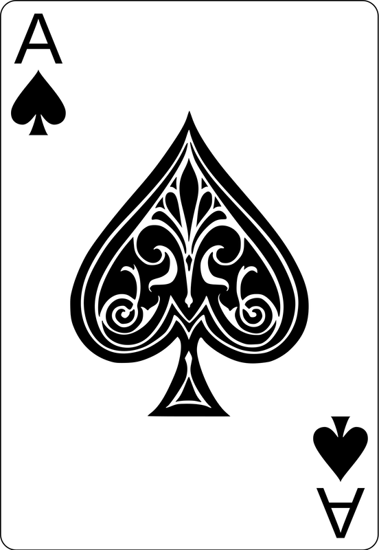
January 9th, 2020: Pathfinder & Path Profile Cont.
Use the provided image to complete your set of Aces.
Your work should be posted to your webpage before you leave today. (Even if you don't finish completely.) You will receive completion points for the days work that are not eligible for makeup. Today's work will not be accepted late.
Your work should be posted to your webpage before you leave today. (Even if you don't finish completely.) You will receive completion points for the days work that are not eligible for makeup. Today's work will not be accepted late.

January 8, 2020: Pathfinder
January 7, 2020: Reflect & Rotate
|
|
|

|
December: Pen Tool Practice
December 2, 2019: Illustrator Intro & Final Project Examples
The following files are examples of the prompt discussed in class. Project files should be saved as "yourname_card#" as a .psd file in a folder titled "yourname_finalproject". Files SHOULD NOT be compressed. When you have a complete set your entire project folder should be airdropped to Ms. White's Desk Computer. This must be done before the end of your class period on December 17th.
No work will be accepted after this deadline. Failure to transfer your files will result in a "0" score.
You will be creating 6 - 2 sided trading cards. Card dimensions are 2.5" wide x 3.5" tall. Files should be 5" wide x 3.5" tall to include the front and back.
Each card should include:
Player's photo
Player's name
Team name
Team logo
4 stats about the person
Custom background
November 18, 2019: Typography
You will be using the basics of typography to create a business card for yourself and your freelance work. Your card should be standard (3.5in x 2in) size and may be horizontally or vertically oriented. Your card should include each of the following:
- Company name (BACC Student Print Shop)
- Your name
- Your title (Freelance Designer or similar title)
- Contact email
- Contact phone (BACC # is 309.829.8671)
November 13, 2019: Avengers End Game Disintegration Effect
|
Use the linked image and brush set to complete this disintegration effect piece
|
| ||
November 11, 2019: Pixel Explosion Effect & Practice Certification
GMetrix Access Code: 71976-ha160-61210

November 8, 2019:
Read the linked article and in a new post on your webpage identify which traits you see strongly in yourself and which traits you need to improve. Discuss how you have developed some traits and what ways you can grow those traits that need work.
After you have finished your post use the following access code 71976-hs160-61210 to begin your first certification practice test.
After you have finished your post use the following access code 71976-hs160-61210 to begin your first certification practice test.
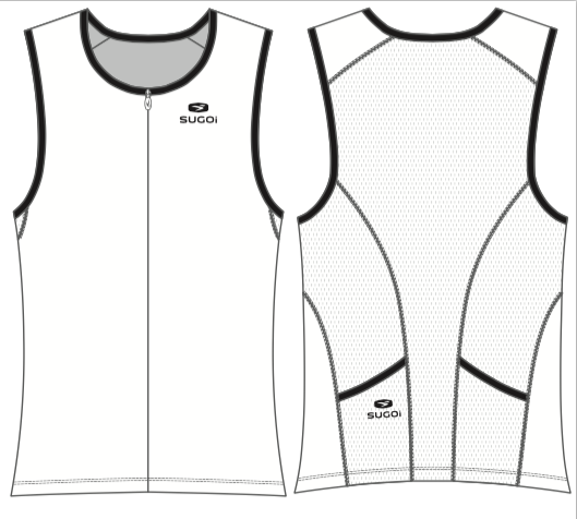
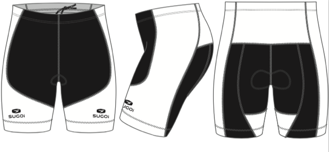
November 4, 2019: Triathlon Team Uniform
Use Photoshop to create a new design for each of the uniform pieces.
Attached is the kit file for the shorts and jersey. I have also attached some of our logos and usable graphics.
The kits will need the following:
Attached is the kit file for the shorts and jersey. I have also attached some of our logos and usable graphics.
The kits will need the following:
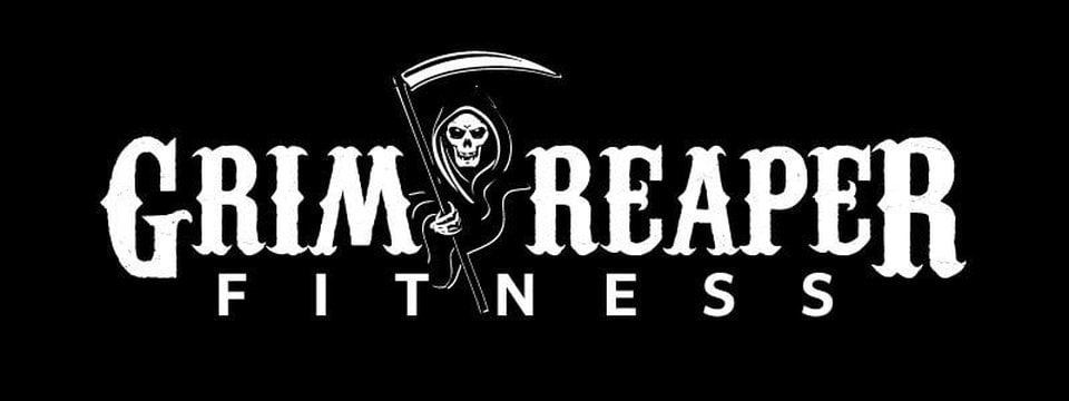
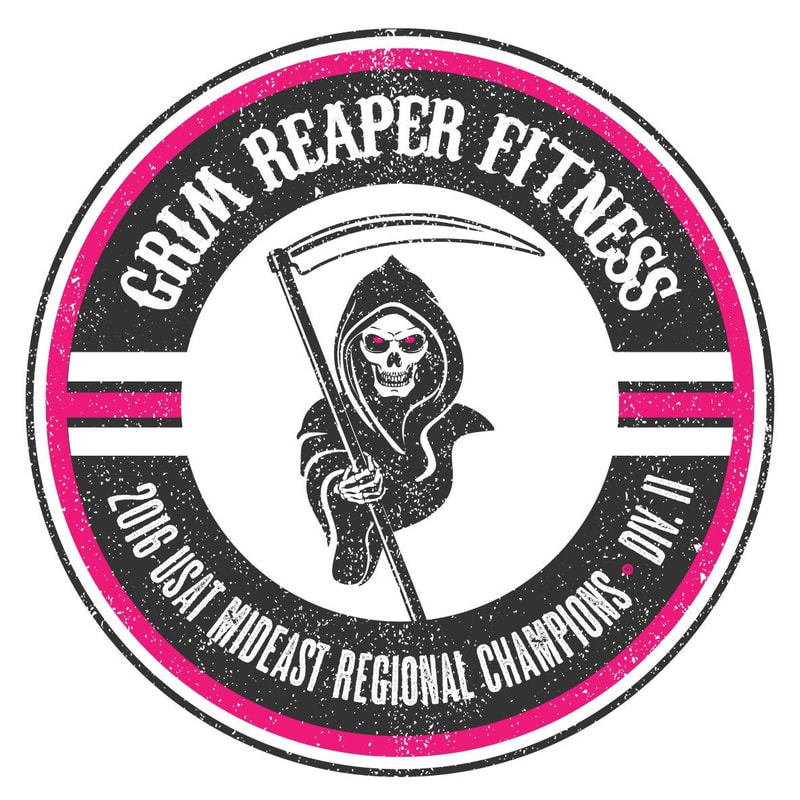
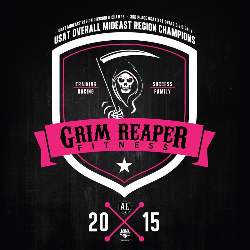
- Feel free to use any of the graphics I have attached, the only graphic we require is the Reaper somewhere on the top and bottom.
- Web address must be somewhere on suit, it can be small as long as its readable grimreaperfitness.com
- Grim Reaper Fitness somewhere
- Our colors have been mainly hot pink and black in the past, we probably want some pink in them, but we are not tied to that as our main color, we do however want them to stand out so they are easy to see in a crowd.
- We are going for an eerie/smoke/ominous look.
- The design has to work for both men and women
- The black section on the shorts has to stay solid black.
Usable Graphics
|
|
Example Uniform

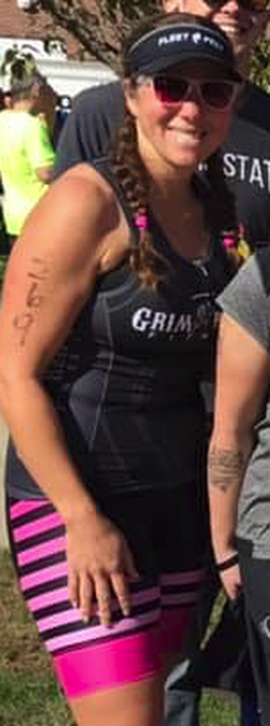
|
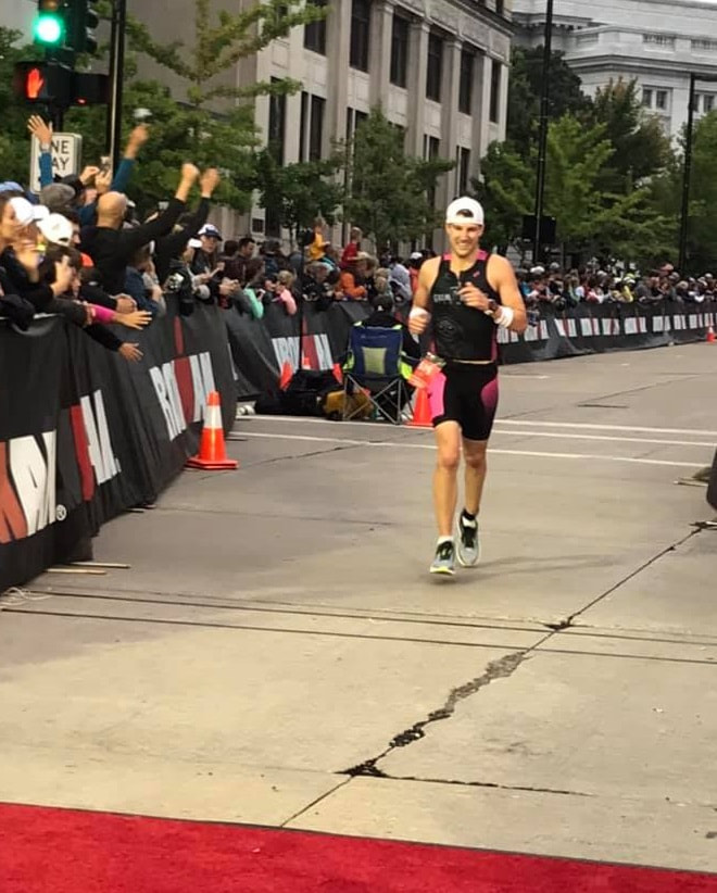

|
Finished Design Example
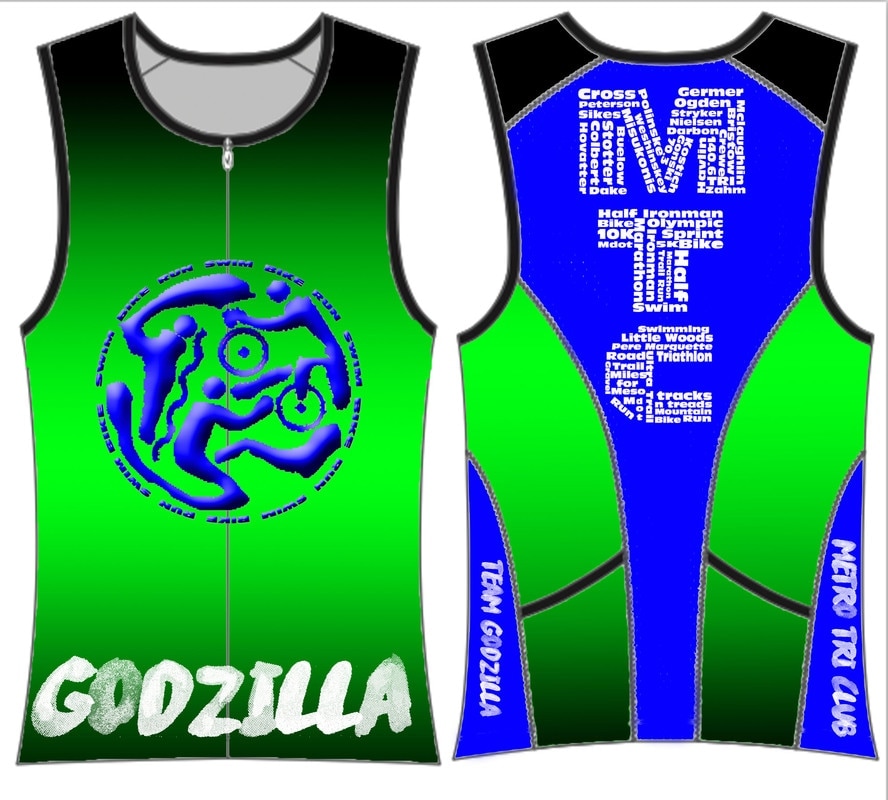
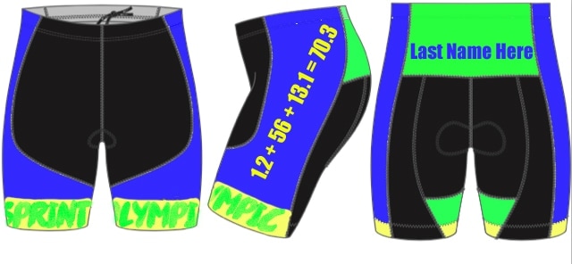
|
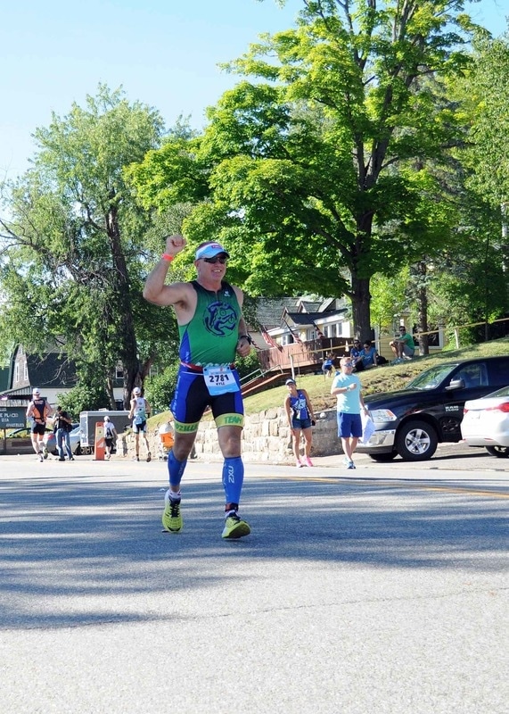
|
Templates
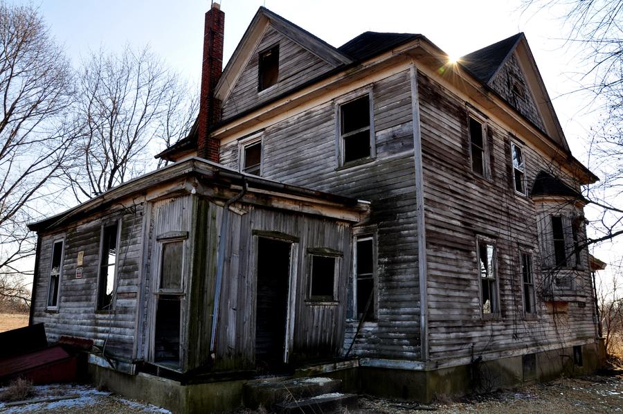
October 28, 2019: Halloween Fun
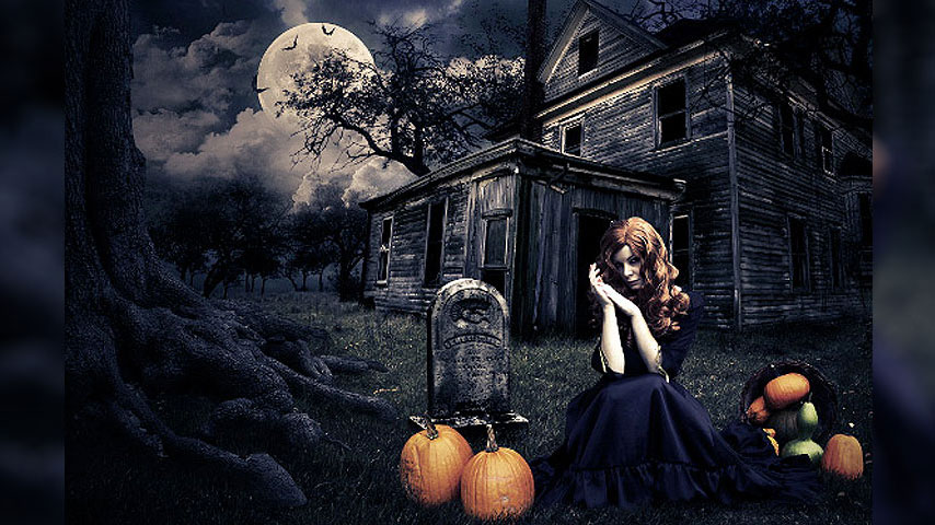
Source Files
|
Background
|
Sky
|

House
Roots

|
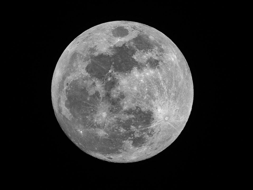
Moon
Pumpkin Girl

|
Brushes
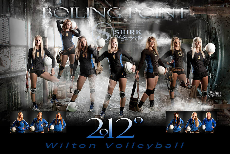
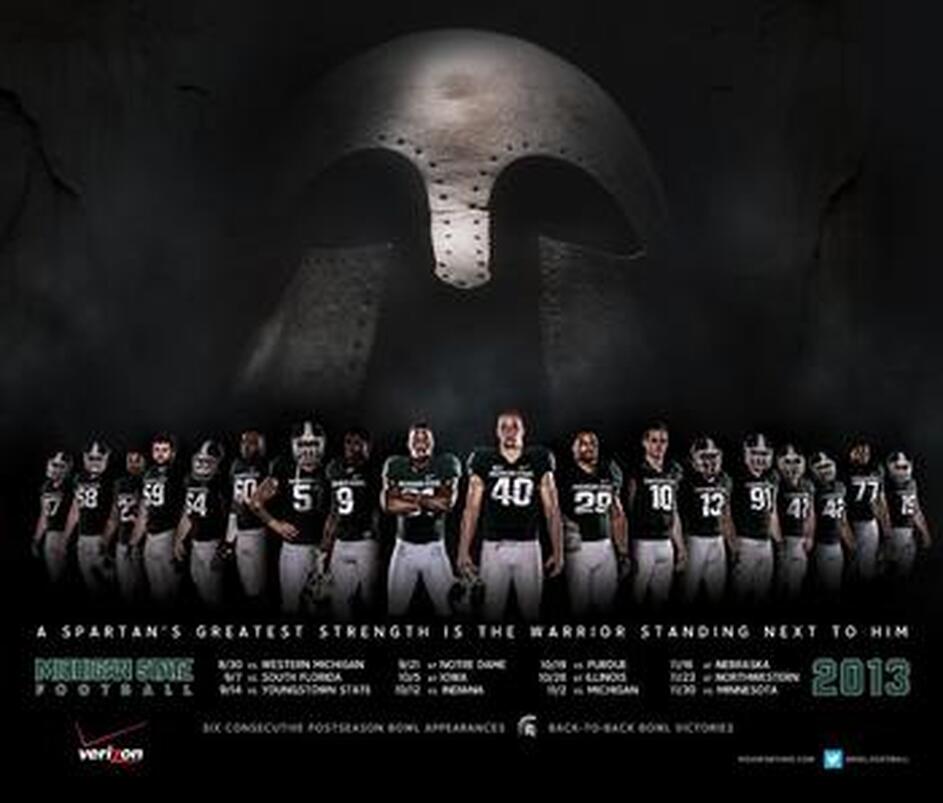
October 16, 2019: Team/Club Poster
| sports_poster_1.xlsx |
|
|
|
|
October 15, 2019: Poem Illustration & Color Palette Sign Display
October 10, 2019: Color Palette Sign Display
October 7, 2019: Student LED Conference Page Creation
Visit the Student Led Conference page and read the instructions. You will download and fill in each document to be added to your page. This assignment is for class credit and the parent feedback survey will serve as extra credit. I can answer more questions about how this process will run tomorrow. Use today to jumpstart completing these files.
*Remember, there is no “done”. If you hit a road block and after asking the second year students truly cannot finish use that time for productive exploration. You don’t have to stay in Photoshop but you should not be playing computer/phone games or just sitting in class.
*Remember, there is no “done”. If you hit a road block and after asking the second year students truly cannot finish use that time for productive exploration. You don’t have to stay in Photoshop but you should not be playing computer/phone games or just sitting in class.
October 1, 2019: Package Design
|
Crayola Color Pencil Package
Design a package to hold a custom set of 6 color pencils. Use the color scheme and theory to tailor your design to the feeling those colors convey. Include each of the following:
|
PlayDoh Package
Design a package to hold a custom set of 2 playdoh jars. Use the color scheme and theory to tailor your design to the feeling those colors convey. Include each of the following:
|
September 30, 2019: Color Theory
Red
Examples of red app icons: Pinterest, Google+, YouTube
Evokes: “Action, adventure, fire, lust, anger, courage and rebellion.”
Examples of red app icons: Pinterest, Google+, YouTube
Evokes: “Action, adventure, fire, lust, anger, courage and rebellion.”
- Red is best used for action orientated products and brands.
- Red and orange are colors that boost appetite.
- Red is one of the top two favorite colors of all people.
- Red is the most popular color used on flags in the world.
- Approximately 77% of all flags include red.
- Red is the international color for stop.

Orange
Examples of orange app icons: Blogger, RSS feed, MozillaFirefox
Evokes: “Energy, vitality, cheer, excitement, adventure, warmth, and good health.”
Examples of orange app icons: Blogger, RSS feed, MozillaFirefox
Evokes: “Energy, vitality, cheer, excitement, adventure, warmth, and good health.”
- Orange is a color that suggests value and discounts.
- Orange is symbolic of autumn.
- Children all over the world are drawn to orange.
- Orange is the color of life rafts, hazard cones, and high visibility police vests.

Yellow
Examples of yellow app icons: SnapChat, YellowPages, TimeHop
Evokes: “Happiness, optimism, enlightenment, creativity, sunshine, warmth, cheeriness and fun.”
Examples of yellow app icons: SnapChat, YellowPages, TimeHop
Evokes: “Happiness, optimism, enlightenment, creativity, sunshine, warmth, cheeriness and fun.”
- Yellow is the color that captures our attention more than any other.
- In almost every culture, yellow represents, sunshine, happiness and warmth.
- Yellow is the color most often associated with the deity in many religions.
- Yellow is the color of traffic lights and signs indicating caution all over the world.

Green
Examples of green app icons: WhatsApp, Vine, Facetime
Evokes: “Growth, rebirth, freshness, revitalisation, and fertility.”
Examples of green app icons: WhatsApp, Vine, Facetime
Evokes: “Growth, rebirth, freshness, revitalisation, and fertility.”
- Green is now the symbol of ecology and has become a verb.
- Green is universally associated with nature.
- Green symbolizes ecology and the environment.
- Green traffic lights symbolize “go” all over the world.

Blue
Examples of blue app icons: Facebook, Twitter, LinkedIn
Evokes: “Dignity, intelligence, cleanliness, peace, security and calmness of mind.”
Examples of blue app icons: Facebook, Twitter, LinkedIn
Evokes: “Dignity, intelligence, cleanliness, peace, security and calmness of mind.”
- Blue is the #1 favorite color of all people.
- However, blue can be over-used. Combining blue with another color creates a more creative effect.
- 53% of the flags in the world contain blue.
- Blue is the most commonly used color in corporate identity.

Purple
Examples of purple app icons: Viber, Yahoo!, Podcast
Evokes: “Nobility, wealth, magic, mystery, spirituality, creativity, dignity, and royalty.”
Examples of purple app icons: Viber, Yahoo!, Podcast
Evokes: “Nobility, wealth, magic, mystery, spirituality, creativity, dignity, and royalty.”
- There’s a huge difference of opinion about purple. It all depends on age.
- Purple tends to be a color that people either love or hate.
- Purple is the color of mourning or death in many cultures.
- Purple is not common flag color. Only two flags contain purple.

Now, using 2 different photos you find convey a feeling through the colors you choose to apply this effect.
September 26, 2019:
Using one of the provided images below create the following photo illustration.


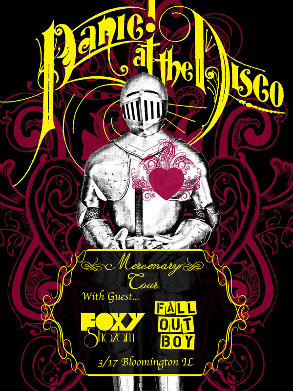
September 23, 2019: Text Hierarchy
|
Concert PosterPosters should be 18" x 24" or 24" x 18".
| ||||
September 18, 2019: Theatrical Portrait
Try out this tutorial with the provided photo then head out to take your own image and problem solve how the settings/effects will need to change.
September 17, 2019: Portrait Sessions
| 2.pdf |
September 16, 2019: Cleaning up photo backgrounds
Video of photo clean up.
Choose 2 of the following photos and make the indicated changes.
Choose 2 of the following photos and make the indicated changes.
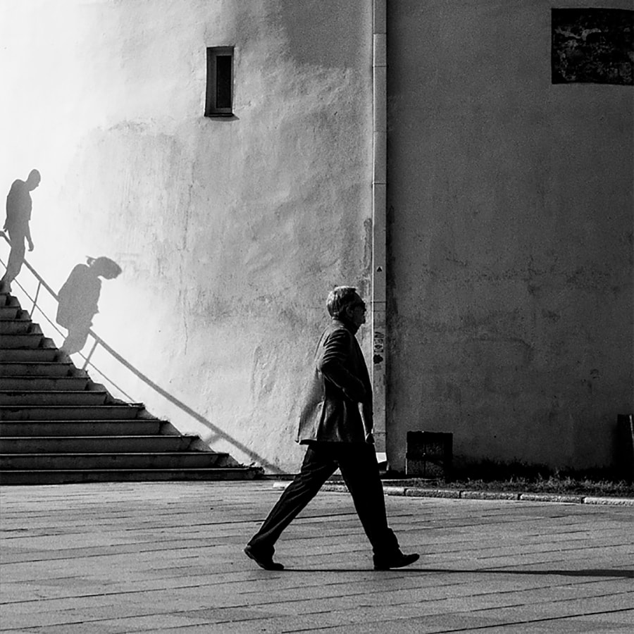
Shadows on the stairway.
|

Blue truck and black car on the street
|

Pole
|
People and van
|
People and car
|
Viewfinder
|
September 13, 2019
Case Study - This assignment is for 1st AND 2nd year students.
Read the article linked below and complete the review.
Your review should be in a Pages document (Open your launchpad and search pages. This is the Apple equivalent to Word.)
Use Times New Roman, 12pt font, with your name and class in the top left corner.
In your review you should have the following in well thought out, complete paragraphs:
- A summary of the article
- Your thoughts on the information provided
- What questions do you have that would require further information?
- What solutions do you think would fix any problem presented?
- How will you use the information presented?
| 9-12-19_picture_perfect_the_direct_effect_of_manipulated_instagram_photos_on_body_image_in_adolescent_girls.pdf |
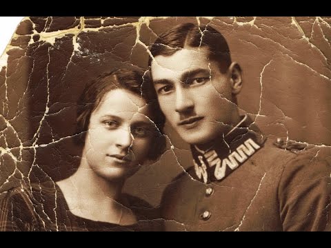
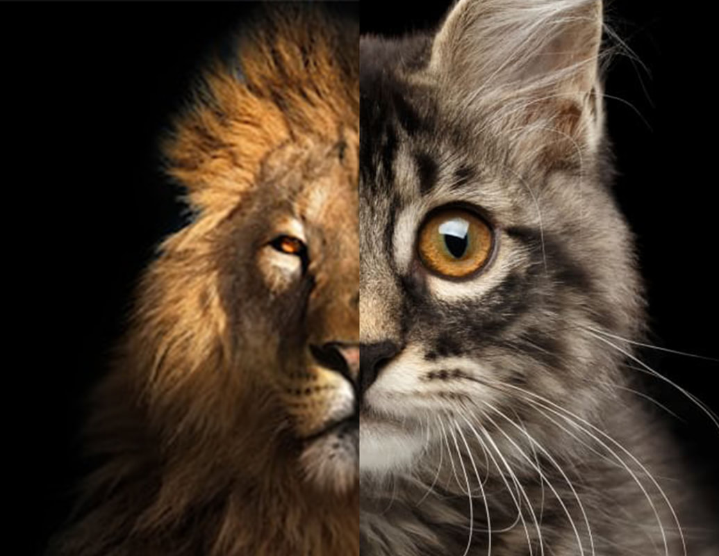
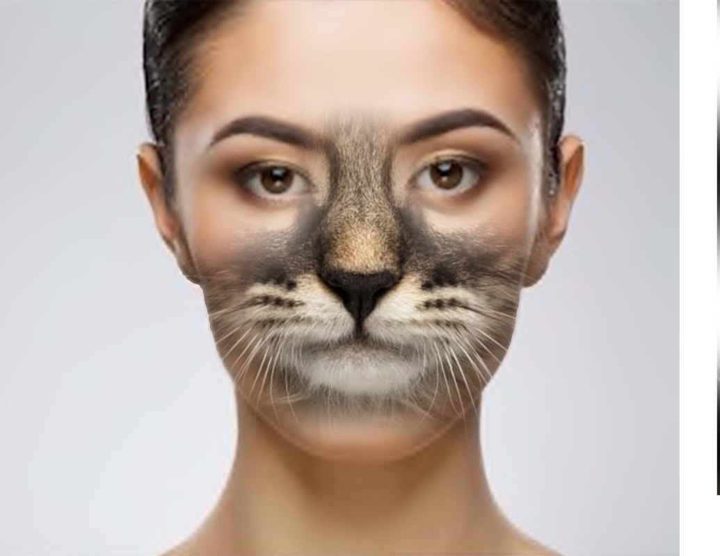
September 9, 2019: Photo Manipulation
September 6, 2019: Principles of Design - Contrast
Contrast is one of the key principles within Composition and Layout. Contrast in design is an accentuation of the differences between elements in a design. Most people think of contrast only as it applies to colors, but contrast can work with any design element. Contrast is important because the meaningful essence of any thing is defined by its value, properties, or quality relative to something else. Nothing has meaning by itself.
Importance of Contrast Focus
Contrast creates focus. In the iPod advertisement below, the designer used a silhouetted character on a brightly green colored background in contrast with the iPod and earphones in white. The design creates contrast and focuses the viewers' attention on the music player.
Organization
Contrast help with organizing the information and improving the clarity of the message. Contrast helps lead the reader’s eye into and through your layout. Each component is but a piece of the overall project message and objective. With creative uses of contrast, you can influence user choices and compel specific actions.
Appeal
A main reason to use contrast in a design, whether for print or web, is to grab attention. Contrast creates an impact, but too high contrast between design elements might give an unsettled and messy impression.
Forms of Contrast
Contrast with Color
According to Colin Ware, most principles for effectively using color in design can be derived from an understanding of the red-green, yellow-blue, and black-white color channels. A phenomenon known as simultaneous contrast occurs in each of the channels. The effect of simultaneous contrast is distortion of the appearance of a patch color that increases the differences between a color and its surroundings. This is called lightness or brightness contrast when it occurs in the black-white channel, and chromatic contrast when it occurs in either the red-green or yellow-blue channel. Contrasting colors are those on opposite sides of the color wheel. The further apart and more directly opposite each other, the greater the contrast. For example, red is from the warm half of the color wheel and blue is from the cool half. Opposite colors is also referred to as complementary colors which generally refers to each of a pair of colors that are directly opposite each other on the color wheel, such as purple and yellow.
Contrast with Size
Big and small elements of the same type as seen on the figure 5, are the most obvious uses of size to create contrast. The big elephant is in contrast with a smaller creature walking beside it.The second picture below shows contrasting white space or the physical size of the piece with another element of the design as another method of contrast. The huge pyramid is in contrast with a person walking in front of the pyramid.
Contrast with Type
Type contrast can use size, value, and color to create contrasting typographic treatments. One can add bold or italics to create contrast, mix large type with small type, or combine serif with sans serif type to create type contrast. You can also set portions of text in contrasting colors or varying values. Changes in type alignment create contrast as does type spacing such as extreme kerning for headlines.
Contrast with Value
The relative lightness or darkness of two elements to each other can create a contrast in value. Whether with shades of gray or tints and shades of a single color, the further apart the values the greater the contrast.
Contrast with Other Design Elements
Contrast is one of the most powerful design concepts because any design element can be contrasted with another. Use the principle of contrast to create strong dynamic differences among elements that are different. If it is different, make it very different. You can achieve contrast through the manipulation of space, color choices, text selection, positioning, and so on. Making use of contrast can help you create a design in which one item is clearly dominant. This helps the viewer get the point of your design quickly. Every good design has a strong and clear focal point and having a clear contrast among elements helps. If all items in a design are of equal or similar weight with weak contrast and with nothing being clearly dominant, it is difficult for the viewer to know where to begin. Designs with strong contrast attract interest, and help the viewer make sense of the visual.

September 5, 2019: Layers & Color
| 2.pdf |
August 29, 2019: Principles and Elements of Design
Find an example of each of the following and in your own words define its use related to graphic design. Post your examples and descriptions on your assignments page as a new post. (If you would like to make 2 posts, one for Principals of Design and one for Elements of Design that is ok.)
Principals of Design
Elements of Design
Principals of Design
- Contrast
- Repetition
- Emphasis
- Balance
- Proportion/Scale
- Harmony
- Rhythm/Movement
Elements of Design
- Line
- Shape
- Form
- Color
- Texture
- Space
- Value
August 28, 2019: TED Talk
August 22, 2019
|
| ||
August 21, 2019
|
| ||
August 20, 2019
|
| ||
