April 29, 2019: Final Project - Apparel Line
| final_presentation.pptx |
Matte HTV vinyl: length x width x .02
Glitter or Holographic HTV vinyl: length x width x .08
Adhesive vinyl: length x width x .04
Glitter or Holographic HTV vinyl: length x width x .08
Adhesive vinyl: length x width x .04
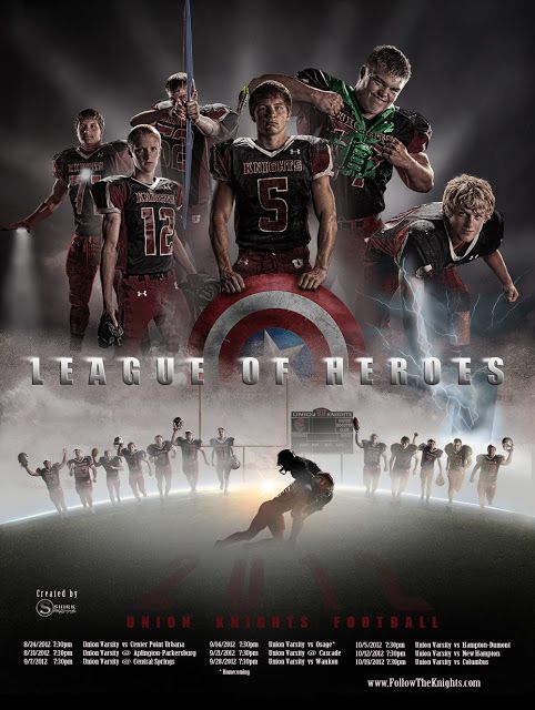
SkillsUSA Competition
See the SkillsUSA page for a complete list of projects to choose from and their technical standards. REMEMBER: This includes an in class presentation and display.
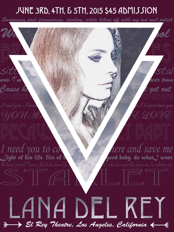
March 18, 2019: 2 Print Designs
March 4, 2019: Music Video
February 21, 2019: How to Video
| video_project_3-_how_to_video.docx |
|
|
|
February 19, 2019: Creative Commons Continued & Production Logo
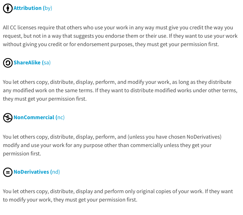
Several sites offer music published under Creative Commons’ flexible copyright licenses.
Here are some:
Can I use any song with a CC license on it? Almost — you need to make sure that what you want to do with the music is OK under the terms of the particular Creative Commons license it’s under. CC-licensed music isn’t free for all uses, only some — so make sure to check out the terms (you can find these by clicking on each song’s license icon).
Most importantly, you need to use music that is not licensed under a No Derivative Works license. This means that the musician doesn’t want you to change, transform, or make a derivative work using their music. Under CC licenses, synching the music to images amounts to transforming the music, so you can’t legally use a song under a CC No Derivative Works license in your video.
Also, make sure to properly credit the musician and the track, as well as express the CC license the track is under. For example, you might include text like this at the end of your video:
"This video features the song “Desaprendere (Treatment)” by fourstones,
available under a Creative Commons Attribution-Noncommercial license."
Here are some:
- ccMixter
- Free Music Archive
- Jamendo
- Magnatune
- Simuze
- BeatPick
- CASH Music
- SectionZ
- Opsound
- Podsafe Audio
- AudioFarm
- Internet Archive’s Netlabels Collection
Can I use any song with a CC license on it? Almost — you need to make sure that what you want to do with the music is OK under the terms of the particular Creative Commons license it’s under. CC-licensed music isn’t free for all uses, only some — so make sure to check out the terms (you can find these by clicking on each song’s license icon).
Most importantly, you need to use music that is not licensed under a No Derivative Works license. This means that the musician doesn’t want you to change, transform, or make a derivative work using their music. Under CC licenses, synching the music to images amounts to transforming the music, so you can’t legally use a song under a CC No Derivative Works license in your video.
Also, make sure to properly credit the musician and the track, as well as express the CC license the track is under. For example, you might include text like this at the end of your video:
"This video features the song “Desaprendere (Treatment)” by fourstones,
available under a Creative Commons Attribution-Noncommercial license."
As we move through video editing we have added credit requirements to all video assignments and are now going to work on Title or Opening sequences. The first requirement for this is a production name you want to work under. Just like a business name needs a logo or sequence you will need a graphic to go along with your productions. Use the next few days to research production names and logos and then create your own original logo. This will be placed at the beginning of every video project from here on out so take your time and MAKE IT GOOD!!!
February 14, 2019: Illustration Prompt
After your 3 Feeling Through Sound videos are done:
Illustrate the following prompt:
You find an empty notebook on the ground outside school and begin using it for reminders. You write "Remember to feed the dog"
The next morning you see on the news, "Breaking News: Scientists receive message from distant galaxy via radio waves that simply says, 'Remember to feed the dog."
Your work should be posted on your website by the end of class.
February 13, 2019: Creative Commons &
Feeling Through Sound Videos
Feeling Through Sound
3 videos titled "Feeling Through Sound 1", "Feeling Through Sound 2", and "Feeling Through Sound 3"
3 videos titled "Feeling Through Sound 1", "Feeling Through Sound 2", and "Feeling Through Sound 3"
- 20-30 second video clip
- Original audio removed
- New audio added to change the feeling of what you see
- Credit given to audio/video artists
February 12, 2019: Final Cut Pro Introduction
- Libraries vs. Events vs. Projects
- Importing Media
- Zooming in/out on the Playbar
- Removing Audio
- Stock Audio/Sound Effects
- Adding Text
- Sharing Finished Files
February 4, 2019: Animated Character Continued
Return to work on your Animated Character. Final Pieces will be due to your web page by the end of class on February 8th.
January 31, 2019: Virtual Learning Day 2
Before Noon please email me ([email protected]) that you have seen the assignment. This will be used as attendance and an opportunity to ask any questions.
Watch the TED Talk video : https://tinyurl.com/ybmdt6jt
In a new blog post reflect about what you heard. What was a new idea or piece of information for you? What do you think about how the artist addressed obstacles? What could you apply to your work in this class and life in general?
Watch the TED Talk video : https://tinyurl.com/ybmdt6jt
In a new blog post reflect about what you heard. What was a new idea or piece of information for you? What do you think about how the artist addressed obstacles? What could you apply to your work in this class and life in general?
January 30, 2019: Virtual Learning Day
Before Noon please email me ([email protected]) that you have seen the assignment. This will be used as attendance and an opportunity to ask any questions.
Read the following story and complete the Free Drawing Activity. Think about how a story translates to you and what you imagine when you read it. Your drawing should be posted as a new blog post on your website by midnight Wednesday night. (A cell phone photo or scan of your drawing is perfectly fine.)
Free Drawing Instructions
Prompt
You can control the probability of things around you. When something will start, who will win, etc.
You change the probability of getting an "A" on your test.
When you get it back, you see there's an "F", with a note reading, "Don't try your magic on me."
Read the following story and complete the Free Drawing Activity. Think about how a story translates to you and what you imagine when you read it. Your drawing should be posted as a new blog post on your website by midnight Wednesday night. (A cell phone photo or scan of your drawing is perfectly fine.)
Free Drawing Instructions
- Gather supplies
- Blank, unlined, paper
- Colored Pencils, Crayons, or Markers
- Read the prompt
- Set a timer for 10 minutes
- Using any of your materials sketch out what you see/feel/think about the story
Prompt
You can control the probability of things around you. When something will start, who will win, etc.
You change the probability of getting an "A" on your test.
When you get it back, you see there's an "F", with a note reading, "Don't try your magic on me."
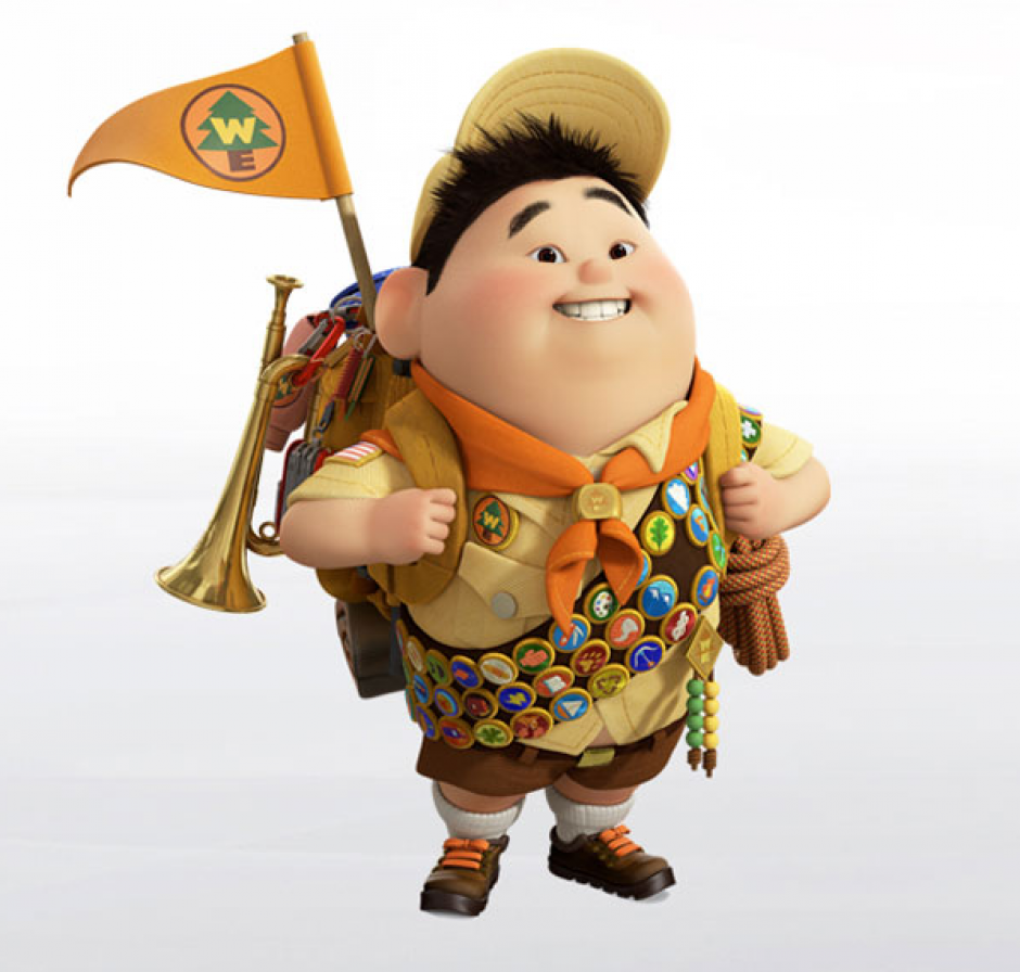
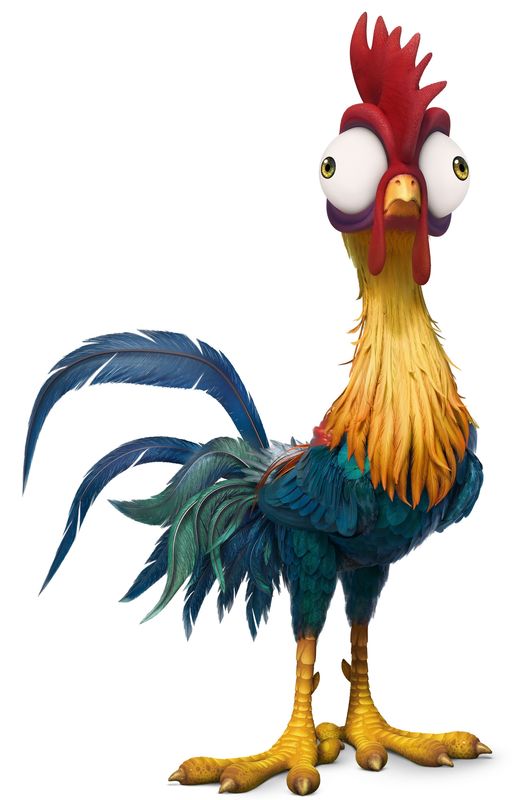
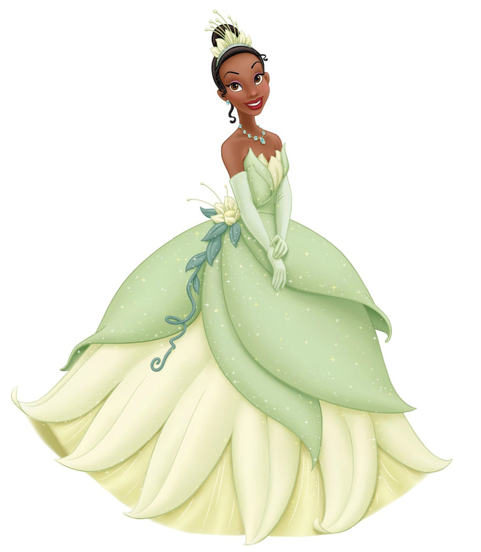
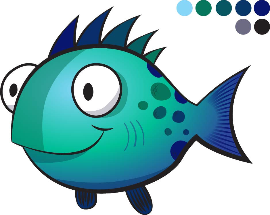
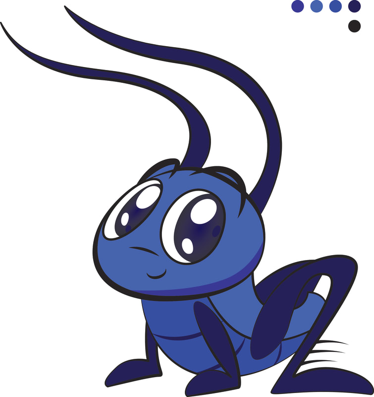
January 22, 2019: Animated Character
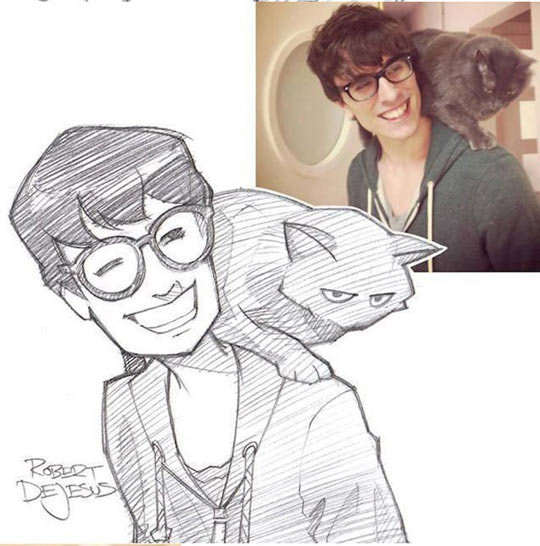
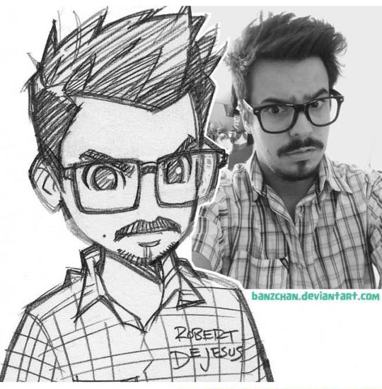
Choose any Pixar, Dreamworks, Disney, etc. character to illustrate. Do not choose a "flat" character but rather one with depth (shadows/highlights). Your character should also be a full body character (head to foot or fin whatever the case may be). Your character should be done on an 18" x 24" artboard and should include a background or scene that is appropriate to that character.
Examples of Acceptable Characters:
Examples of Acceptable Characters:
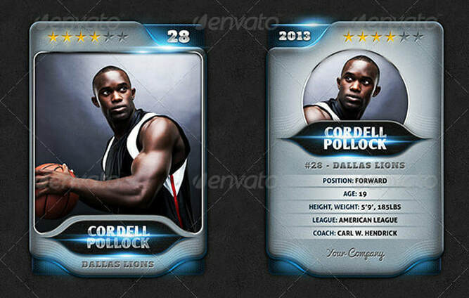
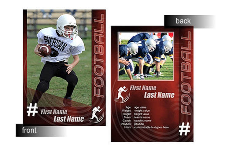
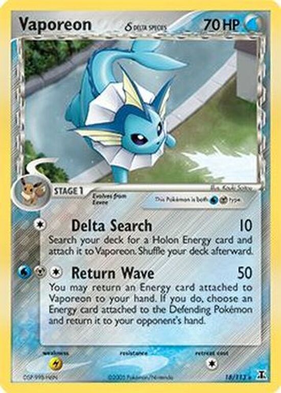
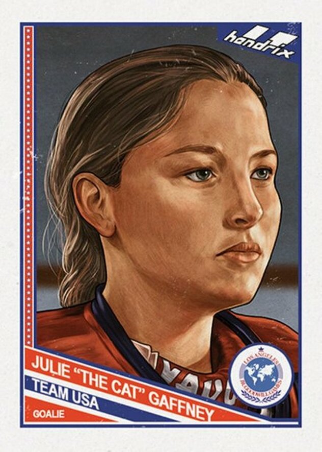
January 7, 2019: Trading Card Project
Cards must include:
- Dimensions 2.25" x 3.5" (1 file with 6 fronts and 1 file with 6 backs)
- Name (title if applicable)
- 4 distinguishing pieces of information ( this could be a logo or information about the person like height or sport stats)
December 10, 2018: Final Project
The following files are digital copies of the prompt distributed in class and files referenced therein. Use all of the following to complete your final project. Project files should be in a folder titled "yourname_finalproject" and airdropped to Ms. White's Desk Computer before the end of your class period on December 17th.
No work will be accepted after this deadline. Failure to transfer your files will result in a "0" score.
No work will be accepted after this deadline. Failure to transfer your files will result in a "0" score.
| graphic_design_and_video_production_final_project.docx |
November 29, 2018: Photo sketch Illustration
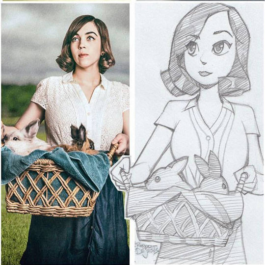
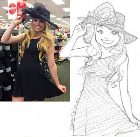
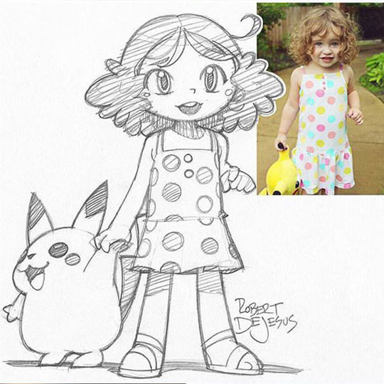
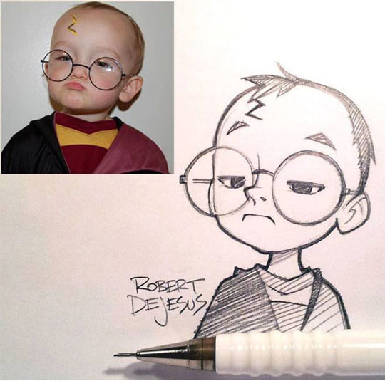
November 26, 2018: Sketch to Illustration
|
|
November 19, 2018: Rotation and Reflection with shapes vs. paths
|
|
November 16, 2018: Rotation and Reflection
|
|
November 15, 2018: White Space


|

|
November 14, 2018: Reflection and Pathfinder Options
November 13, 2018: Using Paths and Shapes
November 12, 2018: Illustrator Intro

November 9, 2018: Pixel Explosion
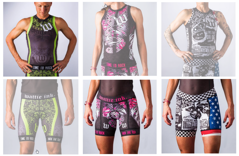
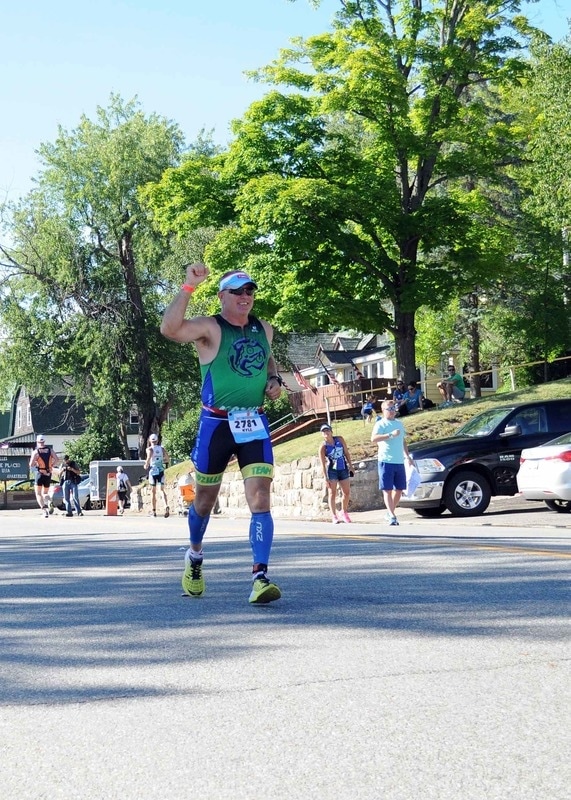
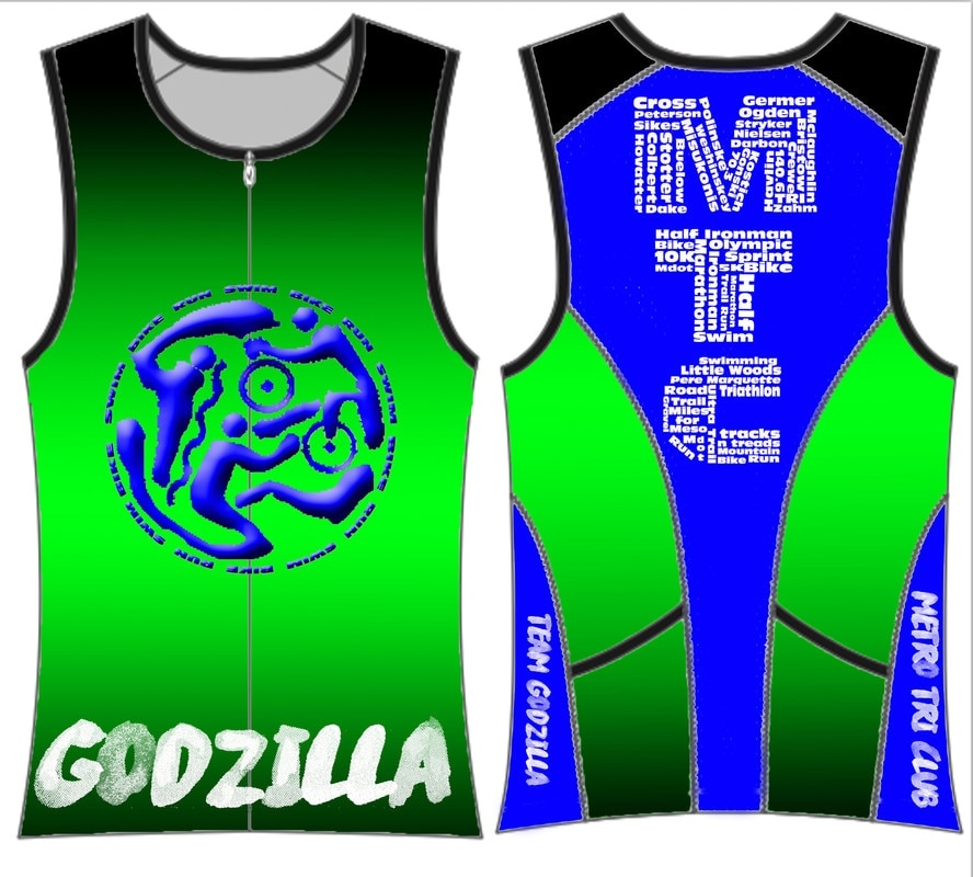
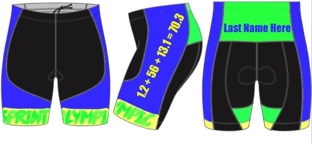
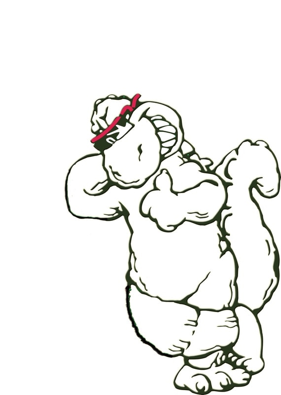
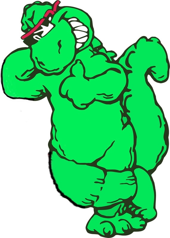
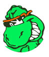
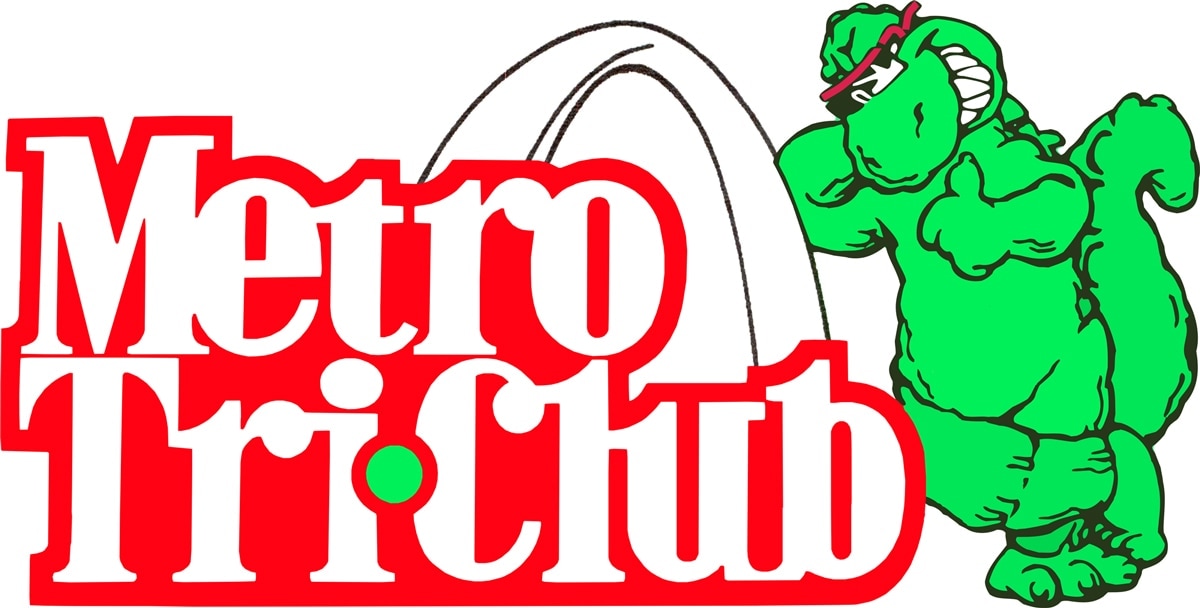
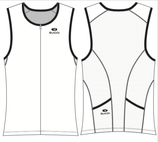
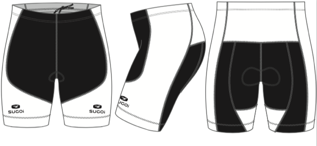
November 5, 2018: Triathlon Club Uniform
Use Photoshop to create a new design for each of the uniform pieces.
Attached is the kit file for the shorts and jersey. I have also attached some of our logos, a photo of the existing kit, a ppt slide with example of the style we are looking for (tattooish)
The kits will need the following:
Feel free to use any of the graphics I have attached, the only one we require is the Godzilla leaning on the arch with the Metro Tri Club text, you can change colors or make it black and while, it just needs to be that graphic.
Web address must be somewhere on suit, it can be small as long as its readable www.teamgodzilla.org
Metro Tri Club or MTC somewhere
Team Godzilla somewhere
Our colors have been mainly green, yellow and blue in the past, we probably want some green and yellow in them, but we are not tied to that as our main colors, we do however want them to stand out so they are easy to see in a crowd.
We are going for a tattoo kind of feel to them
The design has to work for both men and women
The black section on the shorts has to stay solid black.
Past Uniforms/Ideas
|
|
Usable Images
|

|
Templates
October 29, 2018: Halloween Project of Choice
Skull Face Source Files:
|
|
| ||||||
October 23, 2018
Continue with your conference papers.
If you need a quick break check out this article on the 5 ways illustration skills can further your career.
If you need a quick break check out this article on the 5 ways illustration skills can further your career.
October 22, 2018: Student Led Conference Page
Use this page to begin your Parent Conference page. This will be a NEW PAGE on your website. You will choose 3 pieces of work. (They can be pieces you have done independently or ones we have done together.) I have also provided an example of what this page should look like when it is finished.
October 18, 2018: 3D Type
In this Photoshop tutorial, you are going to learn how to create some 3D text using only Photoshop. The mood we will strive to incorporate in our piece is dark and grungy. We are going to use consistent lighting and layer styles to create shadows for our type, Photoshop filters, and more. We will finish off our scene by adding a dark textured background that seems to fade out as it approaches the edge of the canvas — a popular design technique.
Click here to begin.
Click here to begin.
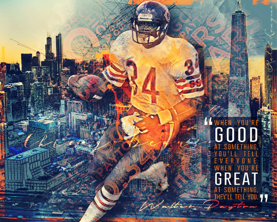
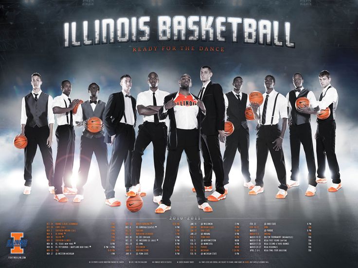
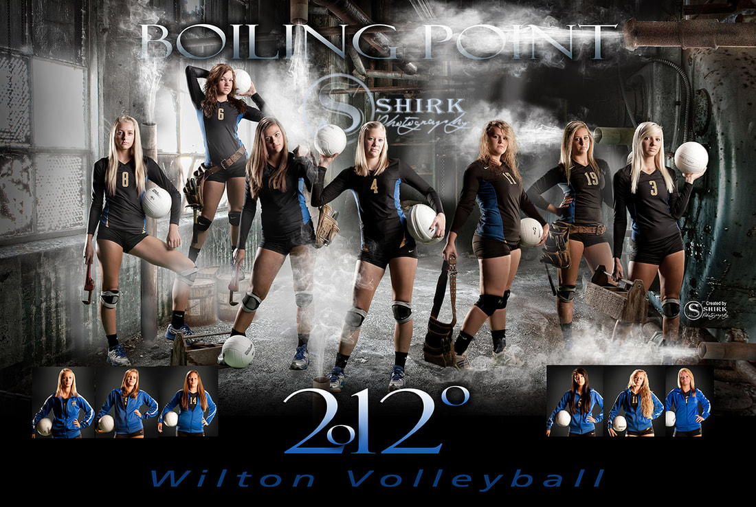
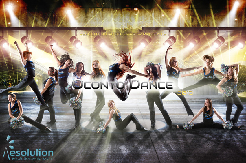
October 10, 2018: Sport/Team/Club Poster
Create a poster featuring a sport/club team. Use your Photoshop skills to make the poster interesting, attractive and a poster the team would be proud to use. Consider the design rules when laying out the poster.
REMEMBER DIMENSIONS: 18" x 24" with resolution of 300
REMEMBER DIMENSIONS: 18" x 24" with resolution of 300
| sports_poster_1.xlsx |
|
|
|
|
|

|
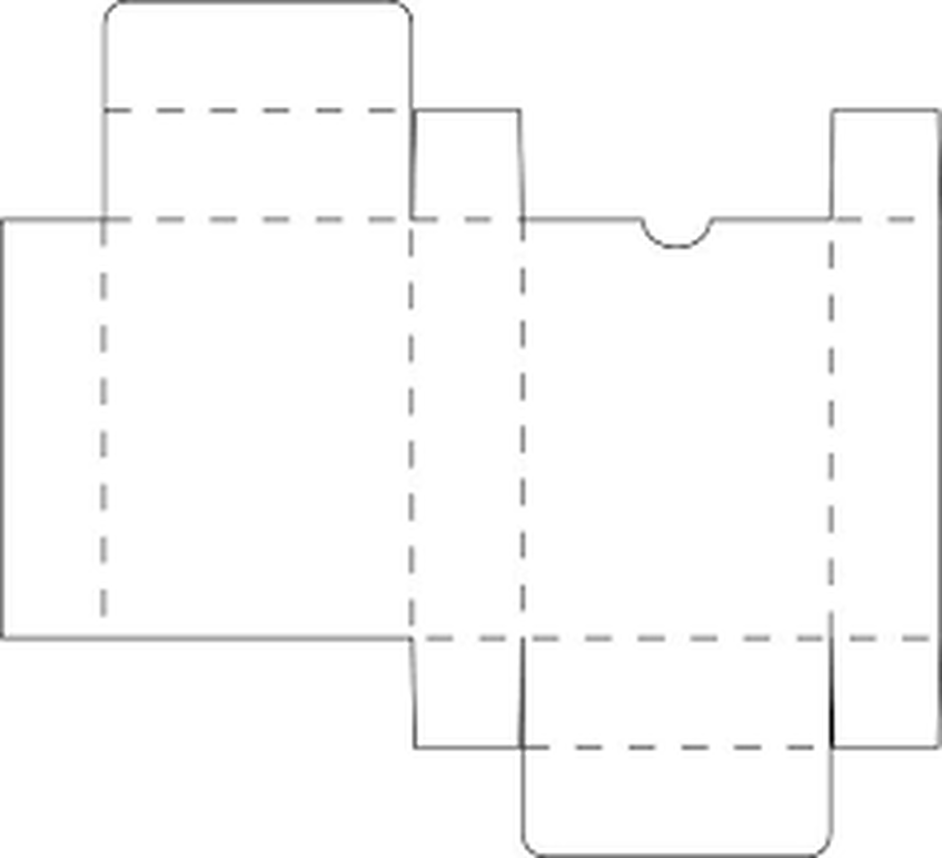
October 3, 2018: Package Design
The following must be included on your label
7" x 2" with .25" overlapping to wrap the design
- Play Dough logo
- Do not eat warning
- Care instructions: "Always put compound back in container after play. Store in a cool place. If necessary, water may be added one drop at a time to restore softness."
7" x 2" with .25" overlapping to wrap the design
October 1, 2018: Disintegration Effect
Let's try this again. All the files needed are below as well as the link.
REMEMBER: If instructions indicate the use of the Control key that is for Windows operating systems. We substitute the Command key in its place.
Disintegration Effect
REMEMBER: If instructions indicate the use of the Control key that is for Windows operating systems. We substitute the Command key in its place.
Disintegration Effect
| particle_brush_2.abr |
September 25, 2018: Type
|
A small look at what it means to design with type for clients.
|
|
Everyone will create TWO typefaces. One will be a script style of your handwriting and the other will be a display font of anything you would like. (This could be a wingdings style or a stylized version of your handwriting.) You will need to use the attached file to create each set and then upload it into www.calligraphr.com
| calligraphr-template.pdf |
September 20, 2018
Using one of the provided images below create the following photo illustration.
September 19, 2018: Color Correction
September 17 & 18, 2018: Color Theory
Today we will be addressing terms associated with color theory and principles. Here are a list of key terms that we will be using. Today you will be creating a single post on your assignments page with these terms and their definitions.
Accent color
Achromatic color
Additive color
Analogous color
Bezold effect
Chroma
Color harmony
Color interaction
Color key
Color overtone
Color theory
Complementary Color
Composition
Hue
Intensity
Monochromatic
Opponent theory
Primary colors
Saturation
Secondary color
Shade
Simultaneous contrast
Split complementary Color
Subtractive color
Temperature
Tertiary colors
Tint
Tone
Value
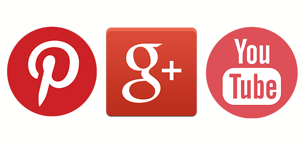
Red
Examples of red app icons: Pinterest, Google+, YouTube
Evokes: “Action, adventure, fire, lust, anger, courage and rebellion.”
Examples of red app icons: Pinterest, Google+, YouTube
Evokes: “Action, adventure, fire, lust, anger, courage and rebellion.”
- Red is best used for action orientated products and brands.
- Red and orange are colors that boost appetite.
- Red is one of the top two favorite colors of all people.
- Red is the most popular color used on flags in the world.
- Approximately 77% of all flags include red.
- Red is the international color for stop.
Orange
Examples of orange app icons: Blogger, RSS feed, MozillaFirefox
Evokes: “Energy, vitality, cheer, excitement, adventure, warmth, and good health.”
Examples of orange app icons: Blogger, RSS feed, MozillaFirefox
Evokes: “Energy, vitality, cheer, excitement, adventure, warmth, and good health.”
- Orange is a color that suggests value and discounts.
- Orange is symbolic of autumn.
- Children all over the world are drawn to orange.
- Orange is the color of life rafts, hazard cones, and high visibility police vests.

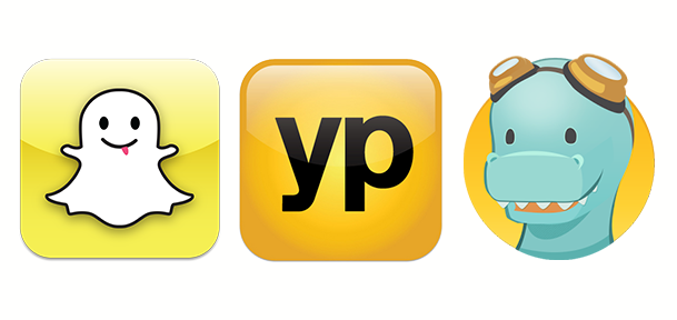
Yellow
Examples of yellow app icons: SnapChat, YellowPages, TimeHop
Evokes: “Happiness, optimism, enlightenment, creativity, sunshine, warmth, cheeriness and fun.”
Examples of yellow app icons: SnapChat, YellowPages, TimeHop
Evokes: “Happiness, optimism, enlightenment, creativity, sunshine, warmth, cheeriness and fun.”
- Yellow is the color that captures our attention more than any other.
- In almost every culture, yellow represents, sunshine, happiness and warmth.
- Yellow is the color most often associated with the deity in many religions.
- Yellow is the color of traffic lights and signs indicating caution all over the world.
Green
Examples of green app icons: WhatsApp, Vine, Facetime
Evokes: “Growth, rebirth, freshness, revitalisation, and fertility.”
Examples of green app icons: WhatsApp, Vine, Facetime
Evokes: “Growth, rebirth, freshness, revitalisation, and fertility.”
- Green is now the symbol of ecology and has become a verb.
- Green is universally associated with nature.
- Green symbolizes ecology and the environment.
- Green traffic lights symbolize “go” all over the world.

Blue
Examples of blue app icons: Facebook, Twitter, LinkedIn
Evokes: “Dignity, intelligence, cleanliness, peace, security and calmness of mind.”
Examples of blue app icons: Facebook, Twitter, LinkedIn
Evokes: “Dignity, intelligence, cleanliness, peace, security and calmness of mind.”
- Blue is the #1 favorite color of all people.
- However, blue can be over-used. Combining blue with another color creates a more creative effect.
- 53% of the flags in the world contain blue.
- Blue is the most commonly used color in corporate identity.

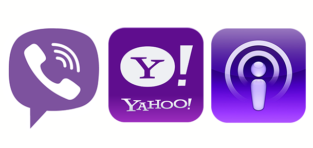
Purple
Examples of purple app icons: Viber, Yahoo!, Podcast
Evokes: “Nobility, wealth, magic, mystery, spirituality, creativity, dignity, and royalty.”
Examples of purple app icons: Viber, Yahoo!, Podcast
Evokes: “Nobility, wealth, magic, mystery, spirituality, creativity, dignity, and royalty.”
- There’s a huge difference of opinion about purple. It all depends on age.
- Purple tends to be a color that people either love or hate.
- Purple is the color of mourning or death in many cultures.
- Purple is not common flag color. Only two flags contain purple.
Now you will be illustrating the feeling of a color following this tutorial. First, visit paletton.com and choose your monochromatic color scheme. Save the color codes so that you can refer back to them as you work. Then choose the word describing that color that you will illustrate (HINT: don't choose an enormously long word 5-7 letters is best) Then begin the tutorial replacing the colors used with the colors in your scheme.
| color.jpg |
| onelily-colormatters.jpg |
September 12, 2018: Concert Poster
| concert_poster_rubric_4.docx |
Posters should be 18" x 24" with 300 resolution.
Due Date: Friday, September 15th
Due Date: Friday, September 15th
September 11, 2018: Glow Text
Work through the Glow Text Effect tutorial using your own phrase or word. Take your time and look at the images that go along with the instructions. If you run into a problem please ASK! If you don't finish today that is fine but please POST WHAT YOU FINISH AT THE END OF THE DAY.
Grace and Rowan: Homecoming materials
Johnnie and Adriana: Fire Science shirts
Johnnie and Adriana: Fire Science shirts
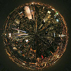
September 7, 2018: Filters, Blending Options, & My Own Little World
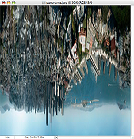
STEP 1: RESIZE AND ROTATE
The first thing we need to do is prepare the image for the Polar filter. We do this by stretching the height of the image so that the image is a perfect square.
Select Image>Image Size from the menus. Uncheck ‘Constrain Proporties’ and set the “height” to the same value as your “width”. Next, rotate the image 180 degrees. (Image>Rotate Canvas>180)
You should end up with something like this:
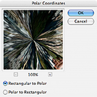
STEP 2: APPLY THE POLAR FILTER
Next, we’ll apply the Polar Filter to wrap our image into a sphere.
Choose Filter > Distort > Polar Coordinates from the menus and in the resulting dialog box, select the “Rectangular to Polar” setting.
(If you’re using The Gimp the command is Filters > Distorts > Polar Coords.)
Next, we’ll apply the Polar Filter to wrap our image into a sphere.
Choose Filter > Distort > Polar Coordinates from the menus and in the resulting dialog box, select the “Rectangular to Polar” setting.
(If you’re using The Gimp the command is Filters > Distorts > Polar Coords.)
As you can see we’re 90% of the way there!:
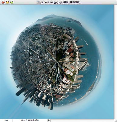
Easy cheesy, right? Now for some finishing touches…
STEP 3: ROTATE AND CLEAN UP
The rest is just a little digital darkroom work: Rotate the planet to your liking, adjust the contrast and colors, clean up the sky and the edges where the left and right border of the image came together. (The clone stamp and healing brush may be handy here.) That’s it, we’re done!
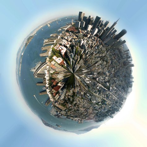
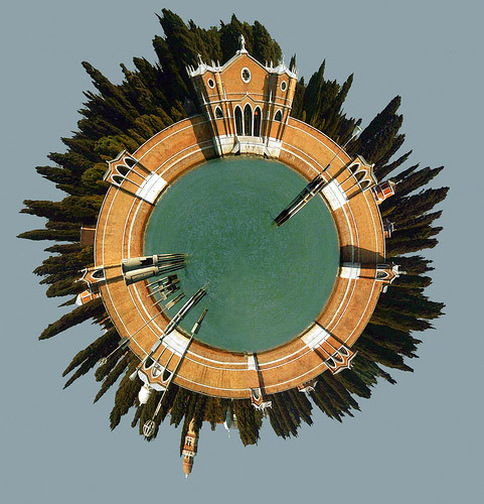
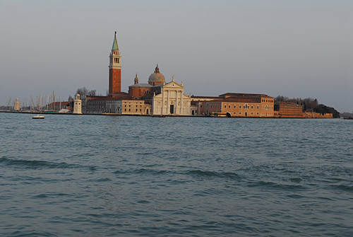
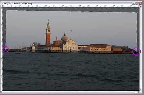
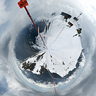
MORE ADVANCED: PLANET VENICE
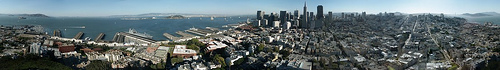
Planets work best when created using panoramas, but for this second example we’ll use the following landscape photo of San Girgio Maggiore Island in Venice. Islands are especially well-suited for planetization because the left and right edges of the images are easy to match up–you only have to make sure the horizon is level.
Planets work best when created using panoramas, but for this second example we’ll use the following landscape photo of San Girgio Maggiore Island in Venice. Islands are especially well-suited for planetization because the left and right edges of the images are easy to match up–you only have to make sure the horizon is level.
CROP AND STRAIGHTEN
Because we’re not starting with a 360 degree panorama, we’ll need to do some extra work before we can follow the steps above.
First we’ve gotta crop and straighten the image to make the horizon absolutely horizontal. Using the cropping tool of PhotoShop we can do both in one step:
First, we must ensure that our crop selection is parallel to the horizon. Choose the crop tool and select a flat rectangular area of the photo. Move the cursor just outside of an edge of the selected area so that the cursor changes to two arrows pointing left and up. Click the mouse button and you can rotate the cropped area.
By moving the top border of your selection to the horizon of the photo you can inspect the rotation closely. Move and rotate the crop selection until the top border and your horizon are parallel, but don’t crop your photo yet.
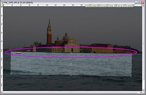
Now we want to make sure the left and the right borders of the image fit together. Look for areas on the right and the left where the buildings have the same height:
Move the right and left borders of your selection so that the edges will match up. Finally, adjust the top and bottom of your selection so your waterline is roughly in the middle of the cropped photo:
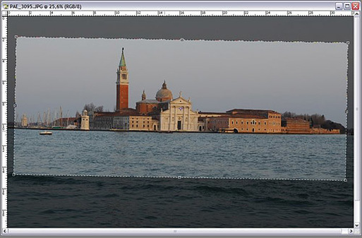
Double-click your image to commit the crop and you’re ready for the transformation! Just follow steps 1-3 as in the example above.
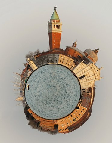
Here’s the final result:
Here’s the final result:
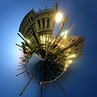
More Examples
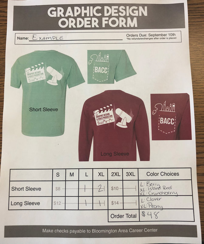
September 4, 2018: Class Shirt Order Form
August 31, 2018: Elements of Design, Fonts, & Brushes
Me Poster
Your poster must be 11in x 17in size and include ALL of the following:
Your poster must be 11in x 17in size and include ALL of the following:
- Picture of You (Recent but not necessarily taken in this class, it can be a senior picture or one you already have from an event or place you want to remember.)
- Your name in a new font (Big enough to read, don't hide it!)
- Brush of some kind
- Background of some kind (This can be a photo or graphic of some kind or something you paint/draw in the background)
August 30, 2018: Color Correction/Manipulation
|

|
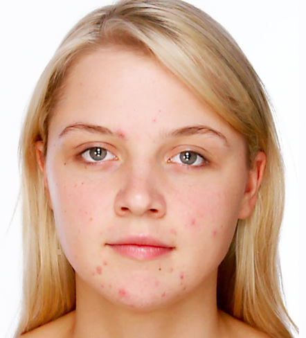
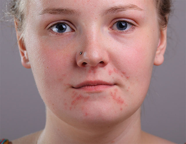
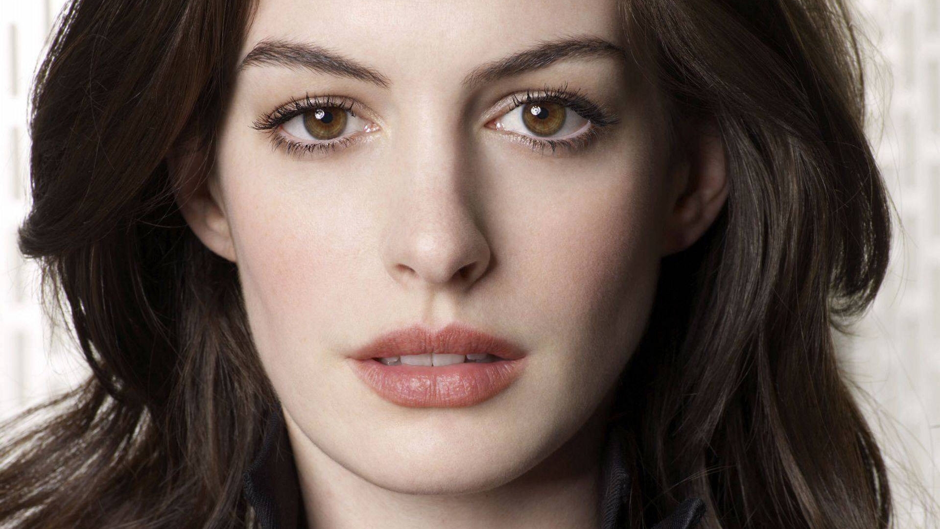
August 29, 2019: Social Effects of Photoshop
As we build on your skills and work toward all together photo manipulation I want you to be conscious of the consequences of the edits you make to real live people. As such, I want you to see the external perspective of Photoshop and it's use in the media.
For today you will read the 3 linked articles and write a 1-3 page reflection. Tell me what you think about the use of Photoshop in the media and the effects it has on its viewers. Tell me about the regulations that have been proposed and if you think they are good/bad/not enough/too much. Your reflection should be at least 1 page but no more than 3 pages. Double spaced, 12pt Times New Roman font. You will use the application Word or Pages and save it to you computer. Before leaving today post on your assignments page and include a "File" option. This will allow you to post your finished paper to your website.
Photoshopping: Altering Images and Our Minds
Thinner, Smoother, Better
| Beauty is Only Photoshop Deep |
August 28, 2018: Principles of Design
Find an example of each of the following and in your own words define its use related to graphic design. Post your examples and descriptions on your assignments page as a new post.
Principals of Design
Elements of Design
Principals of Design
- Contrast
- Repetition
- Emphasis
- Balance
- Proportion/Scale
- Harmony
- Rhythm/Movement
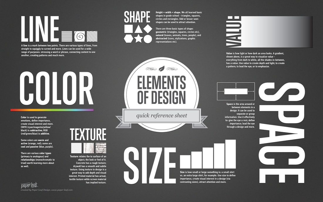
Elements of Design
- Line
- Shape
- Form
- Color
- Texture
- Space
- Value
August 24, 2018: Principles of Design - Repetition, Pattern, Rhythm
Principle of Repetition
The principle of repetition simply means the reusing of the same or similar elements throughout your design. Repetition of certain design elements in a design will bring a clear sense of unity, consistency, and cohesiveness.
Repetition is the use of similar or connected pictorial elements. For example, similar shapes, colours or lines that are used more than once
Repetition can be regular or irregular and even or uneven.
Repetition can be in the form of RADIATION where the repeated elements spread out from a central point.
Repetition may be in the form of GRADATION where the repeated elements slowly become smaller or larger.
Repetition works with pattern to make the artwork seem active. The repetition of elements of design creates unity within the artwork.
Patterns often occur in nature, and artists use similar repeated motifs to create pattern in their work. Pattern increases visual excitement by enriching surface interest.
Principle of Pattern
Pattern is a combination of elements or shapes repeated in a recurring and regular arrangement.Symbolic uses of pattern
Pattern is often used symbolically to represent many things: people, beliefs, the natural world, history, tradition. Colors and shapes have specific meanings, and are passed down from generation to generation. The predictability of pattern is important in establishing a historical tradition and cultural practice.
Principle of Rhythm
We are all familiar with the use of pattern as decoration, from clothing, to everyday objects, to home decorating . Below is an example of an elaborate use of pattern in home decoration.
Rhythm is like pattern, in that the same elements (i.e.shape, line) are repeated; however, with rhythm there are slight variations in the pattern. Rhythm is easily perceived but complex and subtle. Think of water on a beach; it continually breaks on the shore in lines that are repeated, yet each one is different.
Pattern Creation:
5 rows with at least 4 graphics in each row.
5 rows with at least 4 graphics in each row.
August 23, 2018: Principles of Design - Contrast
Contrast is one of the key principles within Composition and Layout. Contrast in design is an accentuation of the differences between elements in a design. Most people think of contrast only as it applies to colors, but contrast can work with any design element. Contrast is important because the meaningful essence of any thing is defined by its value, properties, or quality relative to something else. Nothing has meaning by itself.
Importance of ContrastFocus
Contrast creates focus. In the iPod advertisement below, the designer used a silhouetted character on a brightly green colored background in contrast with the iPod and earphones in white. The design creates contrast and focuses the viewers' attention on the music player.
Organization
Contrast help with organizing the information and improving the clarity of the message. Contrast helps lead the reader’s eye into and through your layout. Each component is but a piece of the overall project message and objective. With creative uses of contrast, you can influence user choices and compel specific actions.
Appeal
A main reason to use contrast in a design, whether for print or web, is to grab attention. Contrast creates an impact, but too high contrast between design elements might give an unsettled and messy impression.
Forms of ContrastContrast with Color
According to Colin Ware, most principles for effectively using color in design can be derived from an understanding of the red-green, yellow-blue, and black-white color channels. A phenomenon known as simultaneous contrast occurs in each of the channels. The effect of simultaneous contrast is distortion of the appearance of a patch color that increases the differences between a color and its surroundings. This is called lightness or brightness contrast when it occurs in the black-white channel, and chromatic contrast when it occurs in either the red-green or yellow-blue channel. Contrasting colors are those on opposite sides of the color wheel. The further apart and more directly opposite each other, the greater the contrast. For example, red is from the warm half of the color wheel and blue is from the cool half. Opposite colors is also referred to as complementary colors which generally refers to each of a pair of colors that are directly opposite each other on the color wheel, such as purple and yellow.
Contrast with Size
Big and small elements of the same type as seen on the figure 5, are the most obvious uses of size to create contrast. The big elephant is in contrast with a smaller creature walking beside it.The second picture below shows contrasting white space or the physical size of the piece with another element of the design as another method of contrast. The huge pyramid is in contrast with a person walking in front of the pyramid.
Contrast with Type
Type contrast can use size, value, and color to create contrasting typographic treatments. One can add bold or italics to create contrast, mix large type with small type, or combine serif with sans serif type to create type contrast. You can also set portions of text in contrasting colors or varying values. Changes in type alignment create contrast as does type spacing such as extreme kerning for headlines.
Contrast with Value
The relative lightness or darkness of two elements to each other can create a contrast in value. Whether with shades of gray or tints and shades of a single color, the further apart the values the greater the contrast.
Contrast with Other Design Elements
Contrast is one of the most powerful design concepts because any design element can be contrasted with another. Use the principle of contrast to create strong dynamic differences among elements that are different. If it is different, make it very different. You can achieve contrast through the manipulation of space, color choices, text selection, positioning, and so on. Making use of contrast can help you create a design in which one item is clearly dominant. This helps the viewer get the point of your design quickly. Every good design has a strong and clear focal point and having a clear contrast among elements helps. If all items in a design are of equal or similar weight with weak contrast and with nothing being clearly dominant, it is difficult for the viewer to know where to begin. Designs with strong contrast attract interest, and help the viewer make sense of the visual.
August 22, 2018: Pretest and About Me Page
About Me Page:
- 3 pictures
- 2 text boxes
- 1 link
- 1 Youtube video
